Style exploration for a meditation app


I worked on some cute characters and crazy gradients for Evolum - a wholesome meditation app that focuses on self discovery and understanding emotions rather than calming our minds.
I'm in a love hate relationship with meditation apps, mostly because they label sadness, anger and frustration as something bad, that we should get completely rid of. So if I fail at controlling my emotions or calming down myself I end up feeling even worse. 🤷♀️
On our initial call with Evolum, I was more than excited to learn that they share my opinion and strive to bring to their users a new way to mindfulness. Without judging and without labels, through self discovery and accepting the whole spectrum of emotions, understanding where they come from and why.
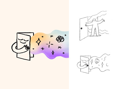
Together, we translated their mission into a colourful illustration style with playful storytelling. The colour palette is warm and vibrant to differentiate the brand from some of their competitors that mostly use blue or green tones. The gradients symbolise both the diverse spectrum of emotions and the different chakras from eastern culture.
My shot descriptions are getting longer and longer and I can't help it. 😂 I have a lot more to share about the project but I'll keep it for the case study.
Swipe to explore the moodboard, the style exploration and some of the final illustrations.
Art Direction and Moodboard - Julia Moroge


