Google Workplace Icons Redesign Challenge

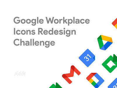

Gave myself a quick challenge tonight, to see if I could improve Googles new Workplace (formerly G Suite) icons.
Googles updated designs were clearly trying to incorporate the Google visual style into each icon but where I believe they've fallen short is remembering that icons serve a much broader purpose - one of usability and distinction, not brand awareness.
By adding in so much of the 'Googliness', the icons are more difficult to quickly differentiate. So my challenge was to see if I could solve those problems.
I'd love to hear what you think of Googles new Workplace icons and feedback on my redesign challenge is always welcome!


