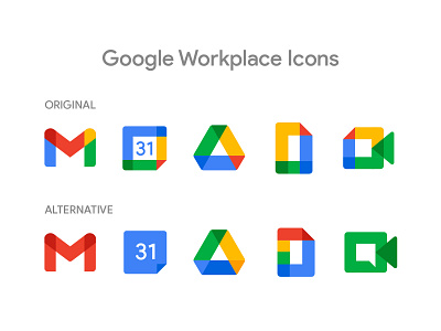
Google Workplace Icons Redesign Challenge


Here's a closer look at the icons from my Redesign Challenge.
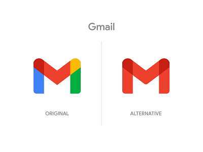
Gmail
This felt like an easy adjustment, bring back the brand colour made it instantly more legible.
Calendar
The coloured borders were just making it difficult to read the date, which is the most important thing when you're trying to associate it with a calendar.
Drive
A simple adjustment to bring it inline. TBH the red wasn't harming anything, I felt this was just cleaner.
Docs
This was the biggest change. I applied a more uniform block sizing and adjusting the colours so it still had the applications in mind. Yellow slides, Green Sheets, Blue Docs. Colour blocking the top and bottom also makes it read more like the D in docs.
Meet
A solid colour made this version stand out on it's own, but still part of the set. I re-introduced the messaging icon to the negative space to connect the original design and the application usage.
I'd love to hear what you think of Googles new Workplace icons and feedback on my redesign challenge is always welcome!