Procreate Playoff

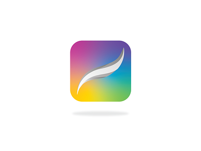
I chose to do a re-work of the procreate icon.
I used the colors on the icon and created a gradient mesh background for more of an organic feel. I think it's representative of how users interact with the app.
For the icon, I decided to apply a monochromatic palette in contrast of the multi-color background.