Ólea Packaging, label and logo design

Concept proposal for Swedish startup company, Ólea, where looking for a unique custom and minimalist packaging design.
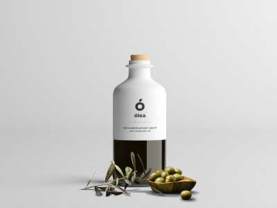
Starting with the bottle, one of the things I was told is that the olive oil is done by hand, so I wanted to portray that with the bottle by doing an artisan inspired bottle, it's half ceramic and glass, the bottom of the ceramic part is threaded so that glass portion can be screwed on, making a single unite.
The logo is simple, originally "Olea", which I changed to "Ólea" and used the "Ó" as a logo, because it looks like an abstract olive.
They also asked for something that is not normally seen on packaging design, something simple and unique that could increase the visual hierarchy. One of my ideas was to add a breaker between the logo and text, a plain line looked ordinary but also I felt something was missing. Thought it still needed to be like a "line".
I was going thought different ideas and decided to use Morse Code, which simply reads, Ólea Olive Oil.
Which was exactly what I was looking for.


