Tome Visual Language

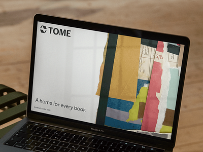

One of my favorite aspects of the new Tome identity is the visual language showcasing scraps of books and paper. I came up with and set a vision for the overall art direction, but the Tome team brought it to life. They made their own collages seen throughout the brand. It adds a really ownable element that is versatile and shows off their innovative creativity.
Tome is a book sustainability company located in the Pacific Northwest. Day in and day out, they take old, trashed, discarded books and use them as a starting point for creating new products like paper goods, newspapers, notebooks, packaging materials, boxes, and even firestarters.
Tome’s purpose is to give life to the old and unwanted. The cast-offs and the forgotten.
I’m really excited to see this brand launch, especially on Earth Day!
My role was to come in as a guide and help the founders align on their purpose and give shape to the brand. Together, we came up with the name Tome, designed a visual identity, and crafted their story to build momentum and excitement around their cause.
Check out Tome.Eco for more!


