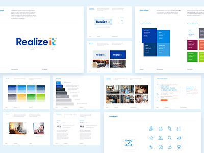
Realizeit Style Guide
Adaptive learning platform Realizeit wanted a bright, saturated color palette that worked across their marketing website as well as their learning platform. They also made it clear they weren't interested in visual elements that were 'designed for the sake of design.'
To avoid things feeling too full-color spectrum, we suggested a visual system where the blue tones could interact, but the remaining colors would require space in between. The simple nature of the iconography paired with highly legible typefaces affords an unobtrusive experience when scanning their materials or using their UX product.
View all tags
Posted on
May 4, 2021
More by Paul Wronski View profile
Like


