Peep - Branding, Packaging & Pattern Design

'Peep' is a collection of branding, packaging and pattern design as part of Briefbox's practice brief for a series of sunglasses that promote summer, positivity, and self-love.
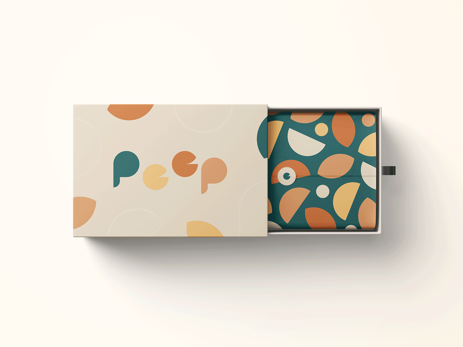
Instead of using a pre-established typeface, a custom logotype was created for the project, with each letterform individually 'peeping' either above or below the baseline to emphasise the sense of joy and playfulness that the brand needed to convey.
The lowercase 'e' letterform also comprises of two separate shapes that individually elude to the shape of the human eye.
The burnt colour palette chosen was inspired by citrus fruits traditionally associated with summertime all over the world.


