Humanised Design System - Color palette


Today, we're exploring a series of shots on our design system. We laboured considerably to make Humanised’s design elements as flexible and functional as we could.
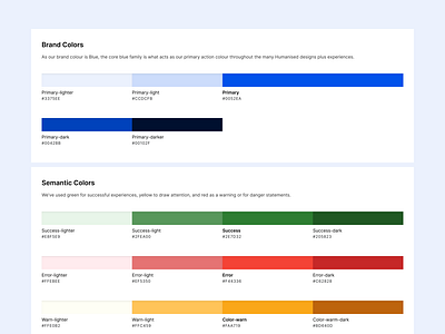
This shot showcases how we developed a coherent color system. This was critical as colors have a huge effect on the overall experience of a digital product. The Humanised color system helped us apply color across our UI in a meaningful way.
With the understanding that the use of brand colors as primary colors strengthens brand awareness, we opted for Primary(blue) as our primary colour. Similarly, the core Blue family is also the primary action colour found throughout Humanised’s various design components and experiences.
We’re passionate about collaborating on fresh projects! Got one that suits us? Reach out to us on info@betalaunch.com
We’re excited to hear from you!
And if you’re keen to check out our work, pay us a quick visit on,


