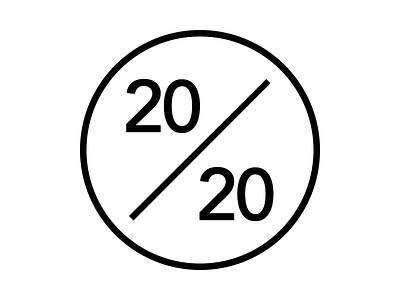
"The 20/20 Story" - Logo 2


I made the whole symbol thicker, so the symbol is more impressing. Should be the final one, if you have no improvement suggestions any more.
Is a font type like "twenty-twenty" next to the symbol necessary or is the symbol sufficient?
(check out the white logo on a black background in the attachment)
Feedback is really appreciated! Check out the @2x version.