Carehood - NDIS provider in Maps


Hey folks,
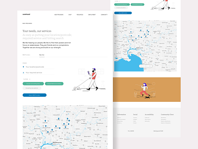
This is the Map view page I have been talking about. It's the same page but it's in a different section. Small creative solutions like these helps the entire product in a lot of ways. The size of the website is lighter, loading time is lower, has an experience like an absolute application when in mobile devices (which I'll upload soon) and so much more.
There were some issues when designing this page but none of them were really serious ones just some small UI related things to fix, that's all. You can see the map is just plain and the reason why I did it that way was to make it easier to use. I mean there is no point of me adding all those features of maps into this, it'll only make the section heavier and if that happened, on switching from the main section you'll see huge blank space in middle of the page which is just awful. But yeah, you could solve that by putting skeleton loading even so the user experience gets disturbed. So, the bottom point is why'd you put unnecessary features and create clutter! I left a dedicated zoom in/out button for those who uses keypads to navigate otherwise mouse scroll-wheel could've also done that.
Hope you guys like it 👍
If you want to work with me then click that "Hire Me" button duh! 🥳 or if you're looking to connect with me I'm on Twitter 🍕


