ADVANCE Logo (AAPI Community at Carvana)

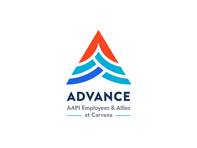
I recently created this logo for Carvana's latest community, ADVANCE, an AAPI focused employee resource group! Here's the design thinking behind this concept that we ended up going with:
This project was quite the challenge for me because with logos that represent cultural communities, we have to be careful about using stereotypical imagery but at the same time, still incorporate visual elements that represent the org truly and uniquely. I did some research of other orgs beforehand and saw that a lot of them fell into this issue. There were a lot of lotus flowers out there so I definitely wanted to avoid that. This final concept hits everything I aspired to accomplish with the logo. I wanted to have a strong visual of the A, from ADVANCE, to show upward movement with a pointed arrow to symbolize our namesake and our mission, and lastly do a subtle nod to Asian imagery without going overboard into stereotypical imagery. I used concentric circles within the A to form a scene where each piece of the circle joins together to form a strong wave rising up together. I incorporated red because it’s such an important color to many Asian cultures and still kept some Carvana blue in there to tie us back to our company.


