“Carta” Font

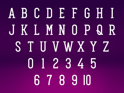
As I was developing these playing cards, it became clear to me that I would want to build out my own font for the corner-index for the cards. Lots of custom decks use a non-standard font for the index, and while I wanted mine to feel classic, it's all-new. Everything you see here was custom-drawn specifically for this deck. So here’s “Carta.” (A–Z, numerals, plus an alternate extra-narrow 10.) By creating these letters myself, I was able to ensure the relative weight to the suit pips was as I intended, rather than using a stock font I have less control over.


