Color

I'm working on some color stuff these days and thought it'd be nice to share it a little bit.
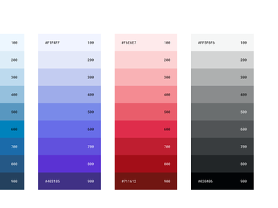
This shot came out of some early explorations, but I'm not happy with it. There is a lot to take into account when it comes to color palettes for design systems. If you're working on color, typography, or any type of foundational work at the primitive level, do your homework and take into account color contrast ratio for accessibility, design tokenization, scalability (please, don't take a base color and start lightening until you get 10 different shades 😣), themes, think about your particular use case, product or platform.
This is not auto-generated so I'm still learning about color science and system implementation and that's why this is not final. Will share more about the nitty-gritty and point to some useful resources and tools I'm using.
Feedback is always welcome 😃


