


Appsotre screens

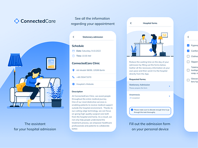
One of the final touches before releasing an app to the market is to get the AppStore and PlayStore ready. The Connected Care brand is mainly built on shades of blue, which generally gives a very peaceful vibe to the designs. But, for the App Store, the color palettes seemed to be slightly cold and distant. This is why I added a few colors that could bring a pinch of warmth and coziness to the composition :) Hope you like it (Available in AppStore Germany).


