Notion Logo Redesign

After a long time, I sat back for some brainstorming!
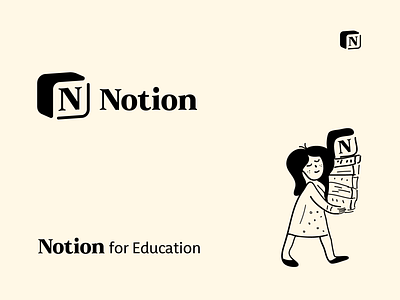
This time I've chosen Notion for redesigning its logo to give it a fresh look.
The main motivation behind this:
"The old lettermark was inside a box that looks kinda congested also limits its meaning. To demonstrate a new meaning I have disjointed the box lines to unravel that Notion is kinda breaking users' productivity obstacles. Also, I have revamped the box in a roundish way to make this mark more accessible and user-friendly".


