My Meta

“we will leave the goal open”
Facebook has a new logo and I couldn’t just appreciate it: I’ve done my version.
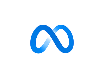
Firstly I like a lot the logo idea, I can see the infinity symbol, the tridimensional object made of this cyclic shape, the oculus mention with this kind of a mask that the circular shape make, and the way it produces a tridimensional object (kind of a building?) is very neat: almost as the tennis ball line outlines it’s geometric volume.
How to not notice the M as the Mark? (maybe some kind of personal preference here, Mark?); McDonald’s already tested it, a very effective shape! Some additional ideas I can see are a pair of wings, which I think is very cool!
Somewhat I feel this is too thin, especially on a small scale; it could be a bit thicker. Also despites it’s a tridimensional mark, I think a bright spot in the center would do no harm; actually put some more significance on the central spot of the mark and even the M letter.
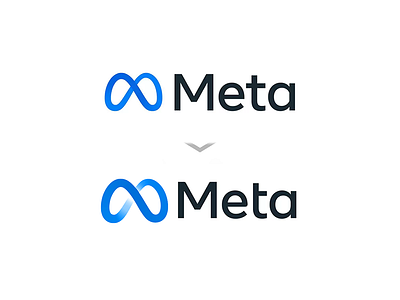
There are some issues tho that I cannot solve, and may be impossible actually (let me know if you have some idea!): the symmetric circular shapes, inevitably remind me of some sexual body parts that I’ll not mention but you know; impossible to get rid of it (sexy curves BTW). The same aspect that makes this seems a glass shape and sort of a M, make this maybe too droopy. Maybe another POV for this 3D shape would do the trick and a blessing about a 3D mark so you have this option in future. About typography all I can say is that it is too simple and doesn't have any connection with the mark. Maybe the T and the A deserves some minor touches that make it seem more like a team, or just a bit more roundy, IDK.
The composition also bothered me a bit, the type seems a bit bigger than it should be and I think this is due the geometric alignment with the bottom and the top of the Mark. It is a very common mistake: everything must be aligned optically; not geometrically. I would make the mark slightly bigger so it seems to have the same height as the type.
Well, that’s just my quick revision on it. I hope you like it and I would love to hear from you people what makes sense and what doesn't :)
Need a logo, illustration or other crazy stuff? Email me now :)
-
Follow & Connect!


