Sea of Thieves Leaderboard

Leaderboard (as part of UI Learn by Denislav Jeliazkov)
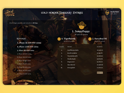
The goal was to design a leaderboard screen which included players names, numbered list, scores and filter.
Challenges I faced:
1) Since I choose pirate theme, I wanted to find a cool typography style that would look as awesome as pirates do. After some research I decided to use Windlass typeface for headlines and PragRoman typeface for content. Both styles work very well together.
2) I wanted the first three places to stand out, but since pirates care more about treasure than crowns, I used some pirate coin icons and I know pirate users would appreciate it.
3) I wanted to put an illustration from the Sea of Thieves game in the background, but had some issues with the visibility of the text. Some dark blur behind the text seems to fixed the issue and the background fits perfectly with the leaderboard and the pirate theme.
4) The background is very dark so dark coloured text was not an option. I used light colours on typography - the important information is white, everything else is slightly darker, but still visible enough.
5) I tried to include filter on the top right of the screen, but in the end I didn't, because it didn't go well with the context. It could be included in the ''Show more'' screen.
6) At first I made elements too big, so I reduced the text size and the icons. It made all the difference - the importance of the white space was a huge lesson for me. Also the background is more visible and it looks very cool.
What I learned:
1) Define the most important element on the screen and made it stand out from the rest.
2) Carefully choose the typography size and typeface to reflect the hierarchy of the elements.
3) Consistency is very important and sometimes I should limit ideas and wishes to maintain it.
4) How to use white space to your advantage.
5) How to have fun with typography, icons and elements to create a beautiful thematic leaderboard screen.


