Fixing the iPhone Timer and Alarm UI

I've been confused by the similarities of timer and alarm Lock Screen interfaces, so I wanted to explore what could be done to better differentiate between the similar actions across both.
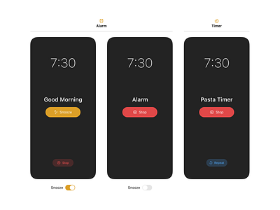
While I think Apple did the right thing by making the prominent button 'Stop' on timers and 'Snooze' on snoozable alarms, the current UI has them both as the same color which makes it easy to forget what you're doing.
Applying same colors to same actions and adding icons makes the whole thing a lot more glanceable — especially when you've just woken up from a deep sleep.


