Dribbble's Like-button — A/B

Recently noticed that Dribbble is testing, or may have rolled out this new, Like Button with a tweak similar to the UX logic of Twitter when they changed the "Follow" with a filled button.
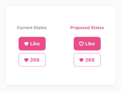
But, in @Dribbble's case, this proposed tweak might not work— better.
The simple reason being that the new button, especially with the filled-heart icon made me really stop from browsing Dribbble and appreciating any Shots.
I was so confused and wondered — "how did I already "Like" these shots!?
.
I quickly decided to tweak and see if this could be done better. I also explored renaming the CTA to "Like?" but it didn't come across as confident or on-brand.
.
Next, I thought about simply removing the fill as it'd still give that affordance of tapping it. With this tweak, the delta in "Likes" should improve.
.
However....I will surely miss the joy of seeing the button getting 'filled' with my "Like". Metaphorically, it made my appreciation — impactful.


