YouTube - Redesign

Hello friends
Happy to share with you a redesigned version of YouTube.
Major alteration is on the main video area.
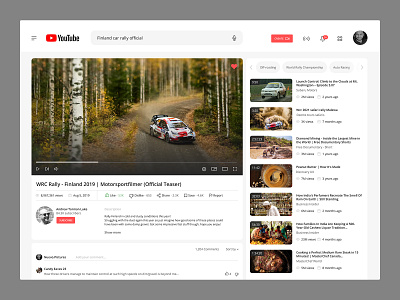
01 - Header
I give prominence for the 'Create' button which is really important for the same reason I have mentioned in point 4. Also the search icon has been removed from the search tab which is replaced with microphone icon.
02 - Favorite icon
I have added a '❤️' button for users to add the video in their favorite list. This will be only visible when you hover/pause the video.
03 - Video title
For me, the current version of YouTube has too much texts and colorful thumbnails images. I have made it neat by isolating the video title by itself. Also other details like views, publish date, like, dislike etc can be found on its own clean place right below the title. Video reactions (Like/Dislike/Share/Save) are numbered to show the actual value of the content.
04 - Subscribe and description
YouTube is all about its content creators. Without them YouTube disappears. So why not show them in the spotlight. Bigger and bolder, I have given them a space for people to see who is behind the video the world is watching.
Right beside the Subscriber area is the video description, which is aligned to the 'Like' button above.
05 - Comment section
A bit more tidy that existing. Showing comments and filter sub-menu is not really important as important as commenting. For this reason this menu has been moved to right. Like/Dislike buttons are aligned right.
06 - Video thumbnails
Currently it looks cluttered so I've added extra space between each thumbnails to make it ease for eyes.
Press “L” to show your love!
---
Follow me here


