Softwhere Logo Design and Case Study

Softwhere.nl Logo Design & Case Study
Almost 3 years ago I was approached by a software developer from the Netherlands who wanted a logo for his company named simply Softwhere
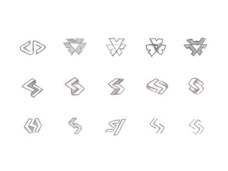
After discussing directions I did some sketches for a few days and it all came down to these initial ideas.
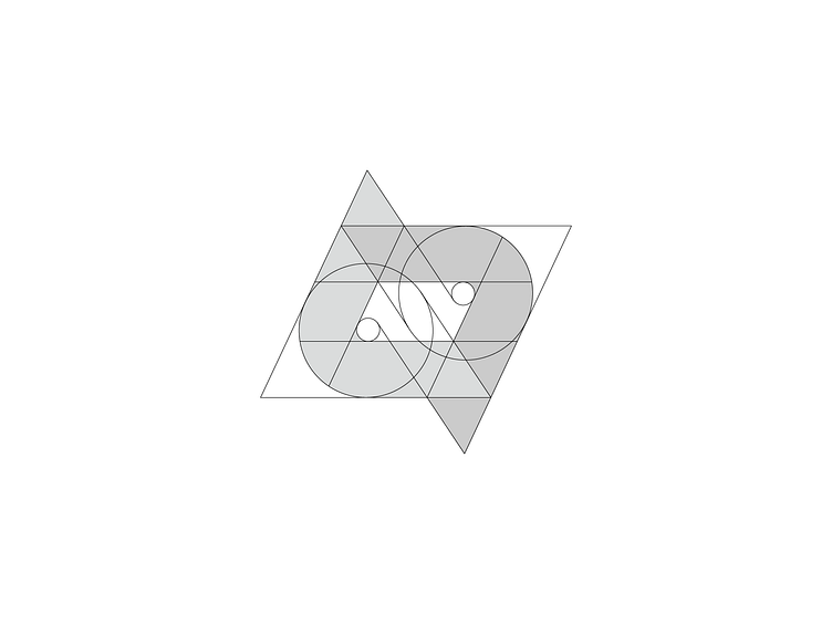
After locking in three of the best concepts I proceeded to vectorizing them while also testing some other ideas I had. Bellow you can see the progress.
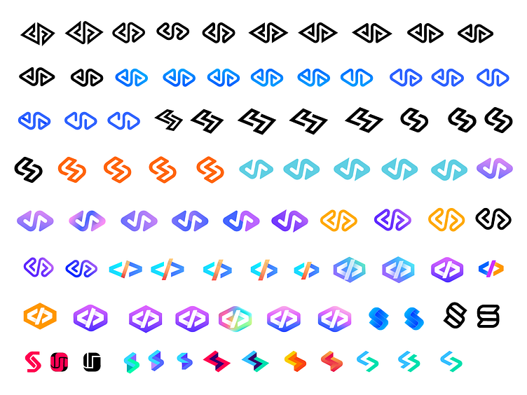
Here is the first proposal, based on the idea of unity, directions and arrows.
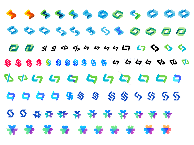
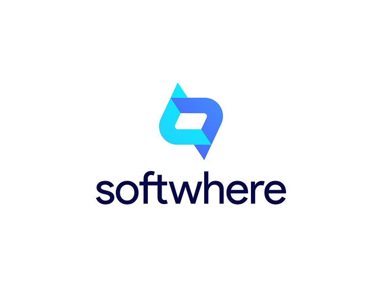
Followed by the second proposal, where I tried to incorporate as simple as possible two arrows into a letter S.
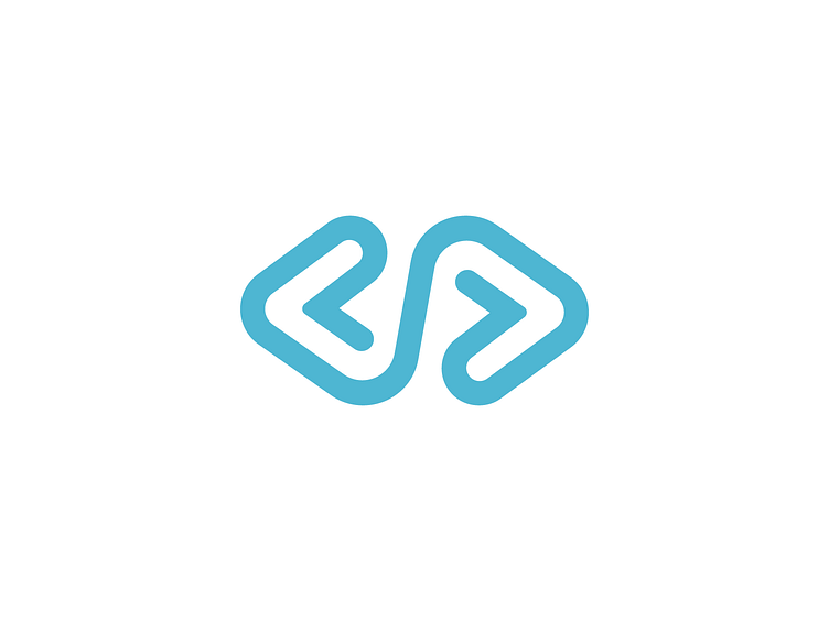
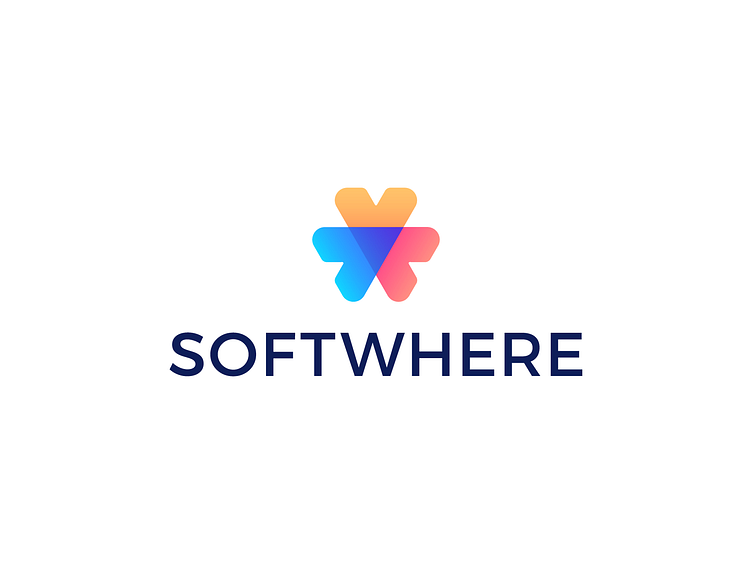
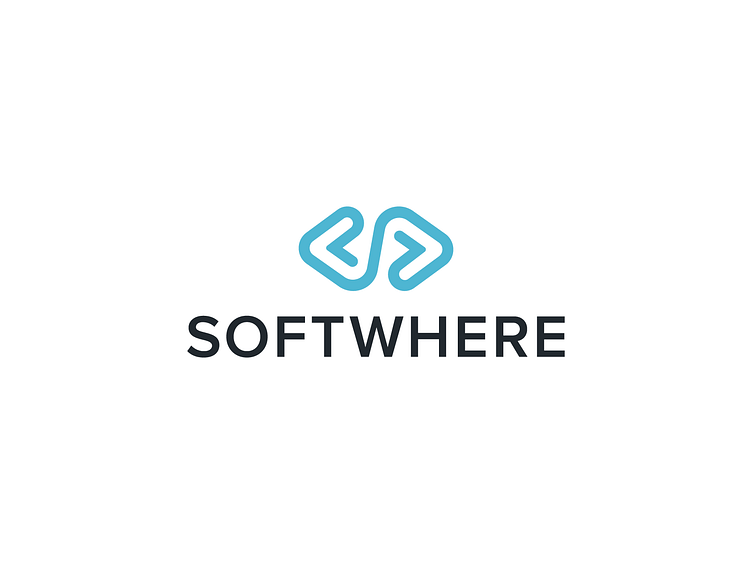
Finally the third Concept, which was the winner, given it's simplicity and clean & airy lines.
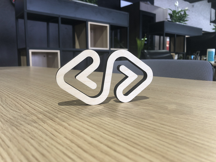
Laser cut logo out of plywood.
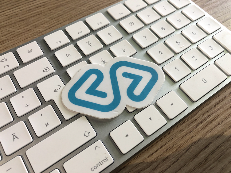
Sticker that I got after meeting with the client in Amsterdam :)
That's it friends!
Thank you for viewing, I am supper happy to share this case study with you and for the new feature from Dribbble.
Many more interesting projects coming soon.
Thanks,
Mihai.


