Designing Insights Trends


Last year, we introduced Insights Trends to Productboard — a brand new surface area within the Insights board that allows our enterprise customers to analyse customer feedback, at a glance.
Let’s take a look behind the scenes, and show you how we designed it. You’ll read about our discovery process, what we gained by moving beyond Figma prototypes, and finally, I'll share selected design highlights from the solution.
Going from “Inbox” to “Insights”
The Insights board in Productboard was originally built for smaller teams who needed to understand what their customers were saying, in one place. Its main value was in centralising feedback from many different sources into one repository.
But, as Productboard grew larger, and larger organisations began using it, the volume of feedback collected started to outgrow the solution. Many customers viewed it as a mere inbox and didn't consider it as a place for learning.
Our objective became to move toward a vision where working with feedback at scale was easy and less manual. We wanted the Insights board to be a place for identifying opportunities, a place that enabled our customers to continuously learn about what their users need.
Discovering the right direction
With this vision in mind, we started reviewing what we knew.
Many customers were already using a feature to help scale feedback: User Impact Score on the Features board, a number that aggregates the volume of feedback and its importance, linked to individual features.
That said, we knew from existing feedback that customers had a hard time learning about the trend in time. They were unsure whether a customer need was growing or if a feature was generating more or less feedback after a release. It was also hard for them to answer questions like “What is our target segment asking for?” and “What topics are coming up recently in my product area?” without a lot of manual work, including diligent linking of feedback to feature ideas.
We needed to learn more about the key jobs-to-be-done, but we also had some early ideas that we wanted to test. We talked to our customers, combining traditional research interviews with early concept testing.
We visualised our ideas and assumptions as an early concept used for testing:
From the interviews, we eventually discovered three main jobs-to-be-done:
Identify opportunities during planning in my product area or for a specific segment
Analyze trends in time for specific topics when prioritizing between multiple ideas or during post-launch analysis
Never miss an important insight in customer feedback I haven’t yet reviewed
Testing the early concept gave us a lot of good insights about which solution ideas had potential. Ultimately, we identified several different possible solution directions:
Optimize the Features board for trend analysis
Create a new surface area in the Insights board with a trend summary
Build a full-blown, customizable reporting capability
Focus on summarizing raw feedback using machine learning
To choose the right direction, we had to consider our “appetite” — or how big of an effort we wanted to invest into this, and the vision we had for the Insights board: evolving it from an inbox to a place of continuous learning at scale.
All of our thinking led us to choose to create a new surface area on the Insights board with a trend summary as the best bet. It would allow us to move toward our vision and deliver value to customers reasonably fast.
Designing the content
Deciding to build on top of the Insights board gave us a great foundation: powerful filtering of notes that we could use to summarize the data. It would also give users a lot of flexibility without building a full-blown reporting functionality.
The next question was: Which data points were the most useful to surface?
We collected a lot of data about this in our initial discovery. To progress, we ran workshops in our product trio (PM, designer, engineering lead) where we analyzed the jobs-to-be-done — this helped us generate ideas around the type of data points we’d need in order to best support them.
We generated a lot of content ideas and focused on those which would best answer the questions above. After some synthesis, we ended up with 4 clear-cut modules:
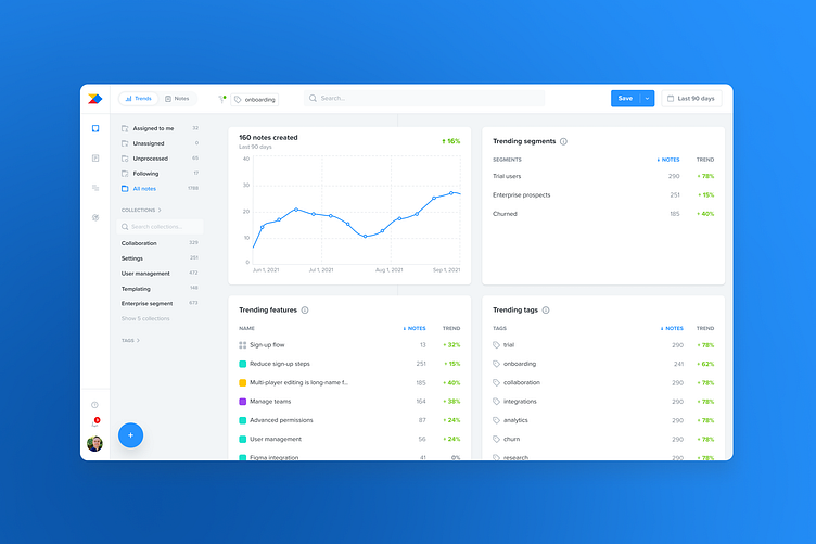
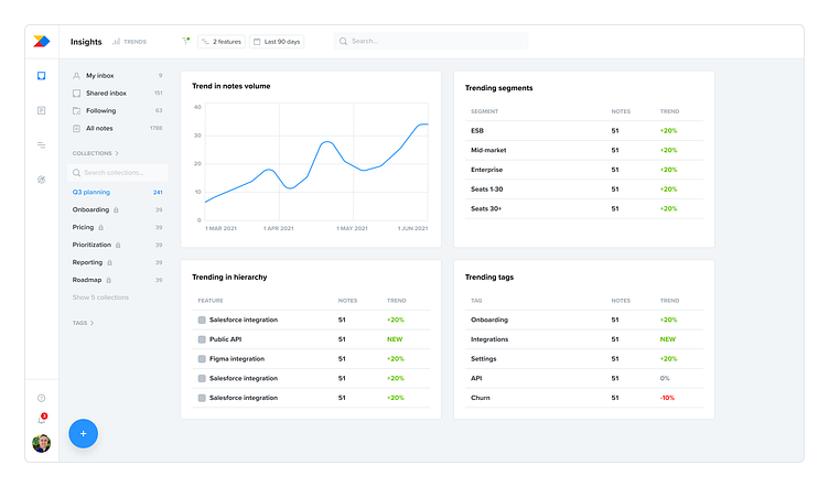
Feedback volume over time
Trending items in feature hierarchy
Trending segments
Trending tags
At this point, we turned these content ideas into a more refined design:
Moving beyond Figma to a live prototype for faster learning
Having clarity about the content, I prototyped our vision and we went to test our ideas with customers again.
While we learned something about what worked and what didn’t, it was quite limiting as long as we were using fake data. Customers struggled to understand the value of what we were showing them. Instead, we needed to show how the solution worked on customers’ live data.
We prioritised learning fast over polishing things up-front, so we made a plan for how to get this to market fast and decided to iterate afterward.
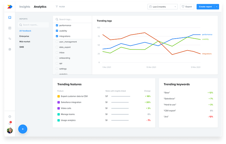
We cut out and built a very minimal and raw coded prototype that uses live data and we enabled it for selected customers in the beta programme.
As you can see, we deliberately focused on surfacing the important data points without much regard to visual polish or additional functionality. No responsivity, no actions on individual items, and no configurability just yet.
We were ruthless in our cutting down, so that customers would get this in their hands as soon as possible and we could continue learning.
Iterating with customer feedback during beta
Once in beta, we started collecting the most valuable feedback so far. We interviewed customers while looking at what Trends were showing them with their data.
This gave us a lot of new ideas for improvements. Throughout the beta phase that lasted over 2 months, we iterated on the solution a lot — in terms of functionality, but also the design polish this deserved.
Let me share some of our learnings and solution highlights.
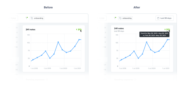
Understanding the time dynamics
From early feedback, we saw that customers were unsure about the numbers we were showing them in relation to time. They were asking things like “What time frame am I looking at right now?” or “What periods of time are the trend % based on?”
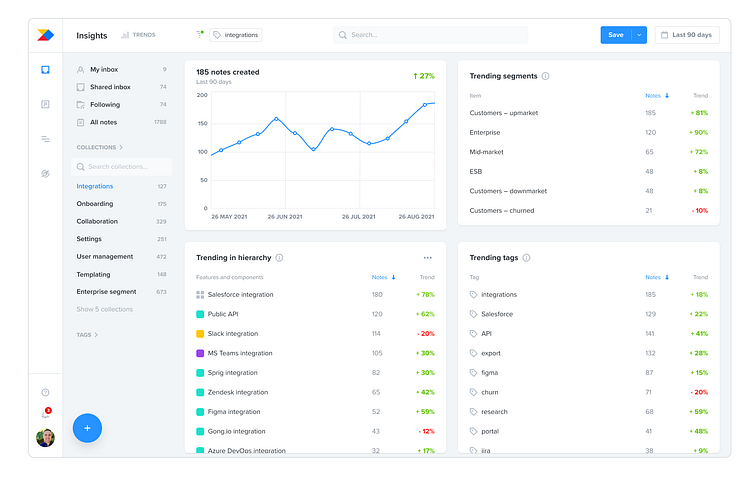
To address this, we surfaced the time filter and added explanatory tooltips that spell out the date ranges behind each percentage. This helped with understanding. Surfacing the filter was also beneficial because adjusting it was a common need.
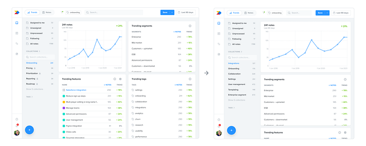
Discoverability of the navigation
Because Trends was an additional way of viewing data on the Insights board, we now had two kinds of views and needed a way to switch between them.
Initially, we designed a simple dropdown switch. The same pattern exists on the Features board and we reasoned users would be familiar with it and have no issues navigating to Trends. We couldn’t have been more wrong.
It soon became clear that users struggled with the discoverability of switching to the Trends view from Notes view. And even when they learned about it, it was inconvenient to always have to click twice to get there.
We decided to pivot to a one-click solution and used a segmented control instead.
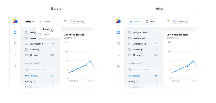
The result was dramatic: 80% lift in engagement. That was a big win for us since discoverability was more important than the consistency. The lesson? Obvious always wins.
The granularity of data for different roles
During the beta phase, we spoke to product managers of different levels: from individual contributors (ICs) to product leaders (directors, VPs). It became clear that they needed to look at different levels of granularity when it came to the “Trending features” module. For context, the features hierarchy in Productboard has four levels: products, components, features, and sub-features.
We initially included only features and components in the module, omitting the less-granular products and more-granular sub-features. This was enough for IC PMs but directors and VPs needed to see the product level.
As a quick fix, we simply started displaying products in the module, but we knew this was far from ideal. The module needed to be configurable and that’s what we ultimately delivered: a set of options to customize which levels of the hierarchy PMs wanted to see.
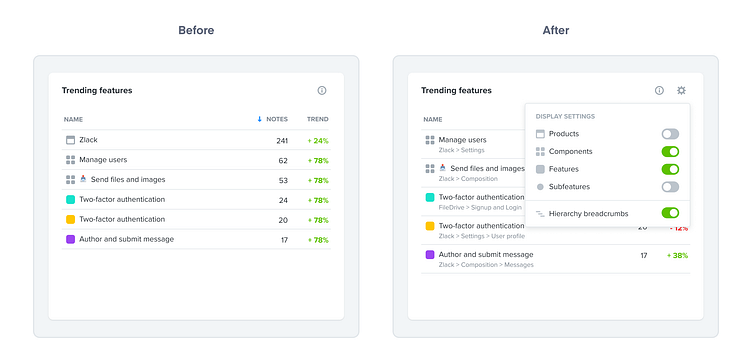
In addition, we also enabled customers to display breadcrumbs to understand where different features sat in their hierarchy. As we learned, this is especially useful when seeing features of the same name, but from different products.
“Drilling down” — filtering vs. opening details
As early as our initial discovery, we started hearing from customers that they wanted to “drill down” into the data. And this theme continued in the beta phase. But when we probed about what “drilling down” actually meant, we were getting different answers.
Some customers meant adding the given item as a filter so they could see the same view, just filtered on that one thing. They needed to go one level deeper.
But others meant reading notes linked to a trending feature or seeing customers from a trending segment.
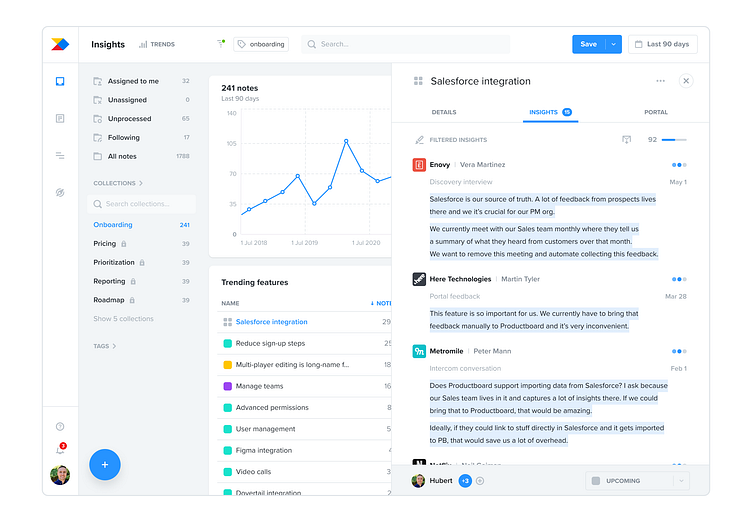
Addressing the two implied very different levels of effort. Opening items’ sidebars (which would address the latter group of use-cases) was a significantly cheaper solution than implementing drill-down filters which would require fundamental changes to the filtering logic.
We made this pragmatic decision, fully knowing that the drill-down filters are still valuable and likely something we’ll still build in the future.
Responsiveness and a UI polish
Last but not least, we finally paid back the design debt of the live prototype by making the whole view responsive. We also worked closely with our design system team on improving the visuals of the underlying components.
The result is a view that’s not only visually pleasing but more importantly, easier to consume and work with.
The first step toward a new vision for understanding large-scale customer feedback in Productboard
It was a great journey through the beta phase. We learned so much and improved the solution step by step by listening closely to, and working with, our customers.
We ultimately released Insights Trends to all of our Enterprise customers just before Christmas. It’s an important first step in our new direction for the Insights board.
It’s now easier for larger customers to understand customer feedback at scale but we know there’s still a lot to do. We’re working hard on reducing the amount of manual work product makers need to do to really understand what their customers need and making Insights in Productboard a place for continuous learning.
We’re very excited about delivering further on our vision later this year! 🚀


