Kayak Case Study


In mid 2021 I got brought in to orchestrate the complete rebrand of the Kayak cannabis company.
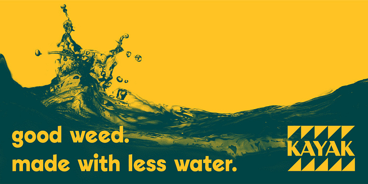
Kayak is a Colorado-based cannabis brand that gets its name from operating in what was previously an old kayak factory. The company culture is rooted in outdoor recreation and water conservation. They back that up by doing a great deal of water recycling and purification on site at their grow facility in the foothills of Salida.
Kayak recaptures and recycles an average of 40,000 gallons of water a day.


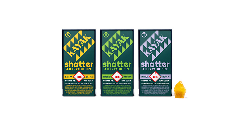
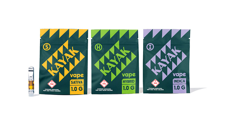
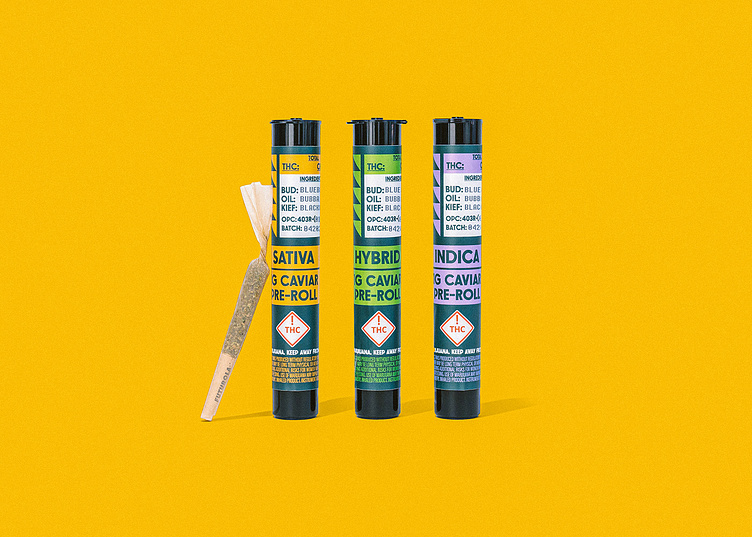
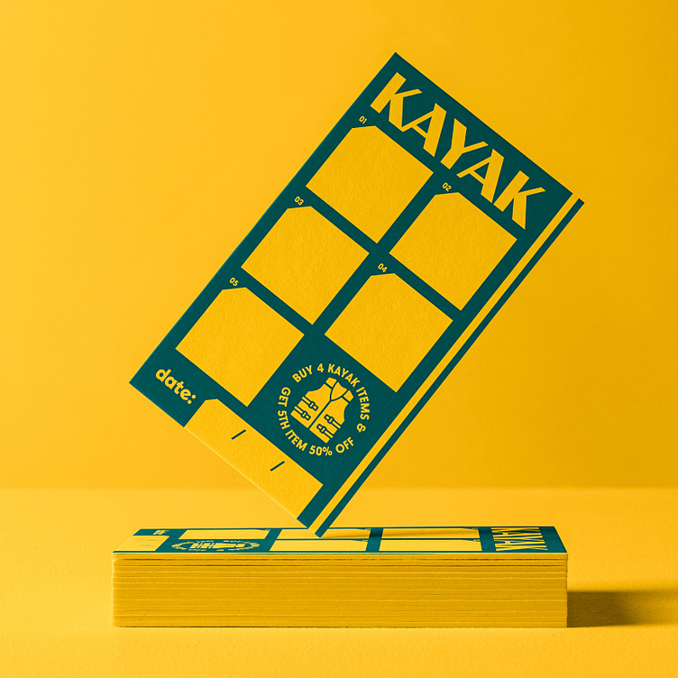
This project entailed creating a comprehensive brand suite including logo elements, colors, typography, and a flexible packaging design system.
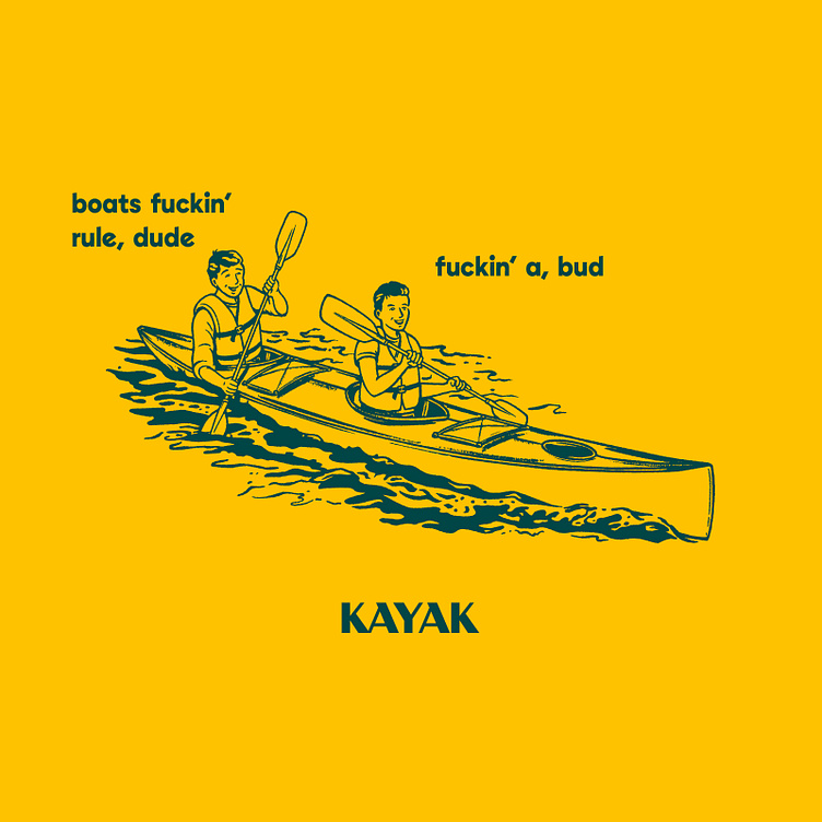
I tried to build something that was unfussy, friendly, and approachable. Right at home on your campsite picnic table or in your whitewater drybag.
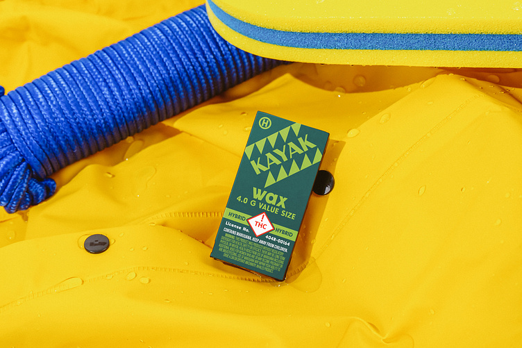
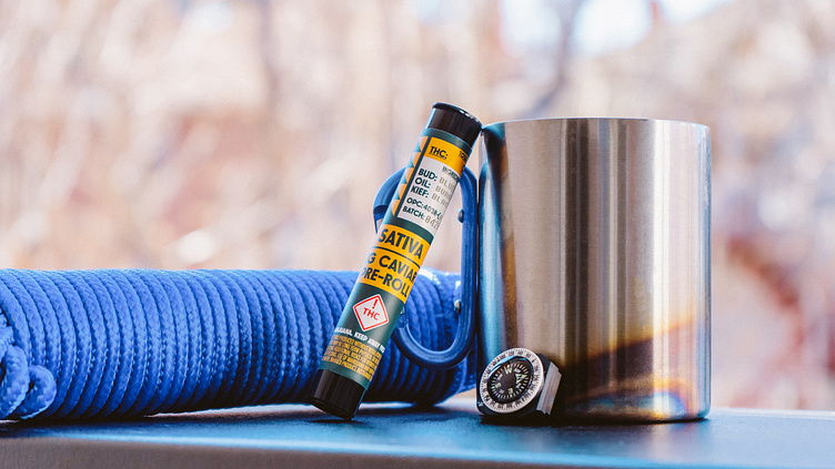

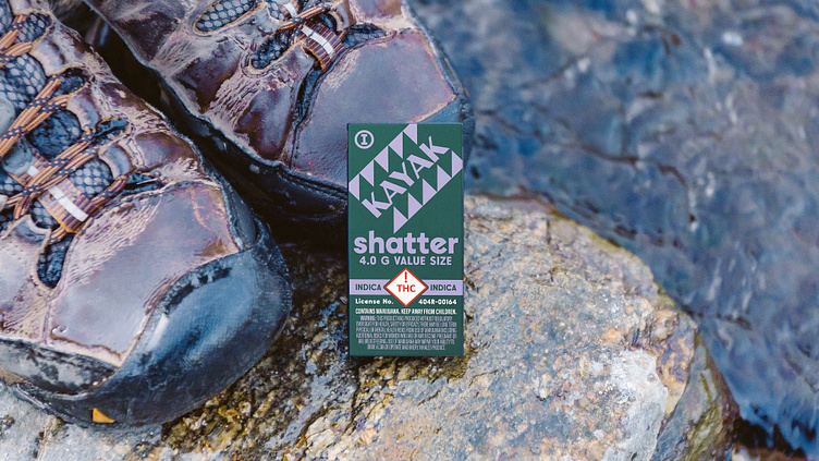


The Kayak project included packaging designs for standard flower and caviar prerolls, wax, shatter, bulk flower, and vape cartridges.
It was important to me that this design system would be flexible and ready to fit into any new packaging form factor we threw at it. Nothing about this brand should feel precious or high maintenance. It is utilitarian, but with a sense of humor.