Data Table

Hello People,
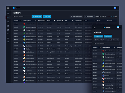
Sharing a simple table design based on the insights that I learned and the experience that I gathered while working on data-heavy products.
Sometimes, it's not just about making everything look spacious and clean but about ease for a user to see maximum data on single viewport. So, keeping a balance is very important.
Below are some points to note
1. Adjusting the height of the cells
2. Instead of truncating data and showing fewer characters, I introduced a column shadow which gives a quick understanding of expendable columns, plus you can see more characters
3. On hover, clearly highlight the line for expanding a column.
4. Instead of truncating column header text, I added shadows behind the sorting icon. Now, I can see more characters, and the design is truncation free
I hope it is helpful. Happy designing :)


