UserEvidence Logo Process
![Max Burnside [Available for projects]](https://cdn.dribbble.com/users/303299/avatars/small/5380070fabf4894e68c5de6113f868b0.png?1690152453)
Introduction
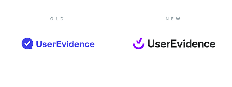
When I first joined UserEvidence, they had a placeholder logo. The original logo and wordmark were visually simple (included later in the case study), without a unique quality that a brand needs to stand out.
As part of the logo and wordmark update, I outlined the following needs:
Convey a sense of "verification"
Be simple enough to work on busy background images
Ideally, tie in visuals for "user", "U", etc.
Work at a variety of sizes
Work in both color and greyscale versions
Initial Concepts
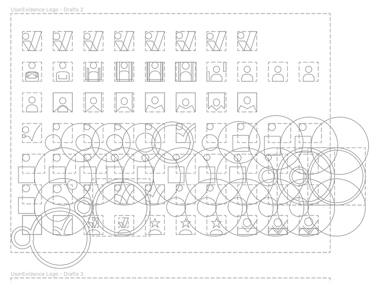
When first working on the logo, I focused on showcasing various depictions of the user. This began with an avatar/profile style frame, with various orientations and border radius amounts.
From there, I tried a few versions of showing a user with their hands raised, doubling as showing the letter "U".
The user with their hands raised progressed into exploring a checkmark that could incorporate the user.

Second Round
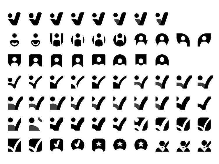
I explored more of the checkmark + user combined image, before moving back into several different versions of a user/avatar depiction. It was during these iterations where I started seeing the strength of the checkmark, and began exploring different ways to depict that common symbol. I wanted it to have curvature, and tried a variety of curved edges, with and without the "dot" or the user's head.
It was also at this time that I started to explore another symbol commonly associated with verified content - the star. More of this symbol exploration in shown in the later images.
Second Round Outlines
Refining Concepts
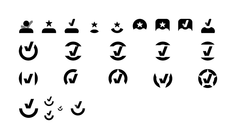
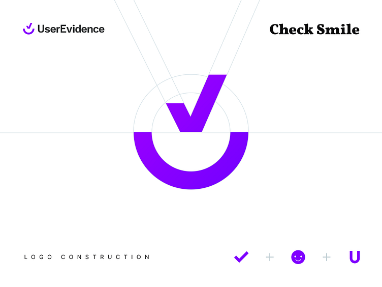
While I further explored using the star symbol, it was at this time that the checkmark was solidified as the symbol that would be a large part of the logo. It has a simple yet powerful meaning behind it. Additionally, the verified checkmark that appears on social media builds in the meaning to areas where UserEvidence content will appear, and this bolsters the benefit of selecting the checkmark to be used in the final logo.
I tried several different cutaways of the circle to create a verified "badge" of sorts. It was during this exploration where I found the bottom cutaway worked best. It makes for a double image of a "smile" along with the letter "U".
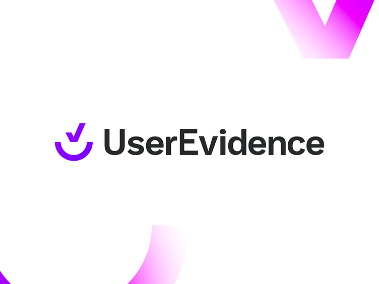
Final Result
After adding the color treatment and creating the wordmark (based on the Inter typeface), the final logo ended up being as follows. The original logo is shown for comparison.
The team and our customers have received the updated branding nicely. It has been over a year since I created the UserEvidence logo and wordmark, and in using it for a variety of placements, it has proven to be a versatile mark.
See the logo and wordmark in action on UserEvidence's website.


