Apple TV+ Friday Night Baseball Redesign Concept
![Max Burnside [Available for projects]](https://cdn.dribbble.com/users/303299/avatars/small/5380070fabf4894e68c5de6113f868b0.png?1690152453)
Introduction
While watching Friday Night Baseball this past week, I noticed a few areas where Apple could improve it's presentation. While the graphics for FNB are nicer than most other national and regional sports broadcasts, they still leave something to be desired from a company that has clearly demonstrated an interest in streaming live content. If Apple really wants to make baseball fans stick with it's broadcast over competitors like YouTube with it's Free Game of the Week, and MLB.TV, it'll need to do more than simply show it's graphics in the San Francisco typeface.
Score Bug
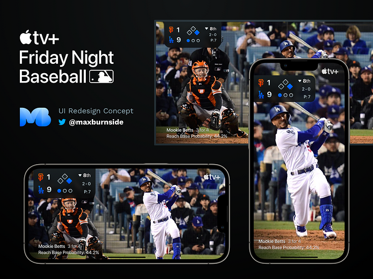
Rather than just rebroadcast the same image across all devices equally (making the score, outs, base information, etc. quite small on devices like iPad and iPhone), Apple should really leverage an overlay UI on the broadcast video itself.
Inspired by how Apple Maps handles overlays, particularly when viewed in landscape orientation, I propose having the score bug and batter information/stats aligned to the same side, with the information scaling depending on screen size.

Customization
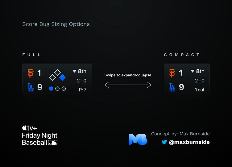
Users can then select from a "full" or "compact" score bug sizing, depending on how much information they wish to view. This change can occur by swiping left on the score bug to collapse it to a smaller size, or swiping right to expand it back to a more traditional view.
Layout
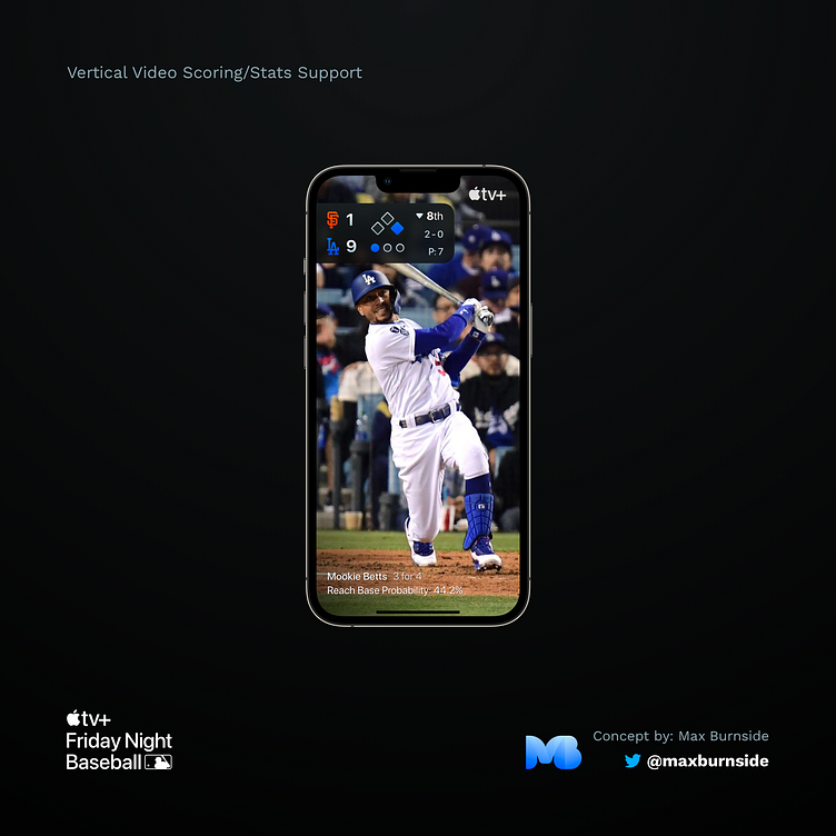
I noticed that Apple allows the game to be viewed in vertical video mode. This isn't uncommon when viewing videos within an iOS app, and the video framing does a pretty great job of showing core content in the center, so that vertical video is a possible viewing option. However, when a user is viewing the video vertically, all scoring/stats information is hidden, as it's located on the left and right side of the screen respectively (out of frame). I've proposed using the overlays to improve the viewing experience of vertical video. Users should be able to view the broadcast in vertical or horizontal orientations, while still getting the necessary game information.
I noticed in the current score bug, that the "Apple TV+" logo takes up a tremendous amount of screen real estate. Rather than wedge this logo in between the score (breaking up the information flow as user's read left-to-right), simply placing this logo in the top right of the screen would solve this problem. No need to reinvent the wheel here, as plenty of channels do the same for their logo placement, with some sports broadcasts not displaying their logo at all, as the UI and game content is enough branding to signal to fans where they're watching the game.
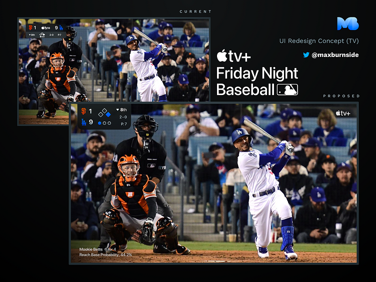
Here's a mockup of the new UI shown on a TV, with emphasis placed on visual hierarchy and relative sizing (larger TV's have the same issue with very small text being hard to read). By making the score bug and other graphics overlays in the Apple TV+ app, they're able to be sized up to each screen size in a legible manner.
Conclusion
Friday Night Baseball is still a very new product, and I'm certain Apple is going to make improvements to the viewing experience. I have no background knowledge of who (whether at MLB Network, which produces the content, and/or at Apple) gets to work on these types of changes. But hopefully, this inspires some changes in the product.
Looking forward to seeing how Friday Night Baseball broadcasts improve in the future!


