solo logo structure

Hello,
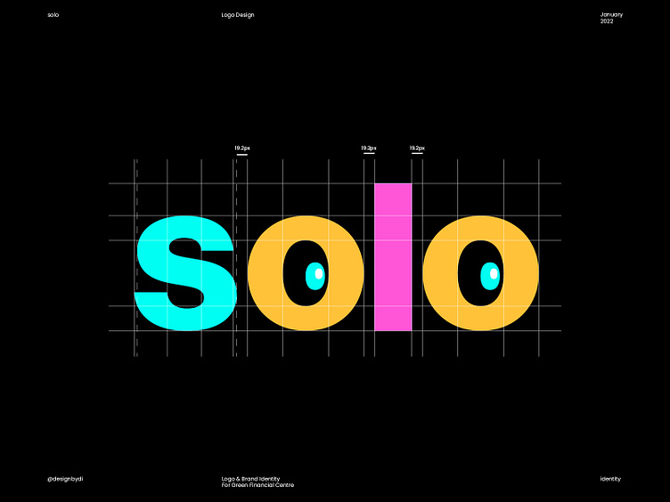
I want to share with you this logo structure that I worked on recently for "solo" a new section of "digitaleys", "solo" is an NFT Marketplace that focused on 1/1 artists and small collections.
idea:
the two “O” ”O” and the “l” represent the 1/1 artists,
they also share the same color.
solo is a new section of digitaleys so why not Taking some remarkable
elements from it (the eyes) , this way everyone will relate between them.
What do you think ?
---
Contact me to get your logo design or branding project done: designbydi01@gmail.com


