420 with True Terpenes (1970 style)

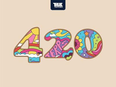

1960–70s has always been my favorite era. I love old hippy posters and the wild color palettes. Last April I worked on a marketing campaign for True Terpenes. This design became the cover of the campaign and was used in a giveaway to promote terpene and vape products.
The 420 graphic was originally sketched using the typeface Ringside. That's currently the main font for the company. But it didn't match the era so I went with Cooper Black. Although the typeface was designed in the 20s it became popular during the 70s and was the perfect fit for this design.
I had to recreate the second image for the web team to use in backgrounds. It was also used as a floor graphic for the terpene bottles to sit on.
Here is the 420 origin story. Its one of the many locations this graphic was used. https://trueterpenes.com/featured/creating-a-culture-how-the-original-4-20-shapes-our-community-today/
💫 Visit my website to see my most recent projects Graphicsbyte.com