Huddle - Brand Identity for Professional Network


For Huddle’s new identity I faced the challenge of developing a visual language that could communicate trust, growth, and collaboration, with elements that could feel precise and powerful yet uncomplicated and approachable.


The client
Huddle is a professional networking app – but rather than having to message people on LinkedIn – you can “buy” someone's time and talk to them directly. The platform will have “experts” who can give you their time for a price from various companies and roles. You can buy their time and ask them for advice/guidance.
The solution
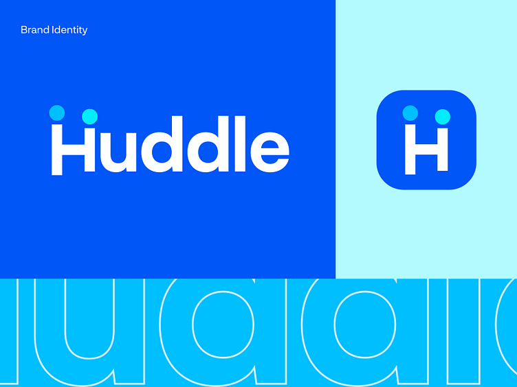
I researched, strategized, and designed the new Huddle visual identity, supported by a spanking new design language that is consistent across all platforms.
For Huddle’s new identity I faced the challenge of developing a visual language that could communicate trust, growth, and collaboration, with elements that could feel precise and powerful yet uncomplicated and approachable.
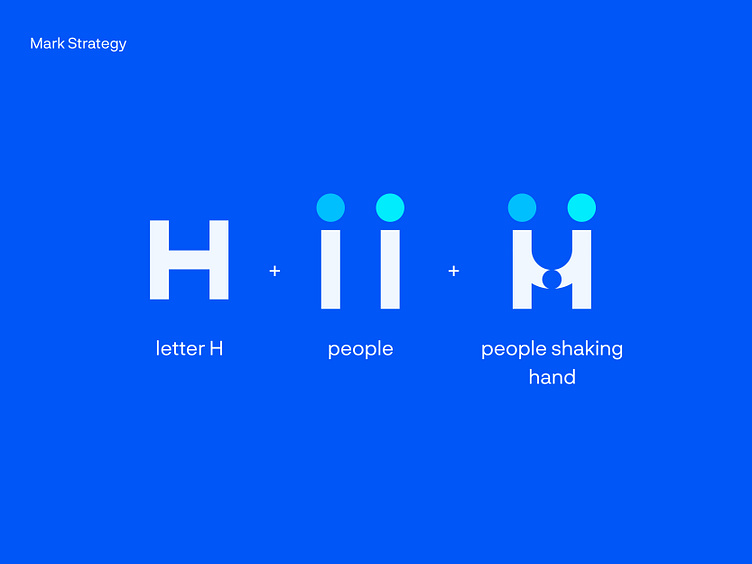
The logo features a simple symbol that brings Huddle’s mission to the forefront: finding a mentor for growth. I combined metaphors like a smile, users shaking hands, and the company's initial letter H. The wordmark spells the brand name in letters that feel structured and accessible, emphasizing both the power and simplicity of the product.
Your thoughts and feedback are welcome.
Have a project in mind? Let's work together!
Get in touch usman@kickstudio.co


