Djemari- Visual identity


Hi Guys! 🙌
Here I will share a new logo exploration case study "Djemari - fresh your body and soul". djemari is one of the largest companies in the field of reflexology in Indonesia, having branches in various cities on the island of Java such as Yogyakarta, Malang, Purwokerto, and Cilacap. djemari focuses on massage and reflexology services, they also offer home massage.
my approach to designing this logo is
Simple, Fresh, and Convenience
discalimer
this project is based on a subjective view and my own research
You can scroll down to see more details 😎
Ideation and sketch
in this phase, I do some sketches to represent djemari itself with my experience and my research

Current logo
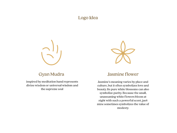
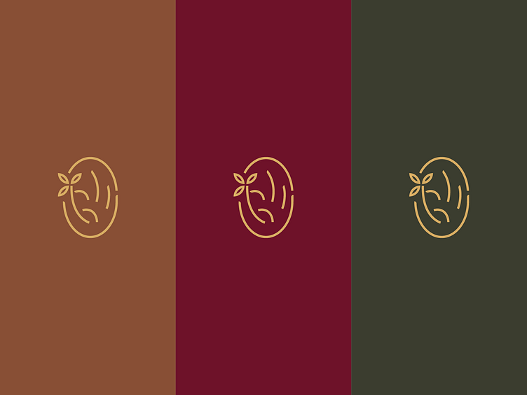
inspired by the previous logo and keep originality (hand and jasmine flower)

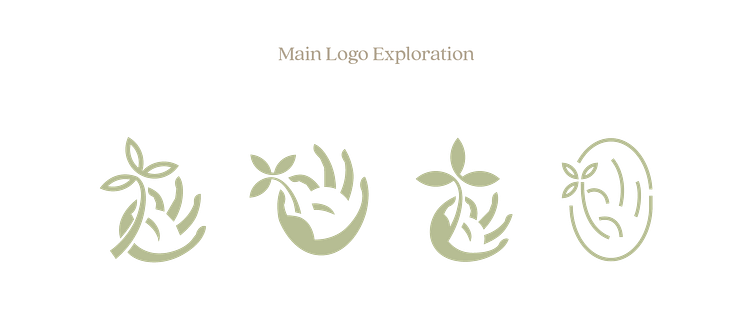
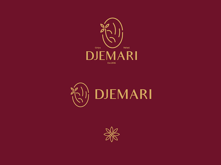
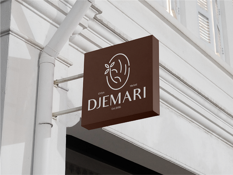
Main logo
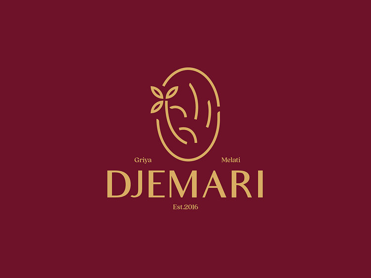
final logo, the reason I chose this logo is because is easy to implement, simple and classy
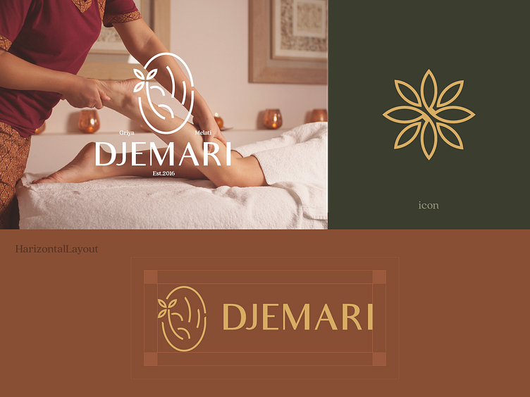
Logo Layout
Consistent is key to a good logo, so I made various layouts that were used for different situations. Above for large space or big media(billboard and prints)
the middle for horizontal space with normal space and last for favicon in browser website or social media profile picture.
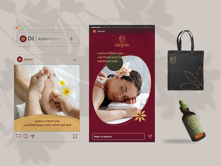
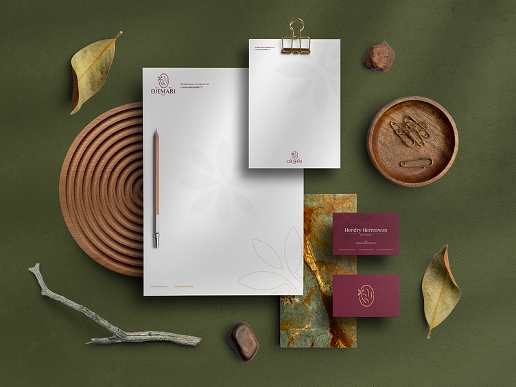
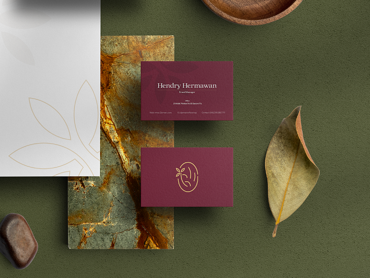
Logo Implementation
implement logos for a variety of output from tote bags for merchandise, instagram post and story until stationary
Thank you for scorlling
have an idea for your busniess, let's talk
----------------------
Don't forget to press (L) and don't forget to follow @Plainthing Studio dribbble account to get lots of awesome design, illustrations and animations
Wanna collaborate with us? Shoot your business inquiry to plainthingstudio@gmail.com
Plainthing.studio | Vicolo | Ui8 | Youtube | Behance


