HYRED - Logo Design
Hyred is a professional networking platform to counteract the ongoing professional shortage in some industries in Germany, mainly in the health sector. They reached us to rebrand their existing branding and visual language to a modern and trustworthy brand that's consistent across all of their communication channels.
The challenge
For the HYRED's new identity I faced the challenge of developing a visual language that could communicate trust, collaboration, and professionalism, with elements that could feel modern and powerful yet uncomplicated and approachable.
The solution
I researched, strategized, and designed the new HYRED's visual identity, supported by a spanking new design language that is consistent across all platforms.
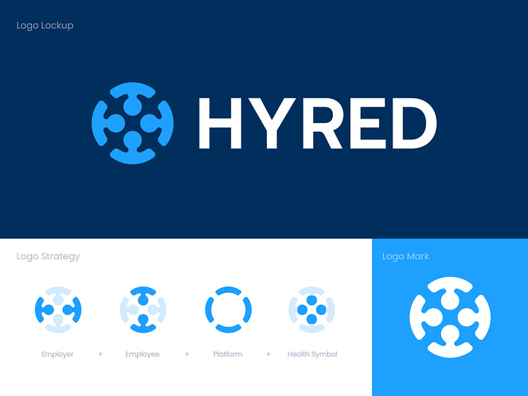
The logo features a simple symbol that brings the platform's mission to the forefront: connecting employees with the employers in the health sector. I combined metaphors like an employee, platform, employer, and the health symbol. The wordmark spells the brand name in letters that feel structured and accessible, emphasizing both the power and simplicity of the product.
Your thoughts and feedback are welcome.
Have a project in mind? Let's work together!
Get in touch usman@kickstudio.co


