Starbucks Drink Size Dropdown - UX Concept
![Max Burnside [Available for projects]](https://cdn.dribbble.com/users/303299/avatars/small/5380070fabf4894e68c5de6113f868b0.png?1690152453)
Introduction
I want to start off by saying that Jason Stoff and his team have done an incredible job with the Starbucks mobile applications. They are leaps and bounds above other applications in their class and make for a wonderful experience in ordering items, paying for goods, and managing rewards.
This past weekend, I noticed an area of the application where I saw room for some improvements, and mocked up how these improvements could be accomplished.
Disclaimer: I don't know what Jason and the team have discussed with regards to this update or any other internal UX discussions that go on. There are a ton of moving parts in a company the size of Starbucks and a lot of consideration goes into product design decision making for an application with this many users. There are Design, PM, and Developer requirements that I am certain I haven't considered in my UX concepts.
All of this to say, this is my humble suggestion for a UX update.
Current UX
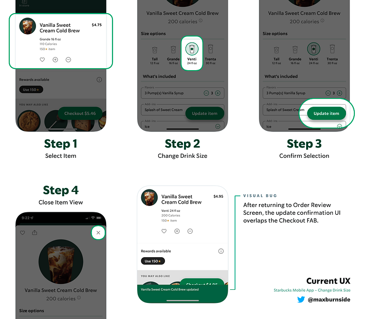
Currently, if a user wants to change the drink size from the Review Order screen, they must:
1) Select the item (opening up the Item View)
2) Change the drink size
3) Confirm the selection
4) Close out of the Item View
After closing out of the Item View, the update confirmation UI remains in front of the Checkout FAB, obstructing this action, and appearing as though it was designed to appear in a different section of the app - unintentionally located in this instance.
Proposed UX
While 4 steps is not an absurd number to take (though, if users have multiple drinks in their order, these steps can certainly add up), I believe this UX can be improved.
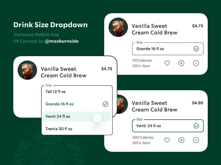
Since users can already take quick actions (including favoriting, duplicating an item, and removing an item) directly from the Review Order screen, I'd like to see the ability to change the drink size here as well.
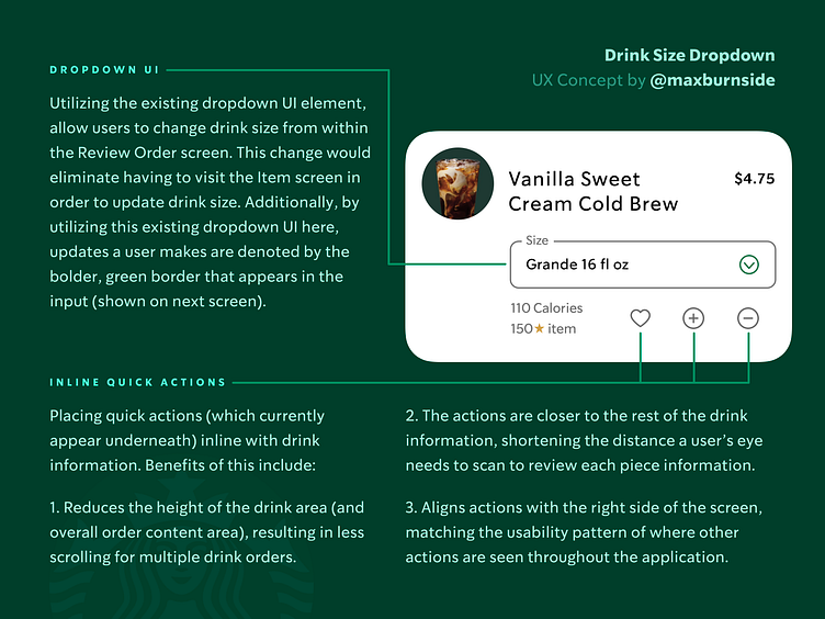
The solution I've proposed utilizes an existing UI element, the dropdown, to make this action possible in this section of the application.
In addition to the dropdown, it would be an improvement to move the existing quick actions to be inline with the other drink information. Currently, the quick actions are located underneath the drink information, creating taller item cards, which require more scrolling and scanning from users - especially noticeable when an order has multiple items.
The dropdown UI could be implemented in it's current state, which brings up an action sheet to change options, or in a true dropdown manner.
I would suggest a true dropdown UI, as it's the expected behavior for dropdowns, along with a contextual state to show which size the user has currently selected. This contextualization (denoted by a checkmark icon) would eliminate any confusion of the current drink size, and eliminate the step of having to close the expanded dropdown to see which drink size is selected.
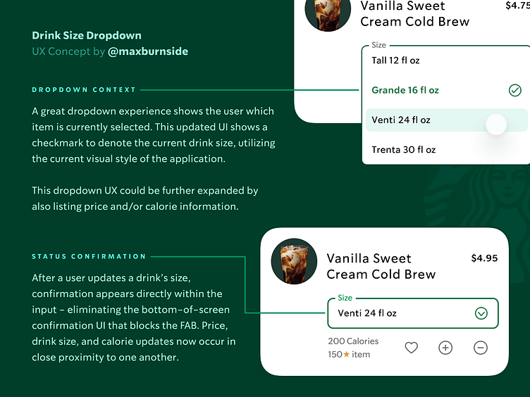
After the drink size is updated, the current dropdown UI again works well and eliminates additional development work - with a bolder border width, and green color applied to both text label and input border. This has the benefit of providing direct confirmation within the input where the user took the action, as well as removing the current bottom-of-screen confirmation UI that blocks the Checkout FAB momentarily.
Having the updated drink size appear directly in the input would also allow users to see multiple item updates at the same time, scrolling through items and seeing which have been modified and which have remained the same as initially selected.
Conclusion
If you got this far in the case study - thank you! I appreciate you checking out my UX concept.
If you like this sort of thing, feel free to check out more of my work here.
Thank you again for taking the time to check out this case study.


