Loudfund Dashboard Idea

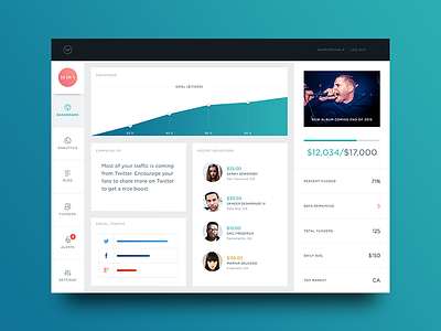
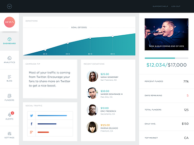
Had a little free time this weekend and wanted to take a stab at a new concept for the Loudfund dashboard. The one we made before did the trick, but I really want to elevate the visual design language and present the information in a cleaner way. I tried to trim some fat here and keep only the most relevant elements on the screen for the "Dashboard" view. This view is meant to give some basic high level details on the health of your campaign. In essence, this is all you would really need to see on a day-to-day basis during the run of your campaign.
This has yet to be tested and is by no means a final draft. This is just some exploration and forward-thinking.


