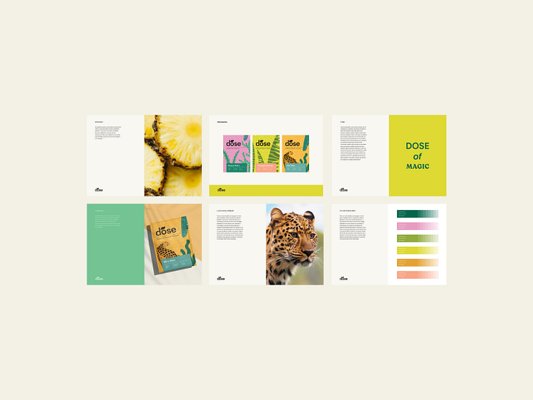
Branding & Web Design for Dose Tea 🌱


Let’s talk about the principles of website design for a tea brand 🖥️
As the principles of website design say about finding the purpose of the website, we have a tea brand here.☕
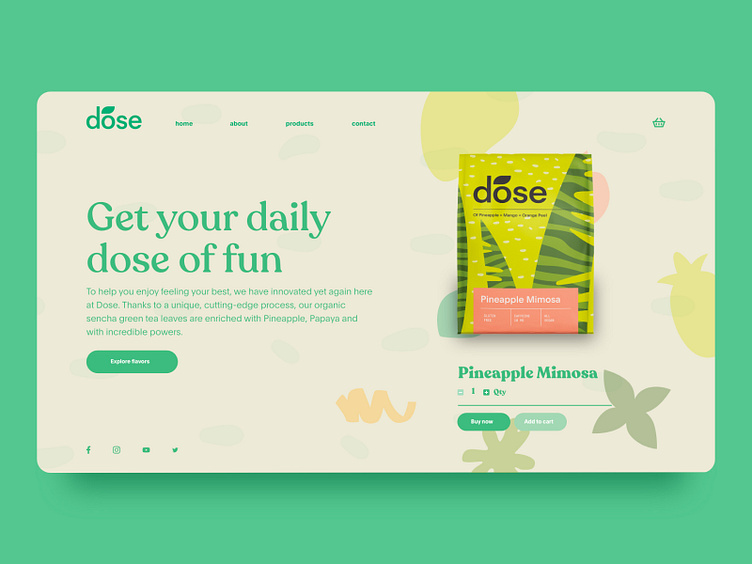
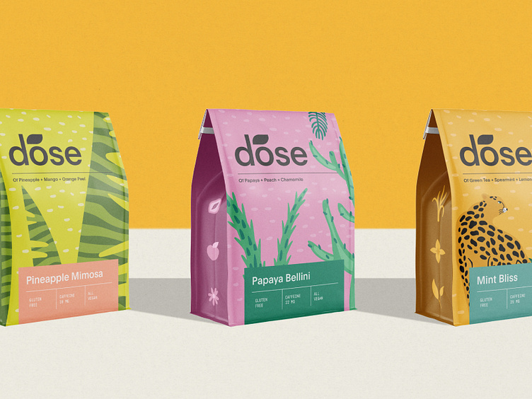
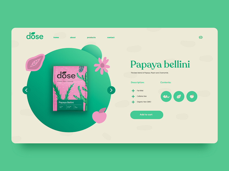
We decided to keep it simple and "delicious" at the same time. The DOSE itself is not a plain packaged coffee. That’s why we selected a minimal website design for them. The background is a plain color, but we highlight the products and main points with the brand’s special design elements.
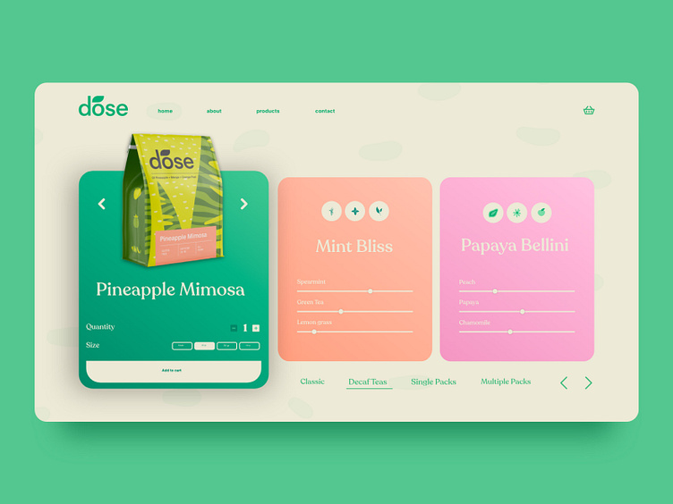
The visual hierarchy is just a pleasure for the eyes and lets website visitors see important information first and then the secondary points. The layout is simple and minimal, and the shade of green on this website is so sophisticated. 🟢
The website of the brand and any other business is an essential part of the business, so it must look professionally made and adjusted.🤓