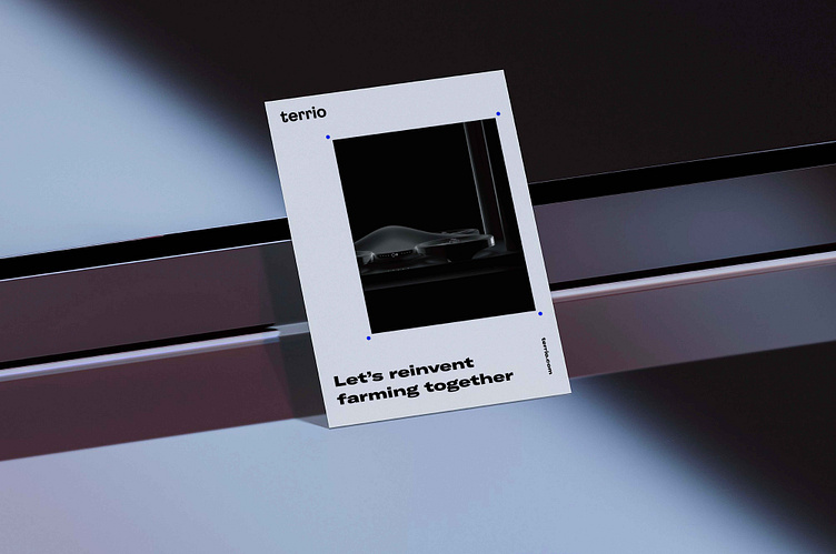
Terrio

Enabling growth of agro-tech
New ag-tech start-up solutions for local farmers
One of the biggest challenges facing the world in the 21st century is unprecedented population growth. It requires a more sustainable approach to agriculture in order to provide people with healthy food. The new startup is a team of IT-specialists and agronomists. They are on a mission to provide farmers with digital solutions in order to make their work easier, more efficient, and less expensive.
Challenge
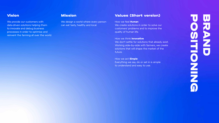
Our goal was to create an image of a cross industrial company. The brand had to be interesting for the farmers as well as for the investors and IT-specialists. In other words, the new brand had to create an image of a "green", but at the same time technological company.
Solution
In order to create a brand which refers to traditional farming but offers innovative technologies for covering farmers’ needs, we reimagined a common image of «green» farming and created a high-tech version of a future sustainable agro-tech company.
Brand Idea
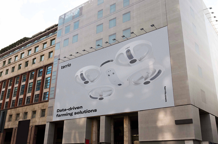
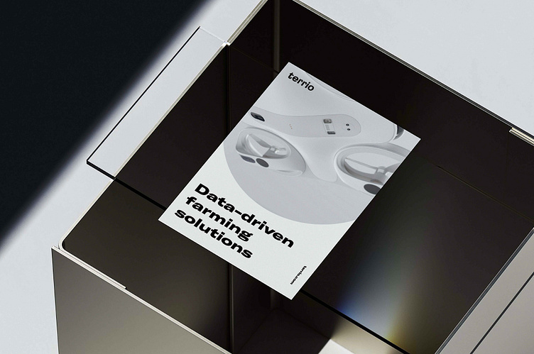
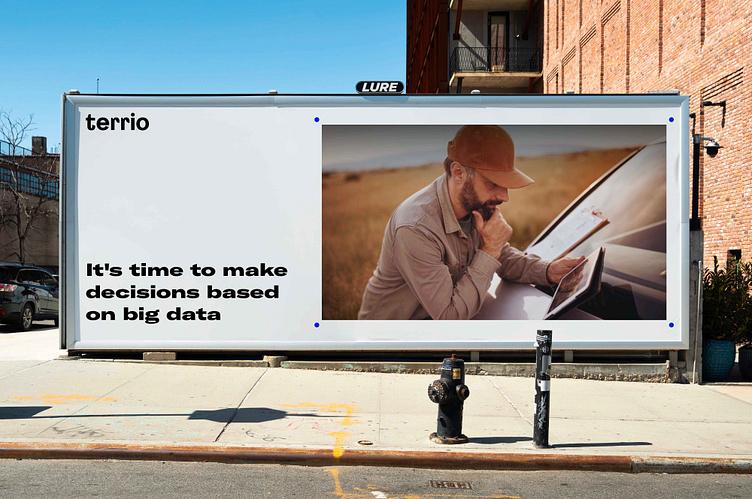
Terrio enables growth by bringing global solutions to local farming communities, getting the most out of fields on the way to high yields, high-quality crops and high profits.
Slogan – Enabling growth
Naming & Architecture
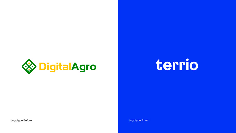
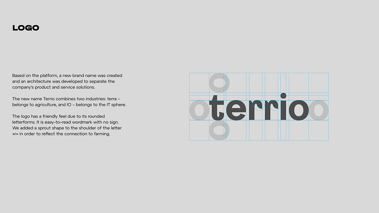
Based on the platform, a new brand name was created and an architecture was developed to separate the company's product and service solutions. The new name Terrio combines two industries: terra – belongs to agri-culture, and IO – belongs to the IT sphere.
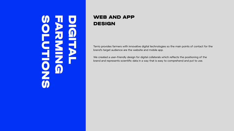
Design
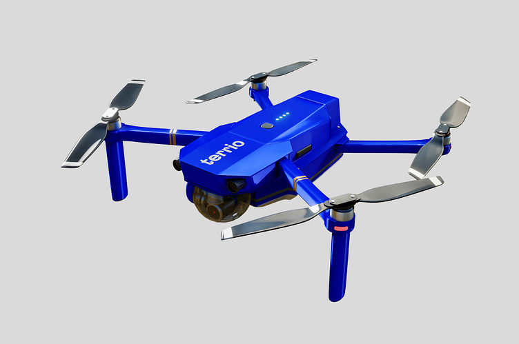
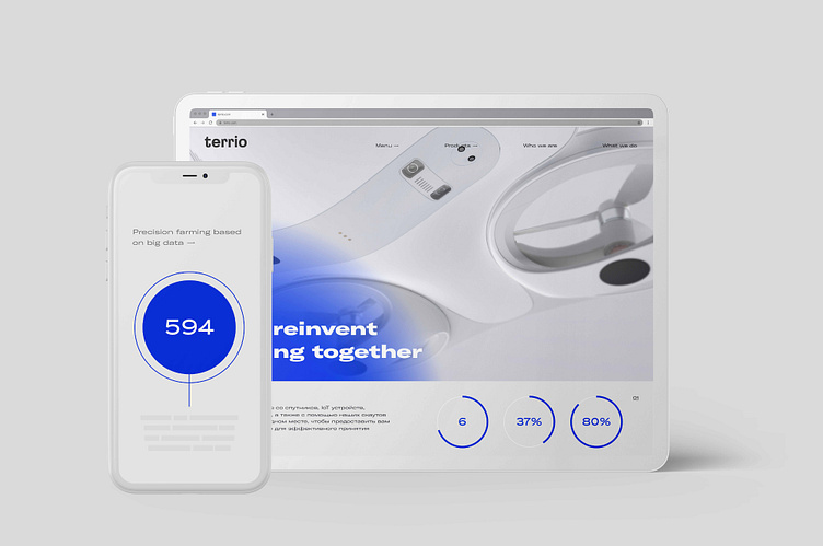
The design is based on the idea of electric field. Terrio connects all your data in one place, identifying anomalies and trends with AI in order to enable farmers with effective decision-making.
Moreover, this design shows the idea of transformation and growth. The main purpose of the company is to empower farmers to grow wholesome and delicious products wherever their farm is located. We decide that such growth and progression can be depicted as a image of heat maps and sunlight.
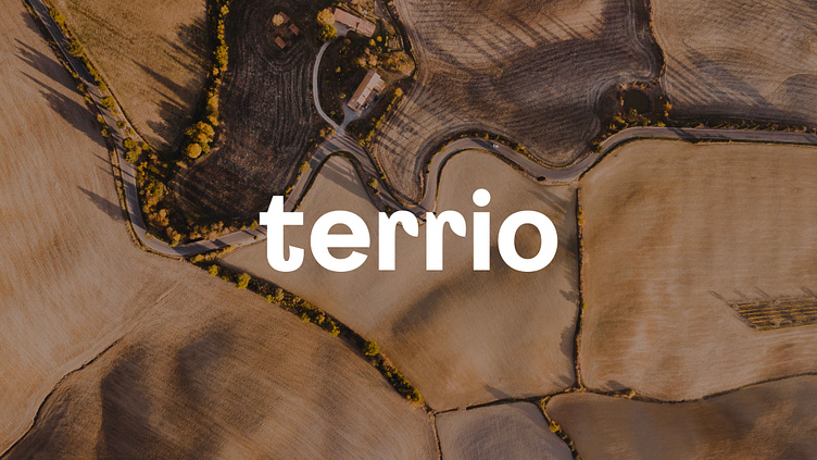
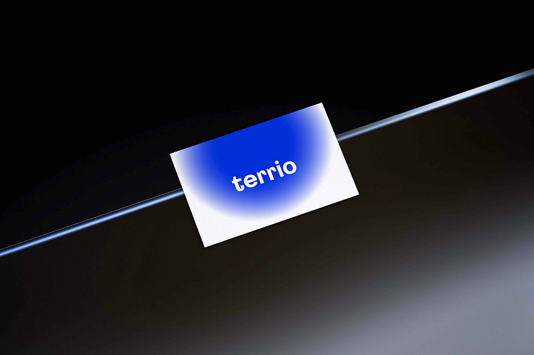
Logo
The logo has a friendly feel due to its rounded letterforms. It is an easy-to-read wordmark with no sign. We added a sprout shape to the shoulder of the letter «r» in order to reflect the connection to farming.
Colors & Fonts
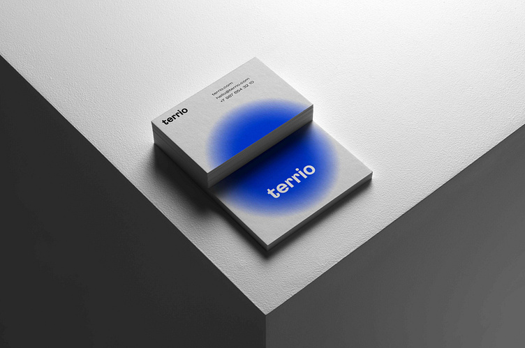
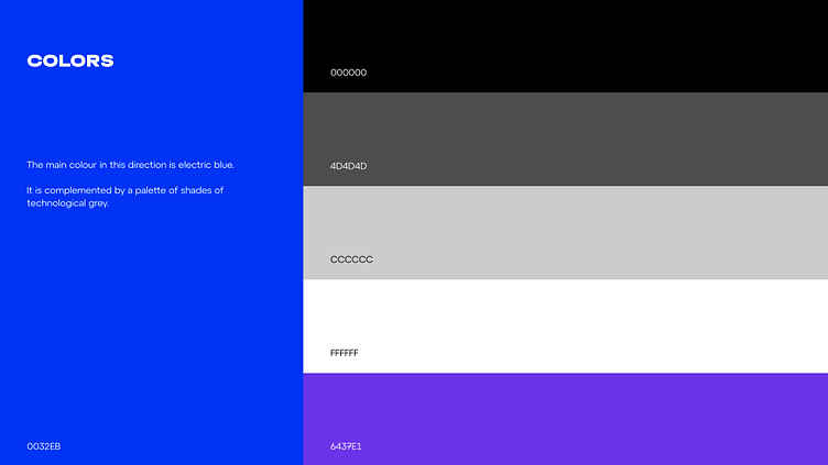
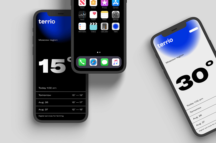
The main colour is electric blue. It is complemented by a palette of shades of technological grey.
GT America is the main brand font. Elegant style with a calligraphic touch give the font a modern look, which is perfect for both digital and offline use. The Montserrat font family has been used as a complementary font. It is a modern, stable and readable font.
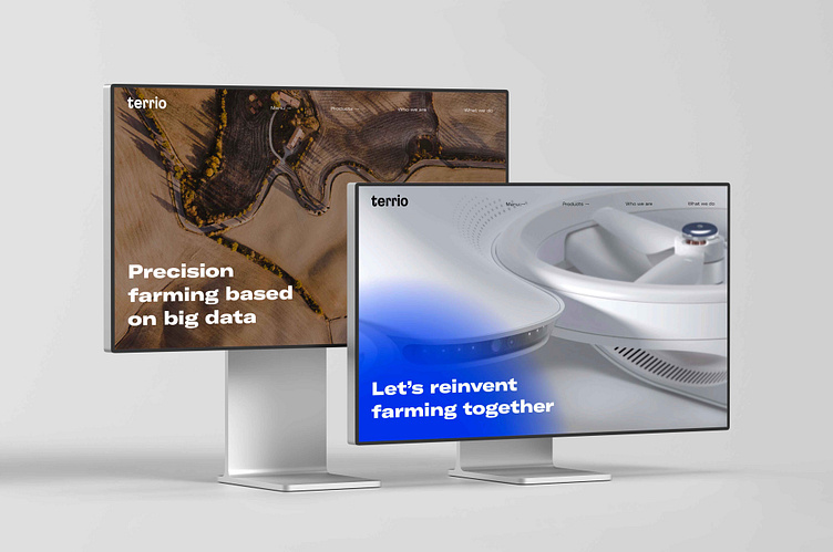
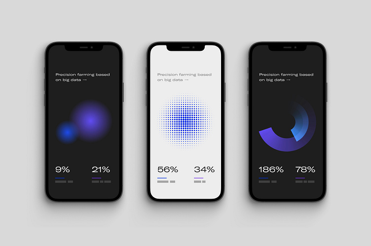
Design elements
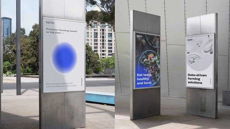
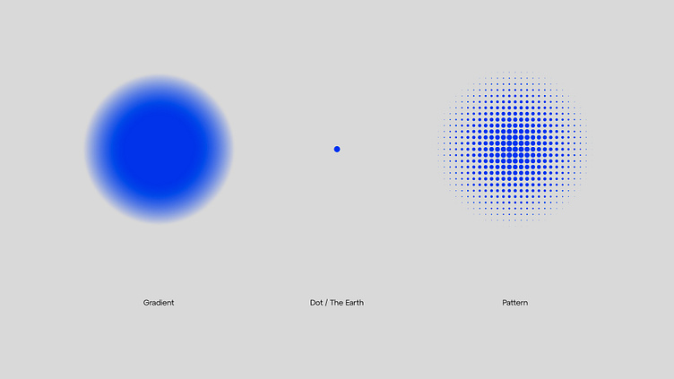
In order to create a sense of technology, we took an abstract round shape as the basis for the design element and combined it with gradient. Due to its colour and blurred edges completed shape is associated with both natural and artificial sources of energy. These element can be used as an accent spot, highlighting different information and also as a part of infographics.
Grid system
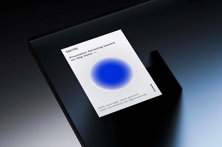
Shapes can be overlaid on the images, giving it a tech feeling, or exist as separate design elements demonstrating energy growth and complemented by a dynamic text layouts.
Result
As a result, a clear brand positioning and a unique visual language were created. The new brand image made it easier for the company to communicate with a wider audience, demonstrating its expertise in both agriculture and technology.