Koncepted Landing Page


Here at Koncepted, we kicked off 2022 by going all-in on Web3.
We’re here for it. We’re busy building. And we wanted to show it. Ordinary was the enemy. We wanted designs that scream “THE FUTURE” - but in a useful, meaningful way. In the end, we perfected a futuristic, high-tech style that easily communicates our values to our dream audience. Let me take you through it
Homepage
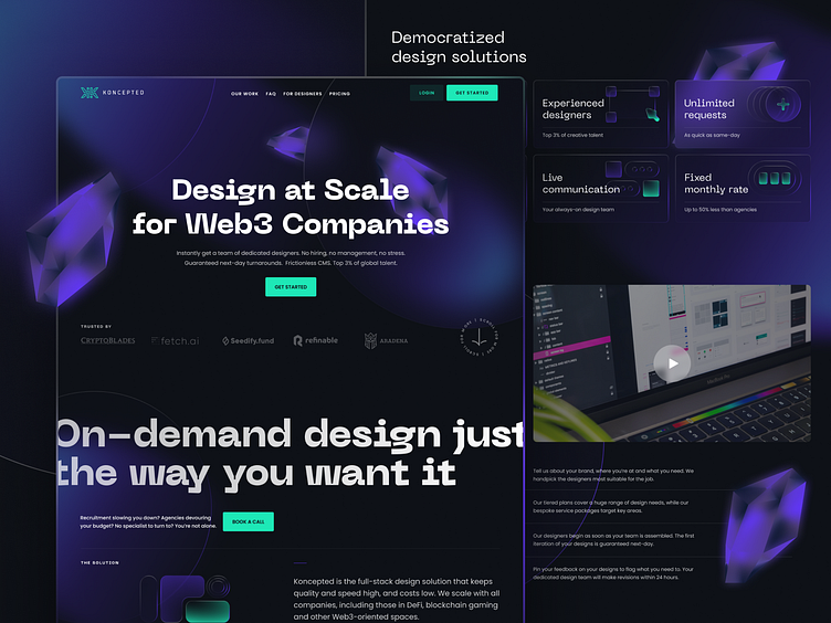
The goal:
To introduce Koncepted
Highlight our work and skills;
Summarize our workflow;
The solution: we constantly asked ourselves “what does the user need to know here? We used a succinct H1/H2, social proof, and the perfect combination of visual and written content to tell people how we roll. Meanwhile, our carefully-placed CTA buttons take users straight to where they want to go next.

Pricing page
Everyone checks the pricing page before getting serious. When we redesigned ours, we wanted to present all the important info in an elegant and intuitive way.
The goal: to reaffirm our value proposition; help people compare plans seamlessly; increase conversion
The solution: we distributed all facts and figures evenly. Price, Monthly Design Capacity, and Talent Included can be compared across 3 different plans in less than 1 second.
We included a handy toggle to show the difference between monthly and annual billing, plus a comprehensive FAQ for all your burning questions.

For Designers page
We’re not just on the lookout for awesome partners. We’re also on the lookout for awesome designers.
The goal: to introduce our team culture; tell designers the requirements and benefits of working with us
The solution: this page targets a specific audience. (designers, obviously!) We carried over a lot of design principles from other pages, like explaining what Koncepted is and what our processes are, using a good balance of visuals and copy. And we included quotes from our amazing team, plus a bunch of perks to encourage the right people to apply.

Graphics
We wanted to cut through the noise and iterate on actual design trends. The ones worth following, that is - and just as important, the ones worth improving on.
The goal: to shape our visual identity; research new graphics and typographies; reinterpret them
The solution: we brought something fresh to emerging design trends, namely glassmorphism. By adding our trademark purple and green hues to frosted-glass effects, 3D crystals (animated and static), and floating UI objects, we spearheaded our own take on this popular visual style.
All about that Web3
This is how we applied a single design philosophy to an entire workload. I hope you enjoyed reading up on how we did it.
Stay tuned for more case studies like this!


