VISUAL DESIGN AND THE ARCHITECTURAL PROCESS

Communicating the complex design process at Heliotrope Architects to clients, by establishing a consistent graphic standard that showcased the Principals’ thought process in a way that can be clearly understood by non-architects.
Role: Visual Designer | Tools: Adobe Photoshop, Illustrator, InDesign, Autocad | Platform: Digital and Print Media
🔨 THE TASK:
For multiple projects with Heliotrope Architects, I was tasked with taking the architects' notes about what they have analyzed about the sites for future private residences, as well as the site surveys showing the site's natural topography, and creating Site Analysis drawings to present to the respective clients for each project.
The key was to highlight the important site features and internal as well as external site influences noted by the architects in a way that the clients, who are non-architects and have little to no experience reading architectural drawings, can understand, while establishing a consistent visual brand.
A key rule I set for myself when creating these drawings was to put the client, or the “user,” first. How can they understand the complex architectural concepts explored for creating their dream homes in the simplest, most clear way possible?
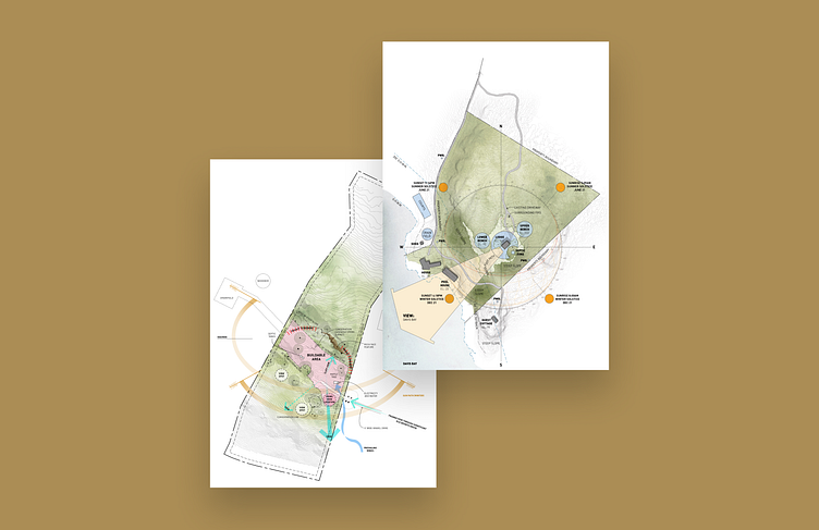
PROJECT 1: LEA LOPEZ RESIDENCE
Site Analysis reference drawings and sketches from the architects.
BEFORE:
Site Analysis drawing.
AFTER:
In order to make the layers of information about the site and the natural/manmade features present, I created a set of visual rules for myself to follow. These rules helped avoid confusion on the part of the clients trying to read a drawing that explains the multitude of phenomena happening on a very large plot of land at a very large scale:
Light green is used to denote what is actually within the property boundary as well as the natural green space
Darker green is used to showcase the various steep slopes present on site
Light blue is used to indicate any kind of present or future human intervention to the natural landscape (except the road)
Dark gray is used to show the existing buildings on site, with shadows used to add a bit of visual weight, signifying their importance for future architectural decisions
Light gray is used to show the existing roads
Light orange is used to showcase the prime view towards the water from the site
Dark orange is used to show the sun at various points in the solstices, bringing to "light" the quality of light on the site throughout the year
To portray the water, I overlaid multiple layers of a watercolor ocean waves texture, at various opacities, to bring out the strong presence of the water on site in a 2D format
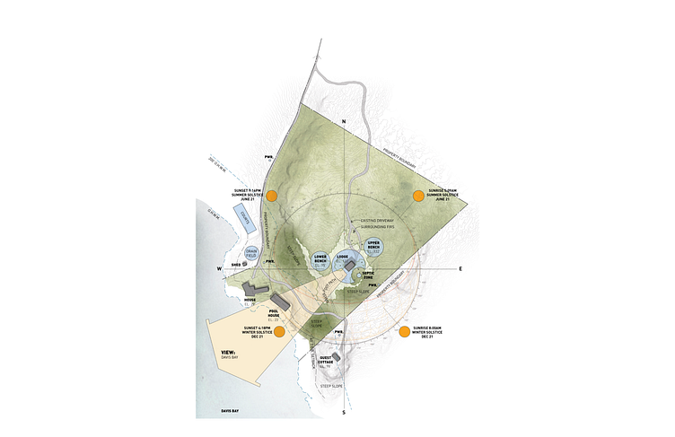
PROJECT 2: CLIFF HOUSE
Site Analysis reference drawings and sketches from the architects.
BEFORE:
Site Analysis drawing.
AFTER:
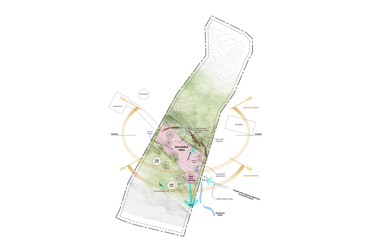
Rules set by me when creating this drawing to ease clients' understanding and keep a consistent visual language:
The orange paths note the location of the sun relative to the site during the Solstices
Light green is used to highlight the most important area within the property boundary as well as the natural green space
Darker green is used to showcase the various steep slopes present on site
Pink is used to show the "buildable area" as set by the local County
Darker pink is used to show the location of the prime view towards the water, within this "buildable area"
Red dashed lines show where on the site there is a need for privacy screening of some sort from the nearby neighboring properties
Dark blue is used to show the influence of the prevailing winds and the direction from which they arrive to the site
Aqua blue is used to show the direction of the various view points relative to the "buildable area," with the size of the arrows determining the desirability of the view according to the client
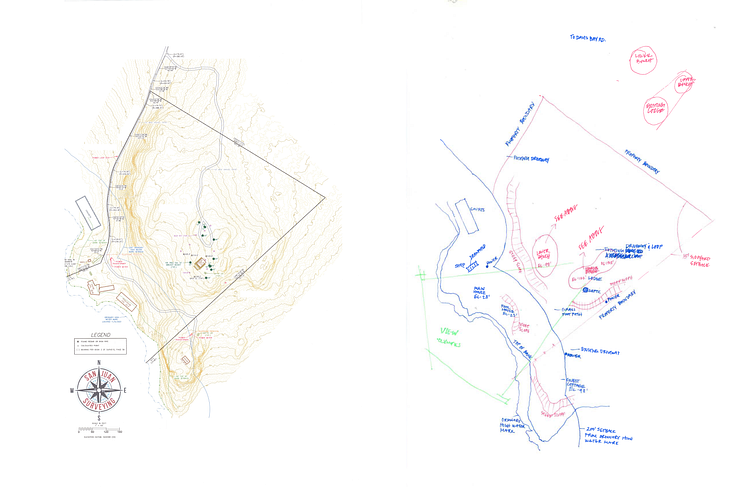
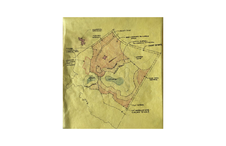
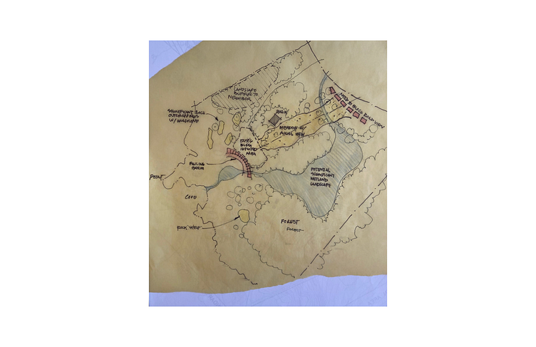
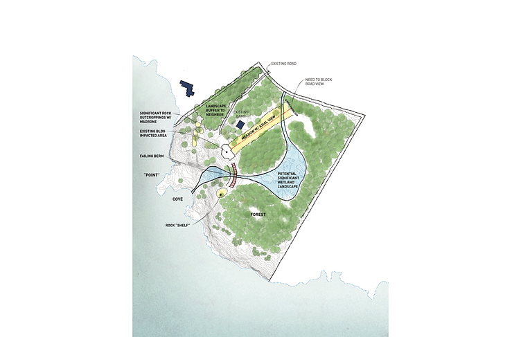
PROJECT 3: WEST SIDE ROAD RESIDENCE
Site Analysis: Site Features sketch and notes from the architects.
BEFORE:
Site Analysis: Site Features drawing.
AFTER:
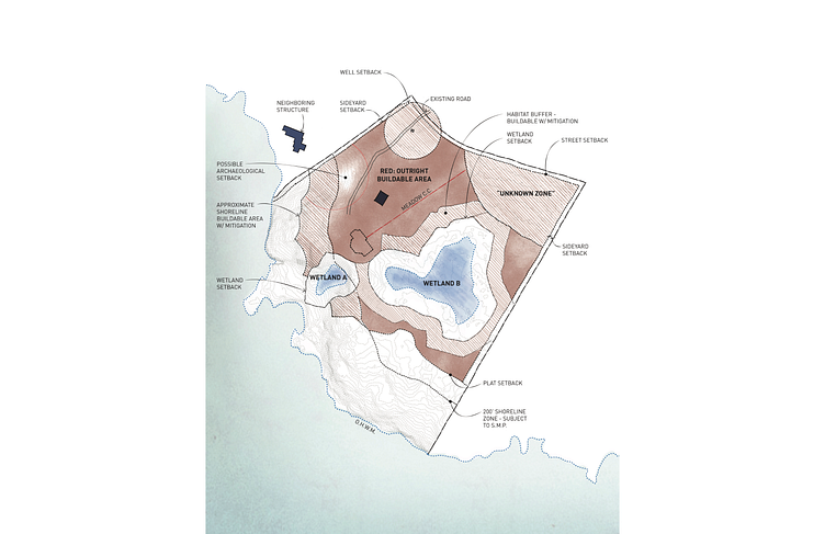
The same as all forms of visual communication conveying a specific set of ideas and observations, it was imperative I created visual rules for myself to follow, making sure there would be no confusion for the clients when being presented the drawing:
Clay red is used to show the "outright buildable area" as allotted by the San Juan County of Washington
Dashed hatches in clay red show the buffer zones and setbacks as determined by the County, where construction is either prohibited or would need serious mitigation
Blue is used to show the wetlands within the site
Navy blue is used to show the existing manmade structures within and around the site that would influence the placement of the future private residence to be designed by Heliotrope
Red dashed lines are used to draw attention to unique site elements, such as key views and possible setbacks
A blue dashed line shows the "ordinary high water mark" as marked by the County
To portray the water, I once again overlaid multiple layers of a watercolor ocean waves texture, at various opacities, to bring out the strong presence of the water on site in a 2D format
Site Analysis: External Site Influences sketch and notes from the architects.
BEFORE:
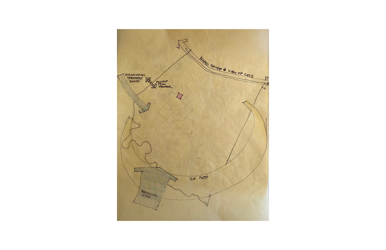
Site Analysis: External Site Influences drawing.
AFTER:
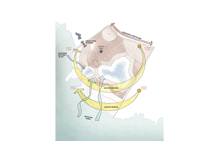
Additional visual rules:
Bright red is used to show external site features that create the need for some sort of acoustical/visual barrier
Light blue is used to show the direction of the prevailing winds that blow towards the site from the water
Orange is used to note the location of the sun relative to the site at sunrise/sunset during the Solstices
Gold is used to highlight the particular path of the sun during the Solstices
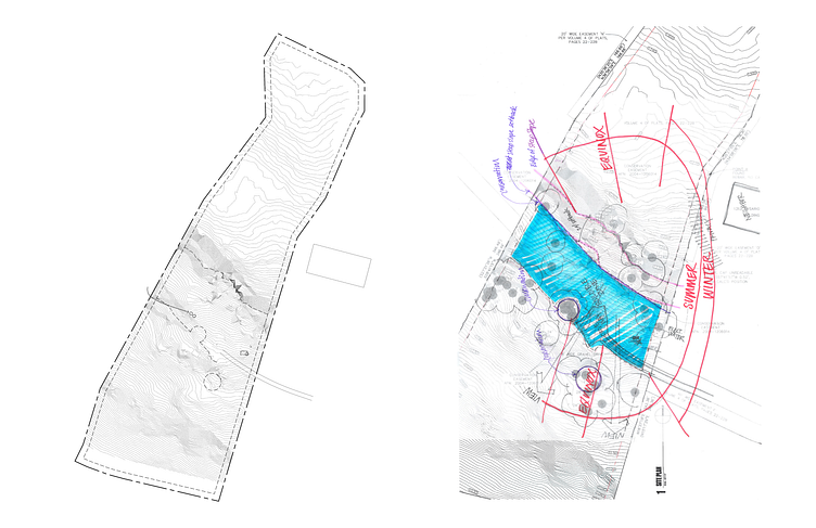
Site Analysis: Internal Site Influences sketch and notes from the architects.
BEFORE:
Site Analysis: Internal Site Influences drawing.
AFTER:
Additional visual rules:
A green stamp texture is used to depict the strong visual presence of the density of the trees present on site in a 2D way
Yellow is used to draw attention to the rock outcroppings on site, as well as the key view up the slope of the site, the only prime view away from the water
Light blue is used to show the landscape architects' future plans for connecting the two present wetlands together to create one significant wetland
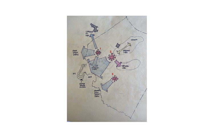
Site Analysis: Possible Home Sites sketch and notes from the architects.
This drawing was particularly graphically demanding compared to the other three Site Analysis drawings. Not only did I need to present these three possible site locations as determined by the architects, I also needed to visually present the depth of information given to me in the form of an email chain. This consisted of describing the pros and cons were of each site, all within one drawing, without losing its legibility.
BEFORE:
Site Analysis: Possible Home Sites drawing.
AFTER:
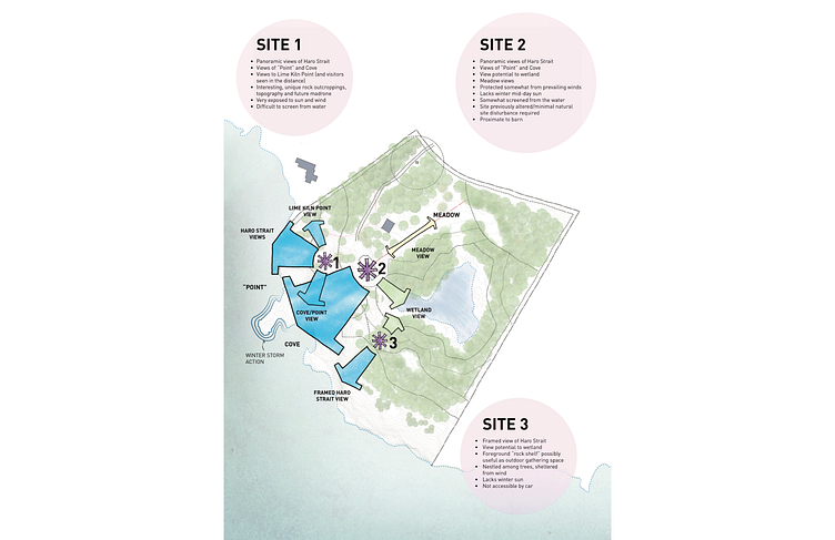
Final set of visual rules:
Dark purple is used to show the locations of the three possible sites for the future private residence, as determined by the architects through the Site Analysis process
I came up with these light purple bubbles spread throughout the drawing, in the vicinity of their pertaining sites, to note the pros and cons of the respective sites in a fun, informative way that doesn't feel overwhelming
Light blue arrows are used to the show the key views toward the water from each of these sites
Green arrows show the view toward the primary wetland area present on the site from some of these sites, where applicable
Project Credits:
Heliotrope Architects


