New Minecraft Dungeons UI: Play the Super Mario edition!

Overview
I've just finished the ELVTR course on UI/UX for gaming and we redesigned the Minecraft Dungeons UI. The course is an exciting and challenging experience. Not only did it help me learn more about the gaming industry and what users want from their games but also allowed my creative ideas come alive.
After learning about player journeys and establishing the players goals, I was able to apply these lessons immediately by designing a new user interface into a high fidelity mockup. On top of that, I decided to transform the Minecraft screens into a Nintendo/Super Mario screens to familiarize myself in adapting styles!
Role
Solo UI/UX Designer
Timeline
8 weeks


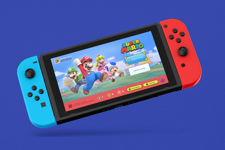
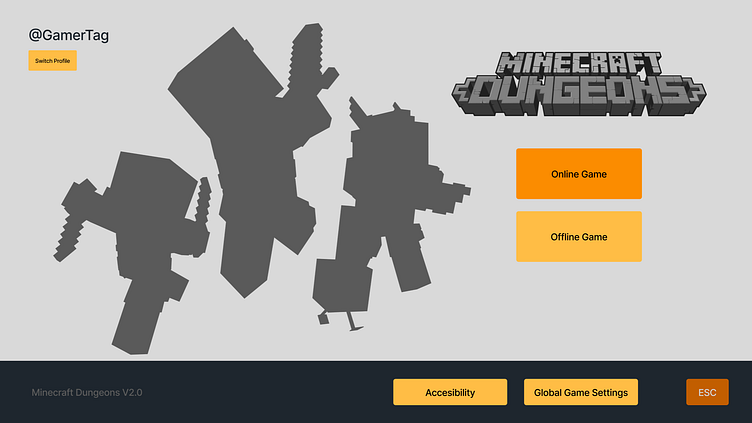
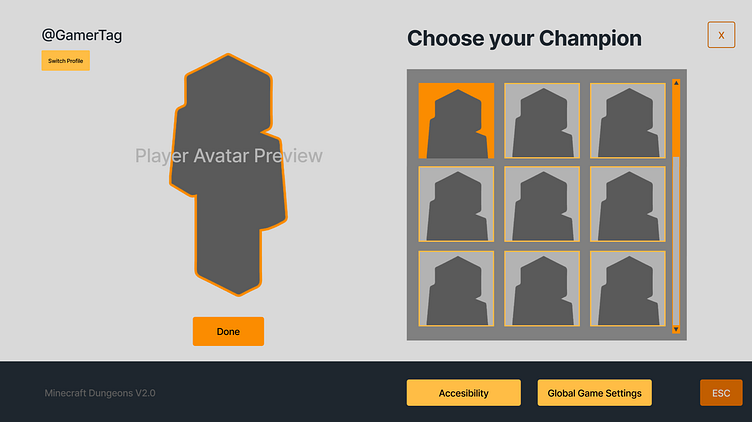
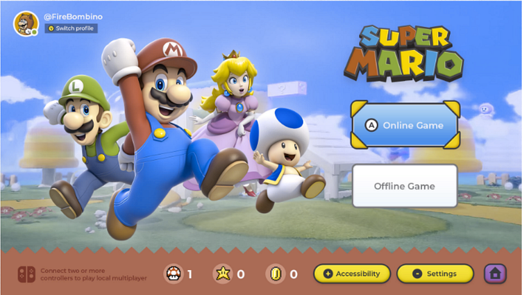
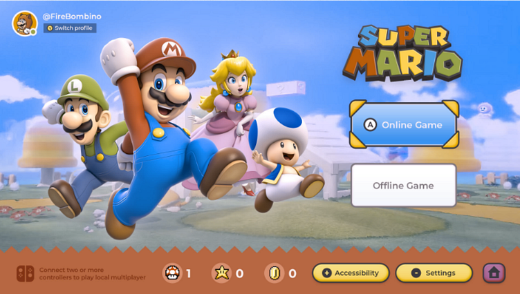
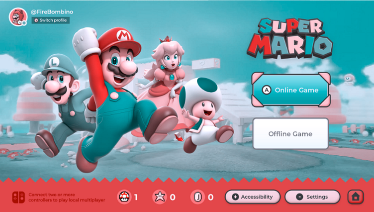
High Fidelity UI
I designed a high fidelity UI mockup in the style of Super Mario for Nintendo Switch. The second screen is the original Minecraft Dungeons UI on Xbox.
One of the most important decisions I made was designing a bottom navigation system that allows players to edit global game options.
UI/UX Research on existing game
I started by watching a YouTube video of Minecraft Dungeons gameplay to get a better understanding of what it's like. The content creator's commentary was helpful for understanding the player's feelings and motivations as they played the game.
Looking at several gameplay screens, it's important to ask these three questions:
• What decisions does the player make in the game?
• What options does the player have for each decision?
• Why does the player make each decision?
The link to the full research is on figma here.
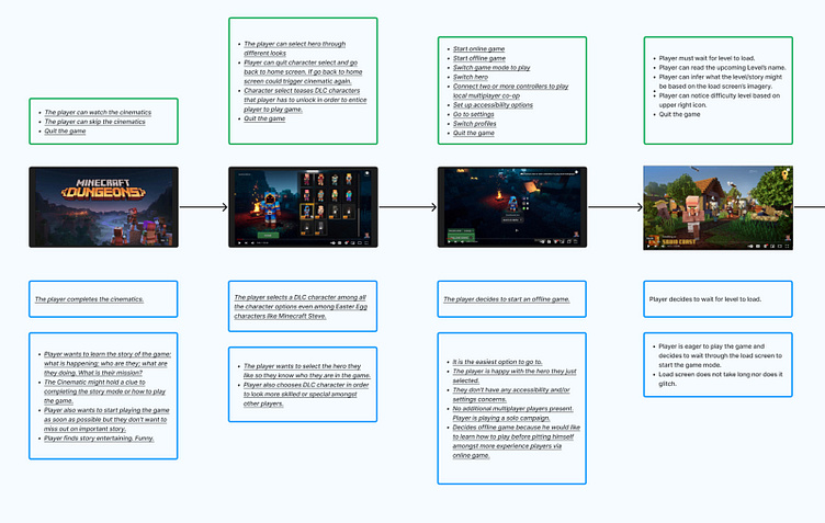
Player journey
To understand a player's motivation throughout the game, it is necessary to create an engaging and compelling journey.
I reviewed each game screen to better understand the following from our players:
• What does the player see, hear, think, feel and say?
• Are there any opportunities to improve and help players achieve what they want to do in the game?
The link to the full research is on figma here.
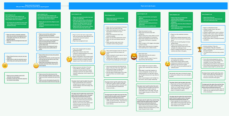
Paper Prototype
The paper prototype I created is an outline of the player's choices. It helps create a roadmap for how they can move through this game.
The link to the full research is on figma here.
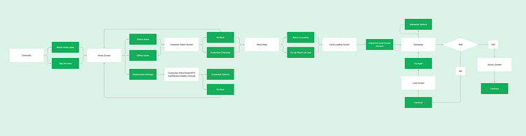
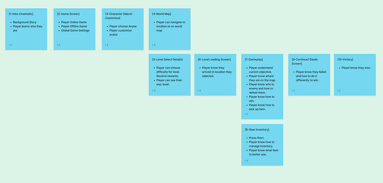
Flow Chart
One of the most important parts about making a game is choosing which gameplay screens you want. With this flow chart, we can make sure that our players will have an enjoyable experience no matter what.
The link to the full research is on figma here.
Wireframes
I chose a couple screens from my flow chart to build into wireframes. Interactive elements are in orange and grey items are static.
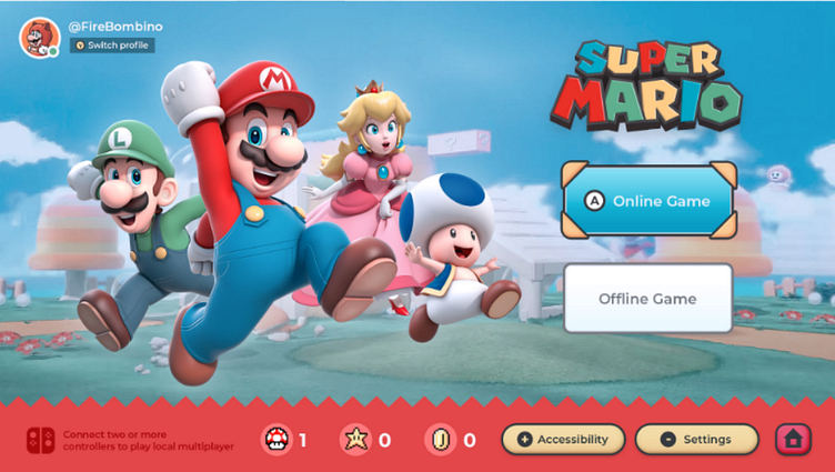
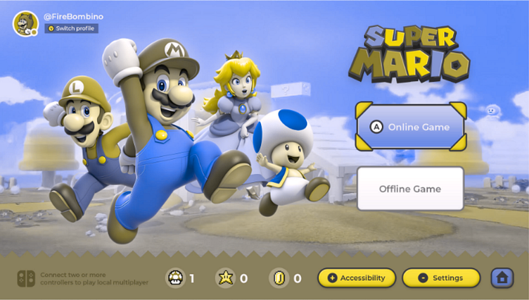
Color blindness testing
To ensure the best experience for colorblind players, it is important to test UI design and make sure there are no layouts that will cause confusion or frustration.
Good user interfaces are essential for creating a smooth gaming experience.
Results
My goal was to make the interface more user-friendly and intuitive. I think I’ve accomplished that with this new redesign. Take a look and see for yourself.
Challenges
• Learning Figma while creating the assets for this project.
• Juggling my full-time job as a Motion Designer while also taking this course.
Learnings
• UI/UX designers help players know the best option for them so that they can choose the best option to reach the game's goal or victory.
• Perception, attention, and memory is different for all gamer's and it's important to conduct UI usability tests to hear/incorporate player feedback.
• Establishing an "Ideal Player Profile" will help us create a better game.
Wins
• I created my first UI/UX project for a video game.
• I learned how to use Figma.
Let's Connect!
I'm excited to hear about your next project and see how my skills can help you. You can send me a message here on dribbble or connect with me on LinkedIn.


