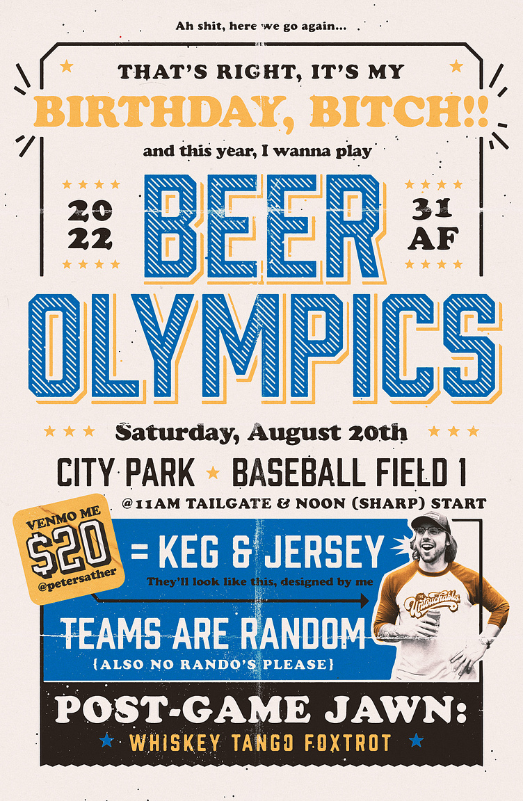
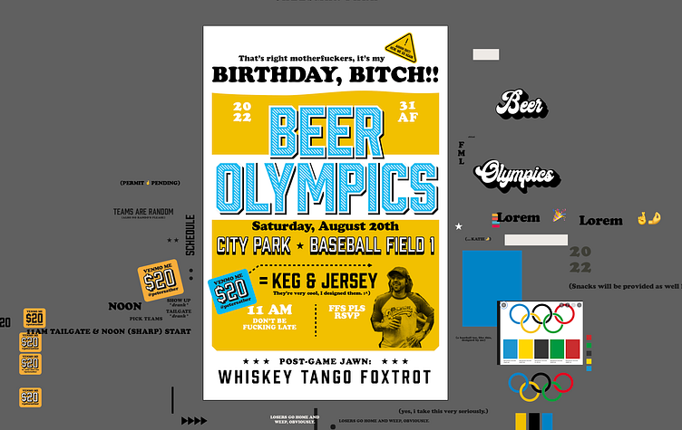
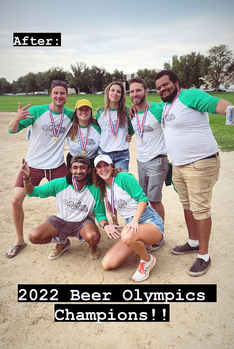
Beer Olympics 2022

The past few years, I've been leveraging my birthday celebration to rope my various friend circles together for silly "Shenanigans" (to cross-polinate so we an all spend more time together, of course). In the past we've rented a mansion in the woods and last year we tailgated a day at a water park. Every time I've pulled this off, there's been a big plan and a very "official," designed invite. So, knowing that I could gather a pretty sizable group together with the use of a little graphic design, my best friend Piper and I began plotting this year's event. We quickly landed on the most nostalgic activity: Beer Olympics.
Although I finished this design pretty quickly, I did experiment with an alternate that saw the entire poster become a big mug of beer. I ended up deciding the original was good enough.
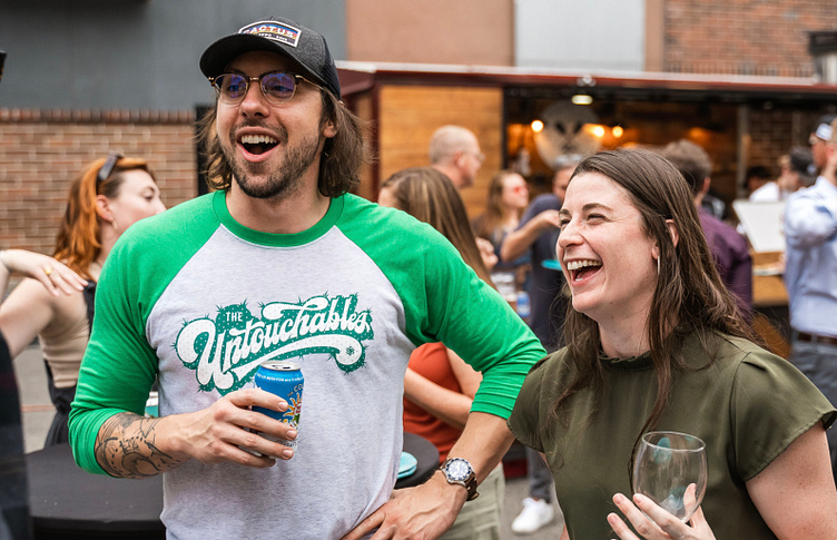
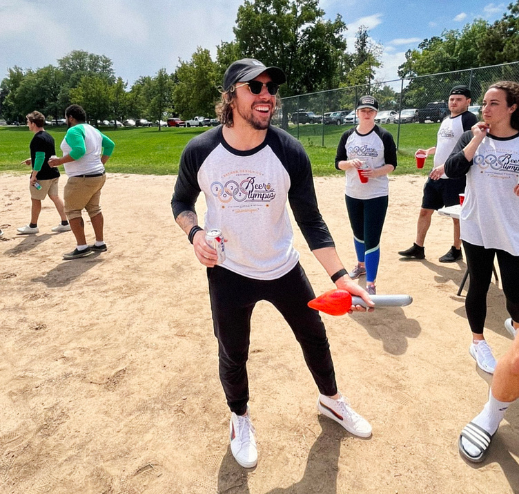
A large part of the inspiration behind this project was the awesome little success that my "Untouchables" Kickball shirt turned out to be. The quality of the direct to garment print and the shirt itself were so good I immediately wanted to make more. Beer Olympics would be the perfect excuse to take that concept even further: make shirts with different colored sleeves and graphics!
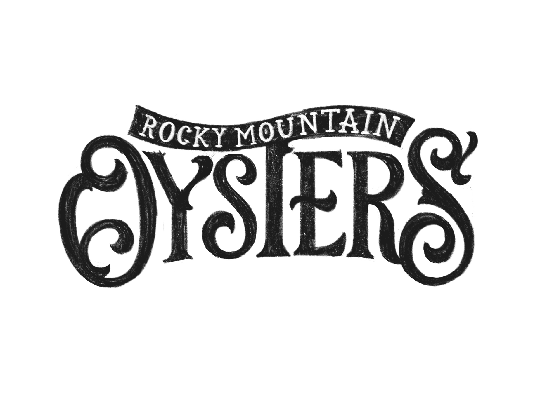
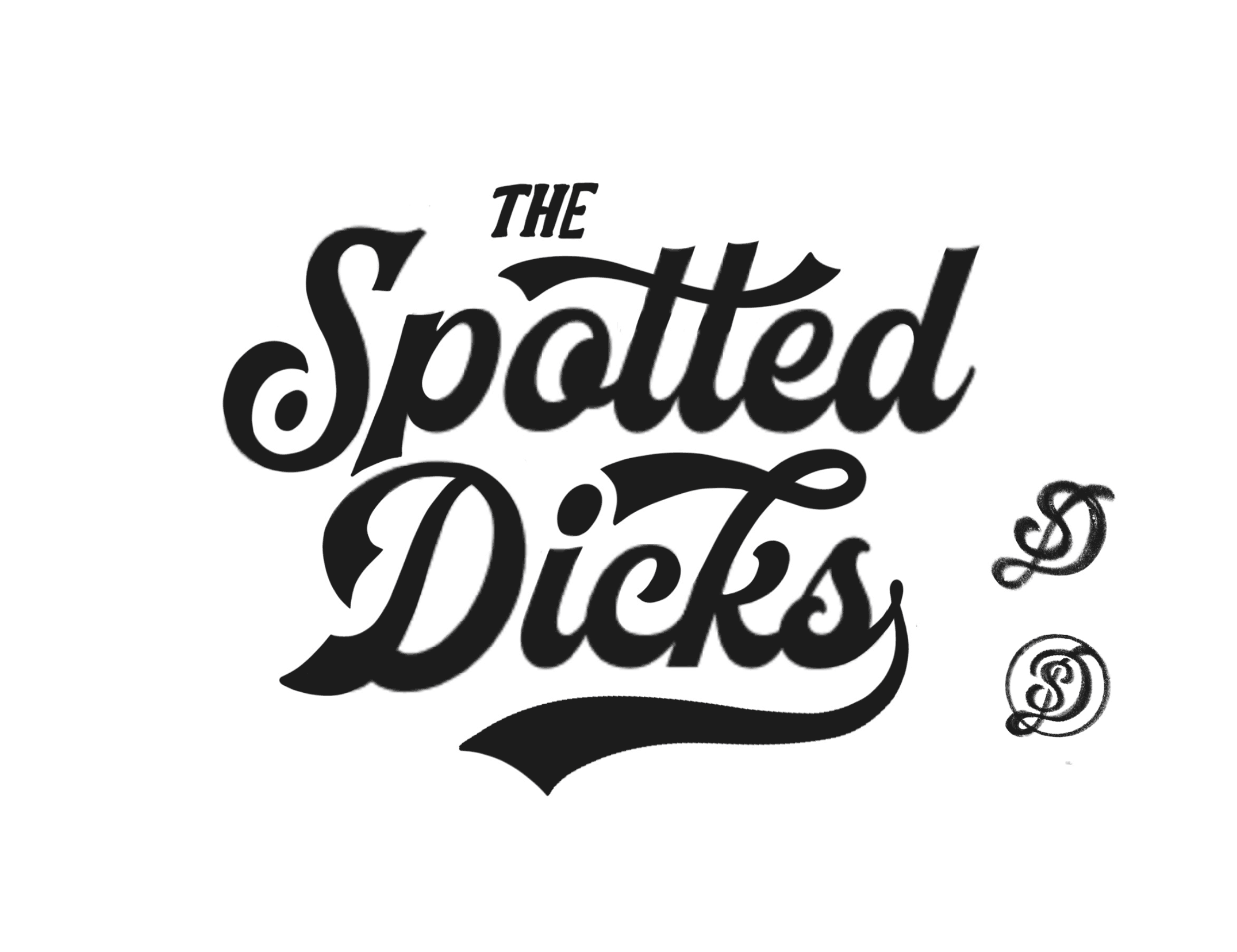
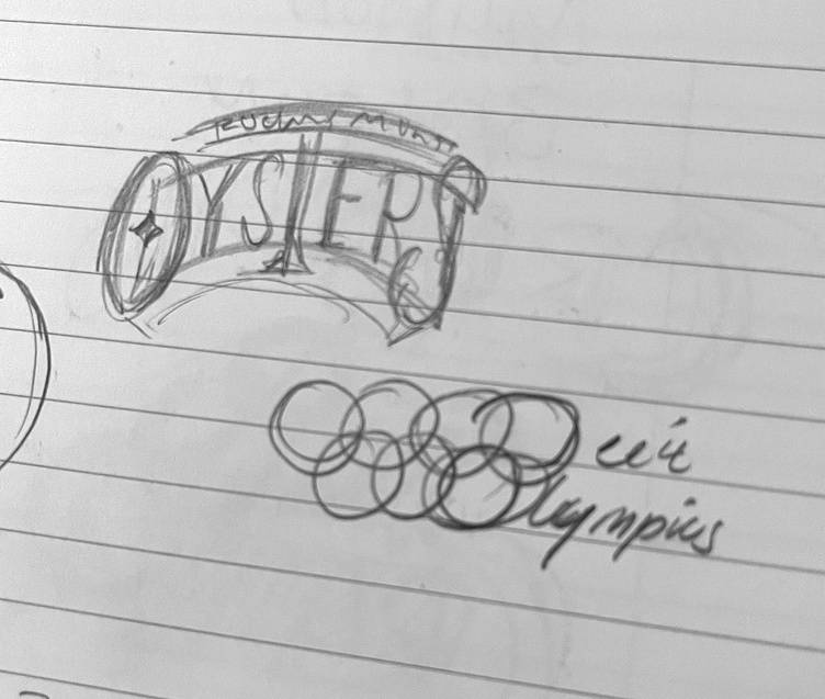
Because I didn't want to be too ~cool~ I decided to name the teams something subtly silly; the Rocky Mountain Oysters, and the Spotted Dicks. While "The Spotted Dicks" is considerably less subtle than the Rocky Mountain Oysters (and the fact that we live in Denver, CO) both were food... and both were genitals :^) And that was all we needed for the green light.
Oysters Sketch & Final
Popular!
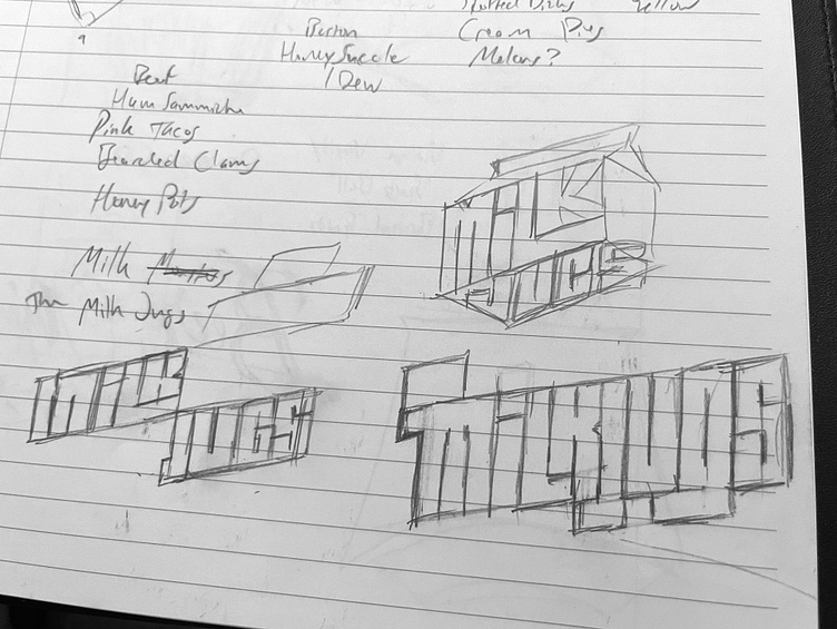
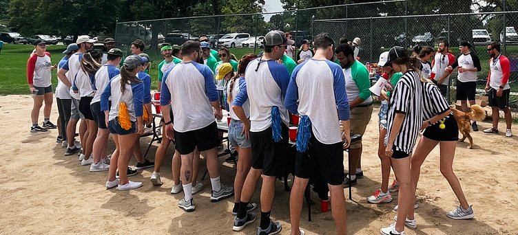
Overwhelming interest, response, and fiscal commitment meant we needed two more teams (about 12-13 people per team, factoring in flakes and no-shows). So we were back to the drawing board to scheme up two new names with two new designs.
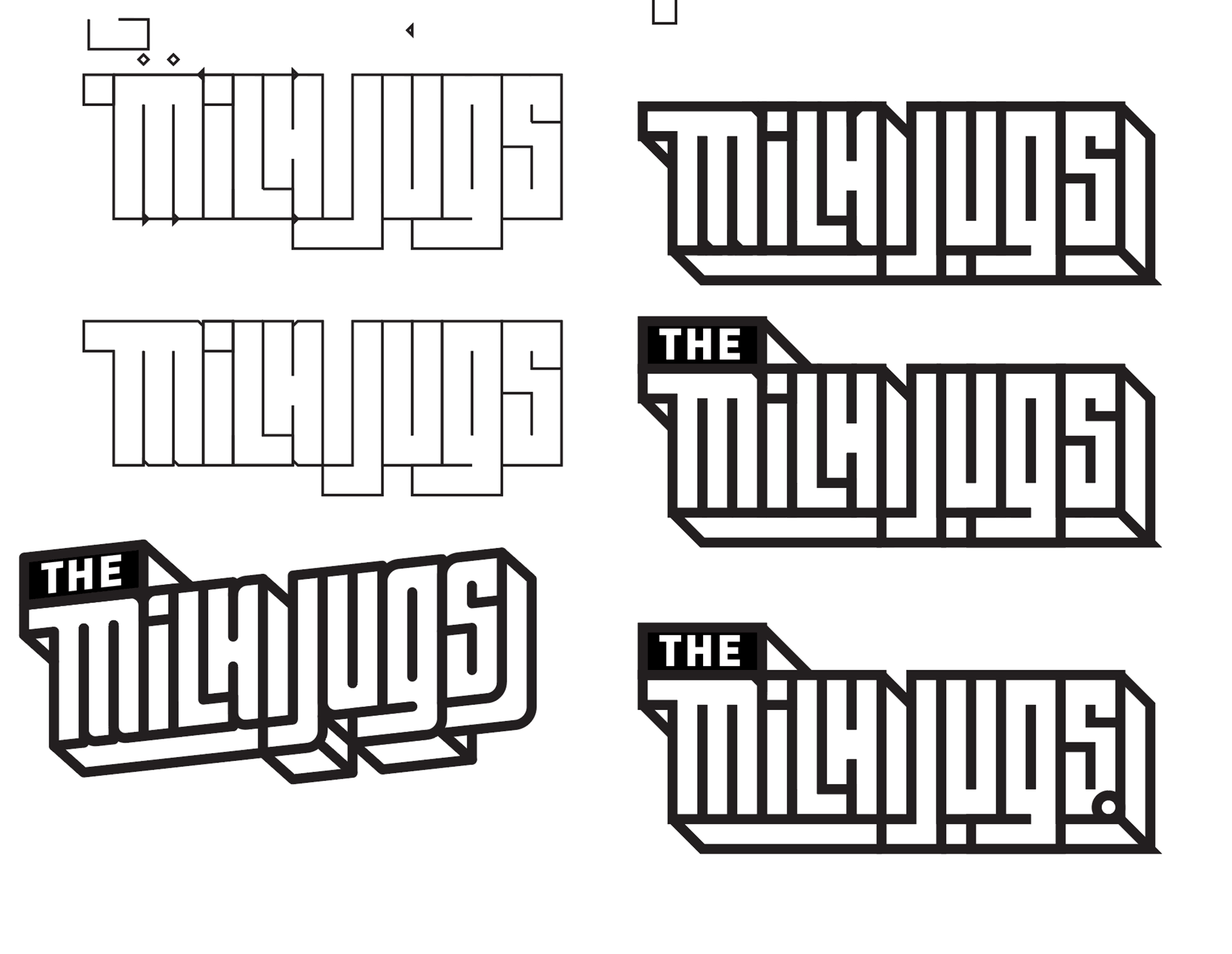
I landed on the third team right away: Team Milk Jugs. Not only was it a food, and a different.. "organ" than the previous two, the name gave the opportunity for a new "carton-y" type style.
The final team name was a real head-scratcher. Not only were we running out of food body parts, we were running out of time! With about 50 people committed to come play, the project manager in the back of my head started to preemptively warn "anticipate production delays" louder and louder each day.
I finally settled on "The Boston Cream Pies" - dare I say the perfect consummation of my team name requirements - as the 4th and final team name??

I DO NOT.
"Boston Cream Pies" was a bridge too far. When I consulted with Piper, we both agreed that balloon letters oozing... cream... was going to be the outlier shirt that ~13 people would feel "stuck" with. While I still wanted to keep the first three names for the teams (the fourth team name being workshopped in the background), I decided to focus on homogenizing the design across teams and create something my friends would love to wear anywhere (rather than just dive bars). So for the second time, I was back to the drawing board.
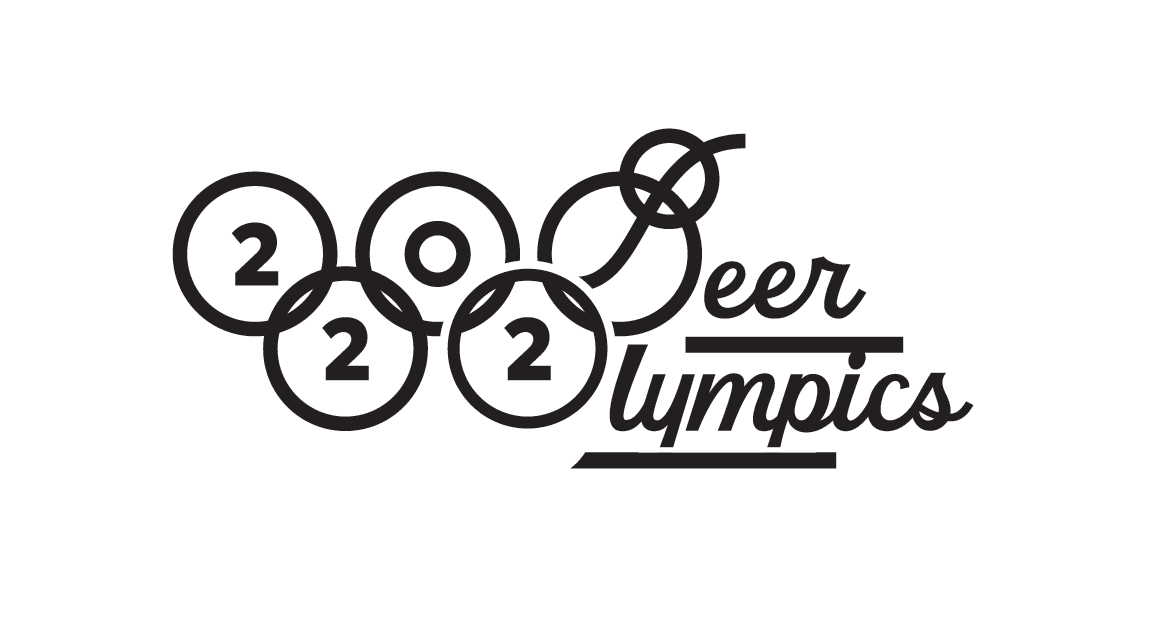
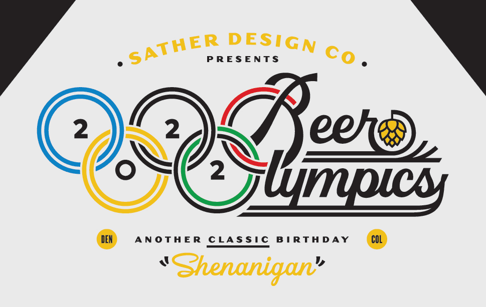
I don't care whether you're a calligrapher or a font designer, if you're involved in typography in any capacity, you're ALSO a sucker for a good ligature. When I discovered the opportunity to twist the Olympics rings and "Beer Olympics" together, I simply would not accept any other design solution. The following sketches and gif's document my war path.
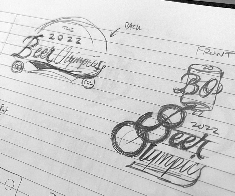
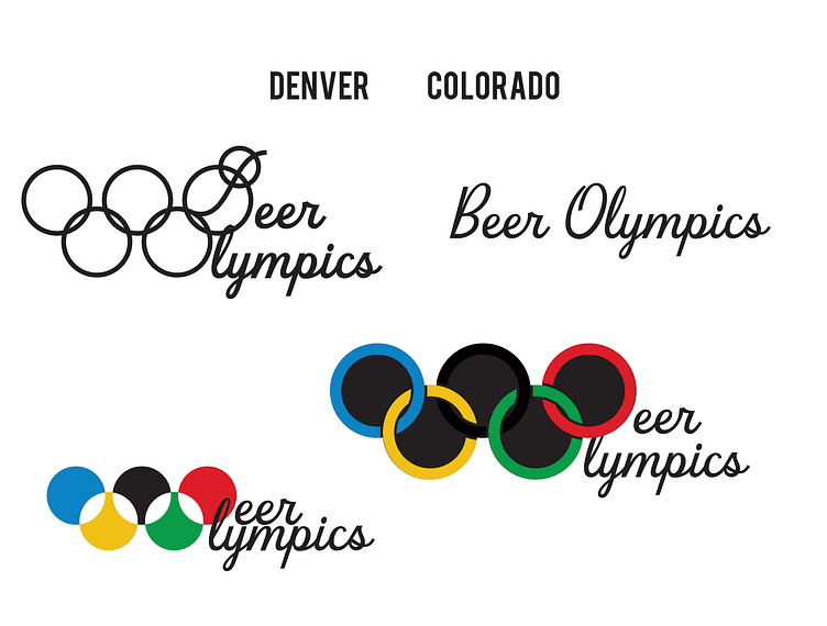
Once again given time constraints, I leaned on one of my all-time favorite fonts from one of my all-time favorite shops: Beverly Drive Right by Hoodzpah Design. While I received push-back on the legibility of Olympic's 'O' - I decided, "What the hell, it's my birthday and it can be illegible if I want it to be :^)"
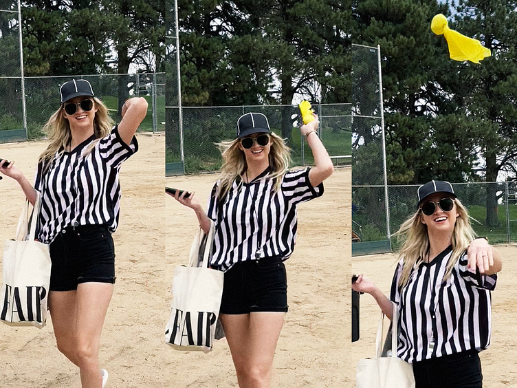
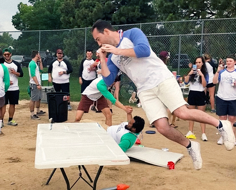
And with that, all we had left was the event itself...
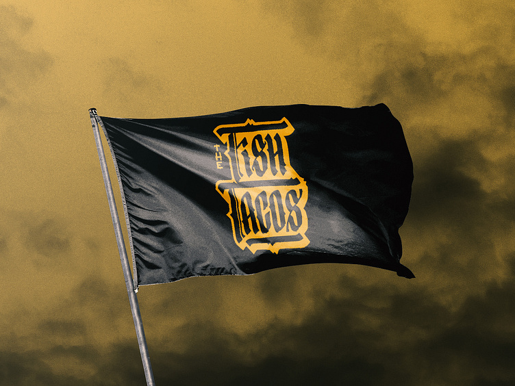
You might be wondering "wait, the very first image I saw was clearly for team Fish Tacos? Where did that come from?"
Great question.
The day before the event, knowing I was only going to include the team name designs in the group text to each team, I schemed it up and made it the day before. I couldn't believe I didn't think of it sooner, but that's just the way it is sometimes. What I particularly liked about this final design is that, because the raglans didn't offer a version with yellow sleeves, it's literally the dark horse of the bunch (and it was my team >:).
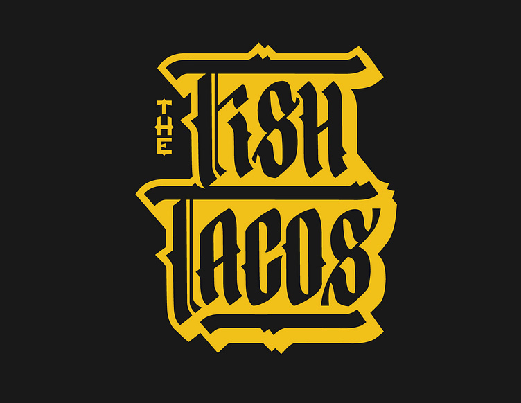
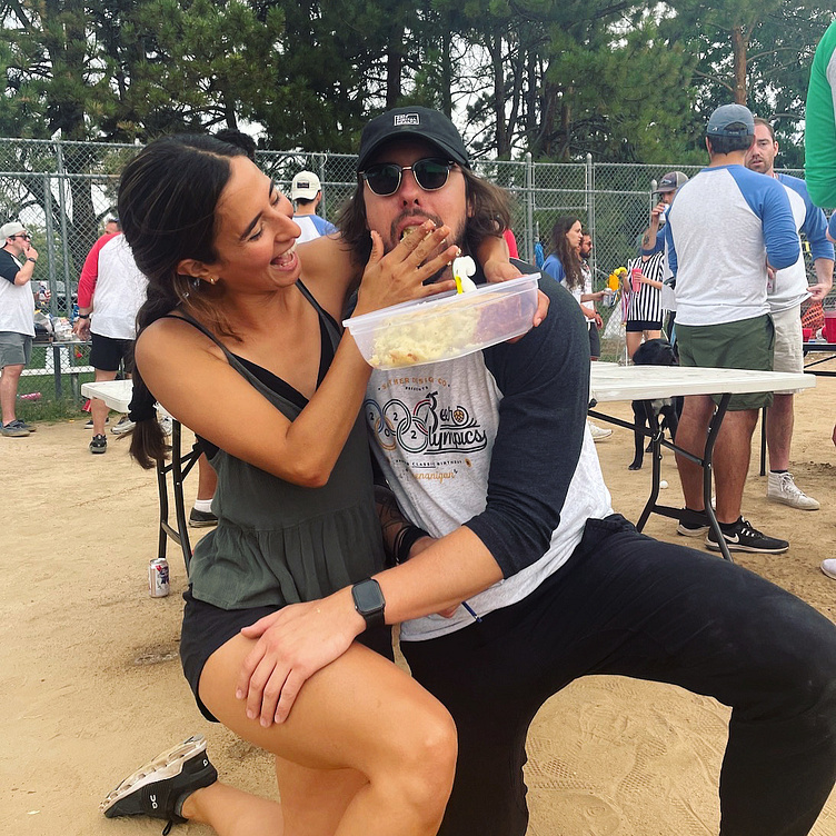
(Team medals were even metal beer bottle openers!)
At least I got cake!