Metta

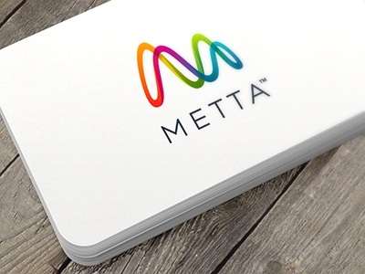
I just finished this visual identity for Metta. Metta makes smartware for self improvement.
The mark forms an M as in Metta and as such it can be seen as an initial mark. But the mark can also be seen as a loop of harmonious sinus curves. The curves symbolise a synchronisation or balancing of patterns. Life patterns, the body’s biological cycles.


