Termgrid - Logo


TermGrid Visual Identity
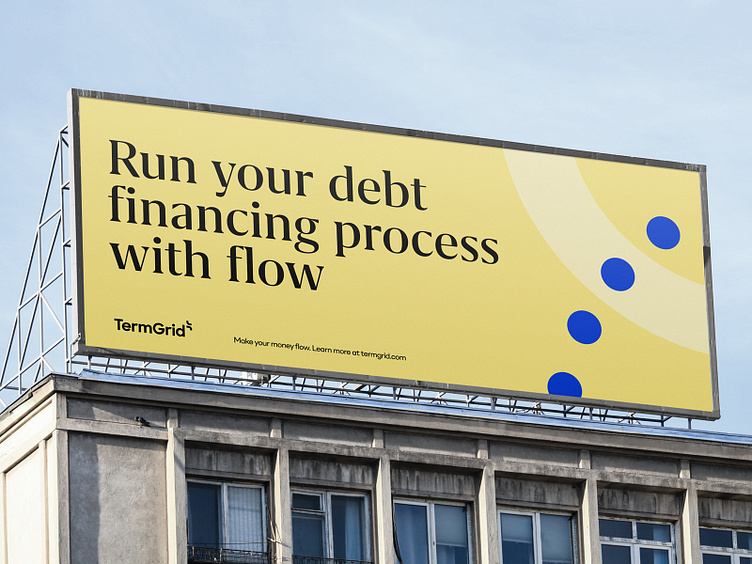
TermGrid is a SaaS platform that helps borrowers, lenders, and advisors manage the debt financing process end-to-end.
They are creating a whole new category of debt management and trying to automate existing traditional categories and make their use a pleasant experience.
TermGrid wanted a consistent and memorable brand with a visual language that would resonate with their customers and serve their marketing team for years.

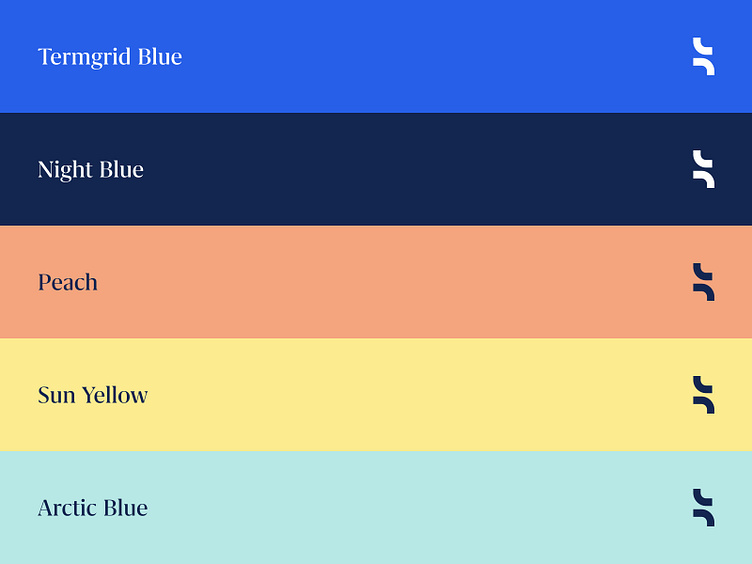
New Color System
The style is simple, well-structured, and easily digestible, conveying a sense of security. Trustworthiness is represented by a clean layout, serif font, and darker shades of blue for the premium nature of their product. Yellow, blue, and apricot, on the other hand, look innovative and modern, allowing the brand to scale and remain relevant for years to come. The contrasting balance of colors helped us convey TermGrid's brand values with its novel and secure platform.
Aligned towards the audience
After extensive research on the three different user groups, consisting of lenders, borrowers, and advisers, we revised TermGrid's visual identity and developed a website platform that exclusively addresses these groups and meets their needs.
Check the Live Website here
We are BB Agency
We're a digital agency crafting holistic, people-friendly experiences. We serve as a strategic partner for fast-growing tech companies in need of a scalable website with modular CMS, a design system, and future-proof brand identity. Through challenging core assumptions, we shape the products and services that improve the lives of thousands every single day.
Check us out at www.bb.agency


