Mezcaleria

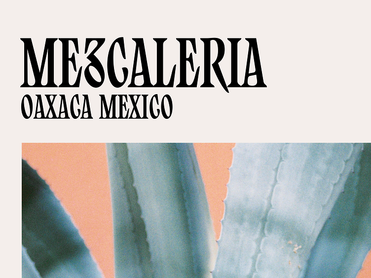
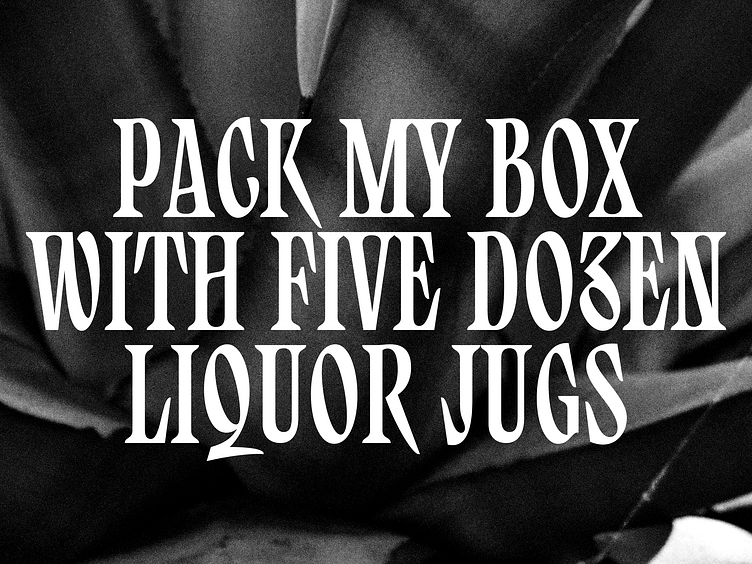
Finetuning the capitals of my Babble Font project
The idea is a condensed serif written with a pen that's giving out too much ink so the serifs bleed into each other, and an occasional expressive swoosh as a way to break the usual boundaries and constraints of the category. Soon diving into the lowercase letterforms.
What do you think? Any feedback is very welcome!
Photo by Maya Schwarzer on Unsplash


