Insurance Contracts Dashboard

Checkout the following Finlex current design
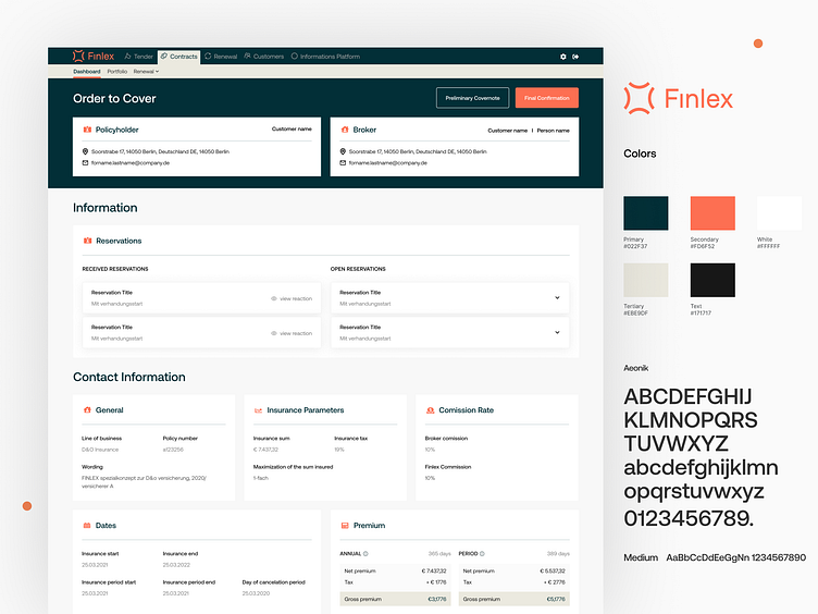
Design Problem
1. “Dashboard” text color contrast with background is 2.27 which is not good readable for color blind people and regular users.
2. Type hierarchy is not good, Hard to understand what a title is what is subtitle and what a paragraph is.
3. The whole frame looks on the same level, difficult to differentiate different sections.
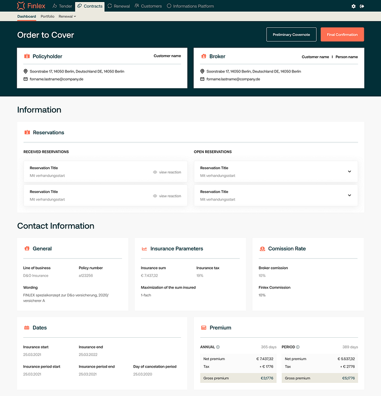
What we come up with a solution
1. In my design I improved the overall type hierarchy for better readability
2. Used color to clearly differentiate different sections
3. Introduced drop shadows to add dimension when sections are expanded
4. I make sure of color contrast in foreground and background which is great visibility and good for color blind people.
I am available for freelance projects/Remote job
Feel free to knock me 👋 islamshishir94@gmail.com


