Hemp Store Brand Identity

Objectives
It is a pleasure to share our playful brand identity for hemp store Indulge Well. Check out the project case study to see how we helped this holistic business to create a cohesive and impactful brand identity to stand out in their market. Sales Director Katinka Kleppe contacted Ulysses Design Co to craft a playful brand identity for this hemp store that reflected the cosmic nature of the products but was also professional and scalable.
Strategy
Katinka had experienced a number of setbacks with Indulge Well’s branding so far. She had tried creating the brand identity herself using Canva, logo generators and templates which produced generic and forgettable results. Katinka also had unsuccessful results from another brand design agency which did not understand her, her brand or her audience. It was our job to put Katinka at ease and devise a solution to resolve her branding problem.
We began our brand strategy workshop by helping craft a mission, vision and niche statement to lay a foundation to build the brand on. Together, we defined Indulge Well’s niche as “personalised bundles of locally sourced alternative indulgent products for Hemp and cannabis curious consumers in New Zealand and Australia.” This positioning statement was our north star throughout the brand journey.
Process
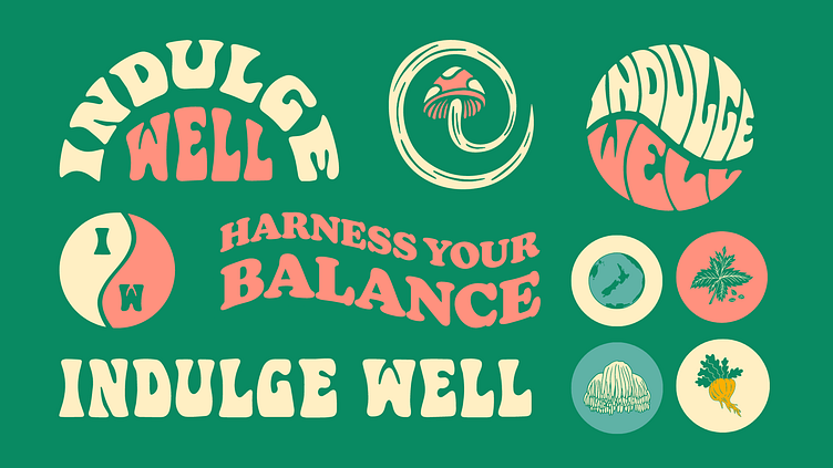
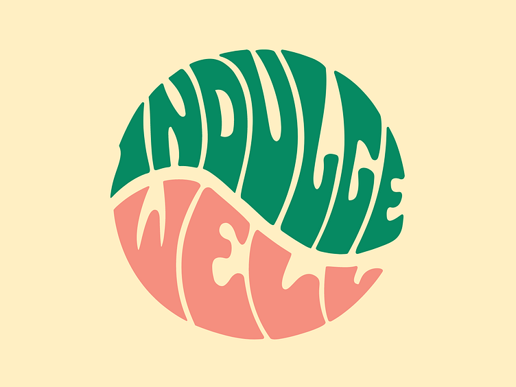
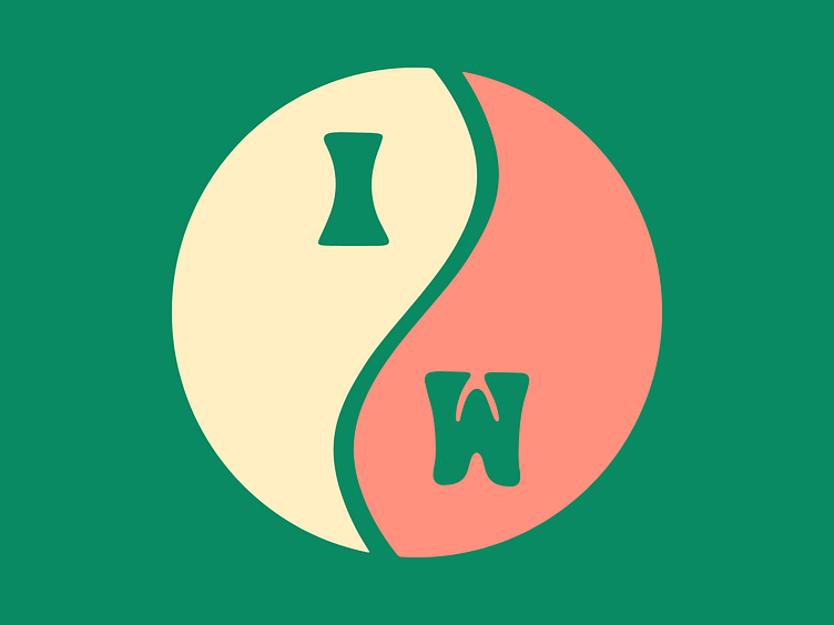
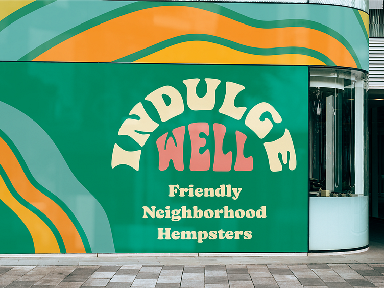
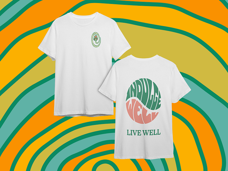
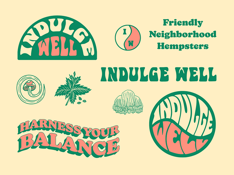
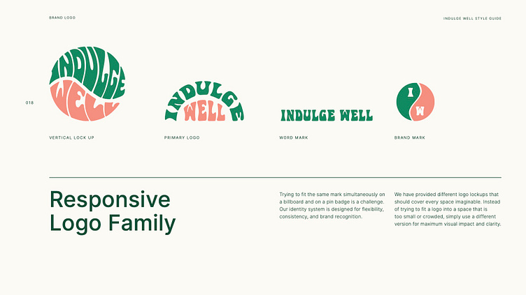
The yin yang symbol and the notion of balance was very important to Katinka and she wanted to incorporate it into the logo. We hand lettered the brand name into a sideways yin yang shape to represent this balance. The irregular and psychedelic nature of the custom type is indulgent and cosmic in itself, which is a perfect visualisation of the brand. We expanded this theme by emphasising the yin yang shape with the brand mark by using the initials as the inner circles of the symbol.
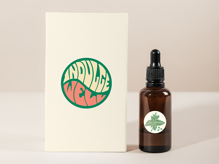
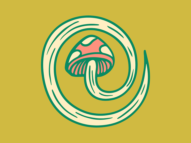
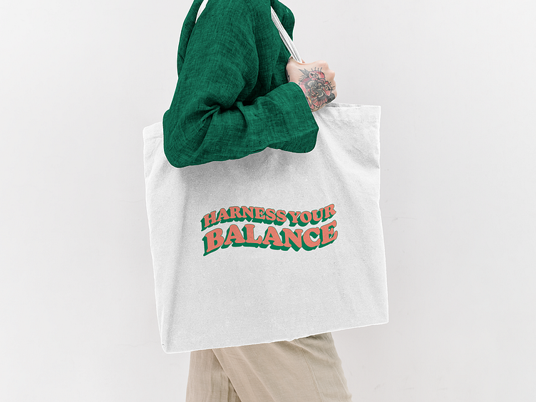
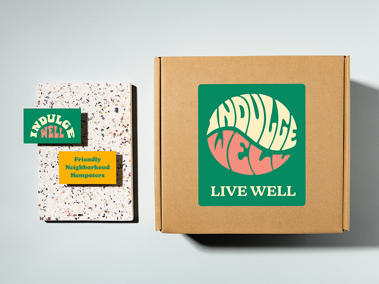
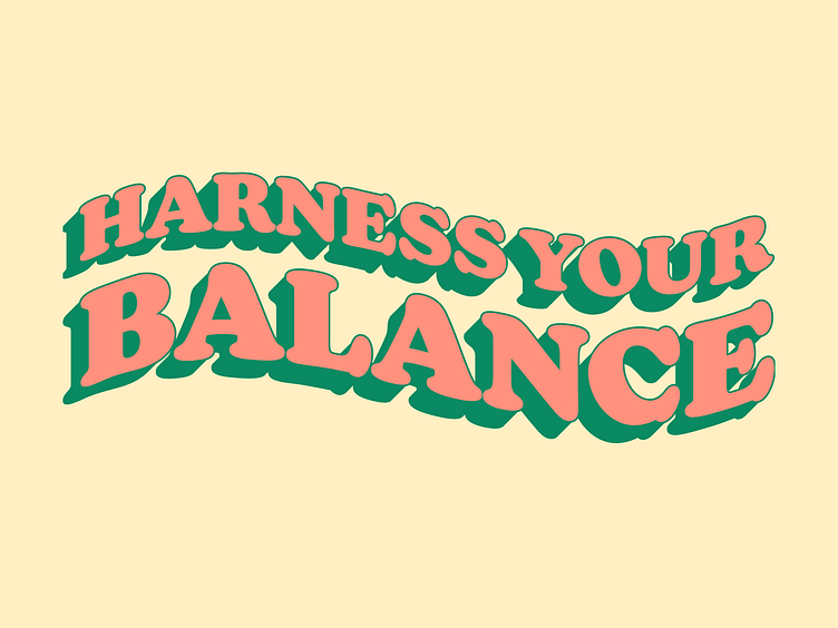
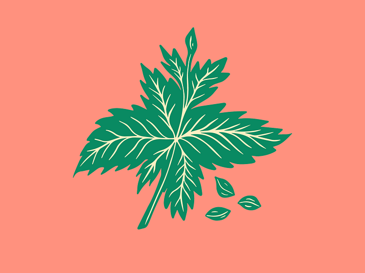
During our brand strategy session we helped Indulge Well define taglines to promote their values and deepen their connection with their audience. We complimented this playful brand identity for the hemp store with a graphics kit to add personality which included type lock ups of their brand taglines, illustrations of key ingredients from their products and editable patterns. The pattern design was inspired by the gills from one of the mushrooms they sell.
Design
The results of our work was a strategic brand identity that succeed where other attempts had failed. We brought everything together with a comprehensive style guide to help Katinka and her team implement their new brand identity. Their brand bible included our advice on logo placement, colour palette and typography as well as key extracts from their brand strategy road map. This essential document acted as a hand book that gave Katinka the tools to take her brand to the next level.
Testimonial
We choose to work with Ulysses after some mishaps with other design agencies and we are SO happy with the result and experience working with Paul and Shalina! It blew away any other competitors! They really helped us hone in our vision and smashed out some epic logos and graphics. Along with the workshop and branding guidelines, we have been given the tools to succeed and a new energy to thrive with. Super excited to release our new brand! Thanks Ulysses Design Co :) Looking forward to another epic collab in the future.
Katinka Kleppe, Sales Director, Indulge Well


