Interior Northeast I-Corps Branding Project

I-Corps Hubs are funded and guided by the National Science Foundation to support scientific innovators on their entrepreneurial journeys. We built the Interior Northeast region a new brand system from the ground up that will lead and support participating institutions.
The Interior Northeast (IN) Hub of I-Corps is currently comprised of 10 partner institutions from Dartmouth College to West Virginia University, with plans to add another each year for the next five years. There are other regional hubs across the country, and one goal here was to differentiate the IN I-Corps from the rest.
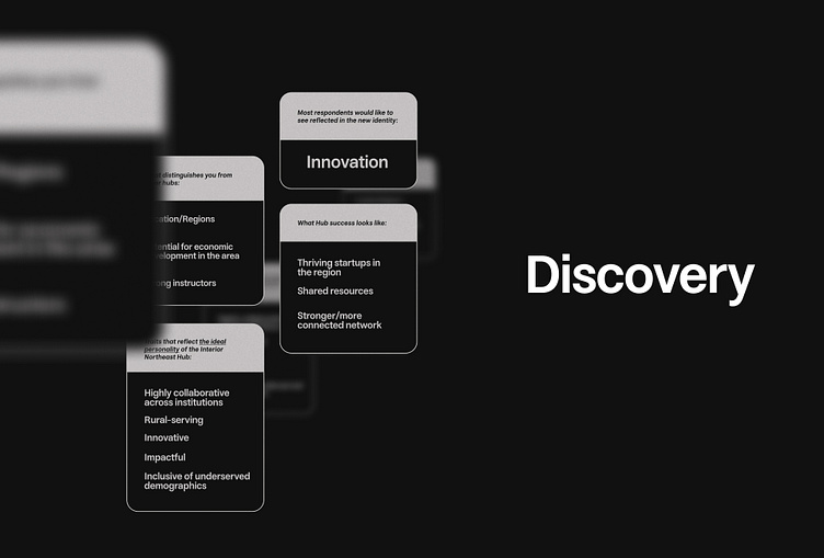
We worked with the organizing team at Cornell University to do an in-depth discovery including a survey of other participating institutions’ stakeholders.
What we found was that the responses were very much in sync: innovation and collaboration were at the forefront of everyone’s feedback. The consistency among responses gave us more to discuss during the end of Discovery, providing ample inspiration and material to explore throughout a variety of deliverables.
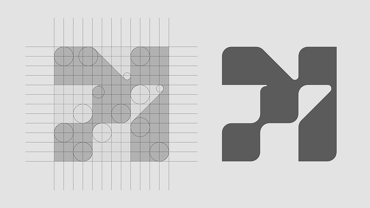
After looking at the other I-Corps hub logos we knew we could make something different and memorable. Exploration ranged from the literal (IN) to the weird. Everyone agreed that innovation was a driving characteristic worth illustrating. We also felt compelled to include a nod to the technological focus of the program, so a pixel grid was created as the icon foundation. From there, arranging the pixels to form a directional symbol was a no-brainer. We refined the shape to be asymmetrical and modern, with a combination of sharp and rounded corners, to represent all forms of innovation.
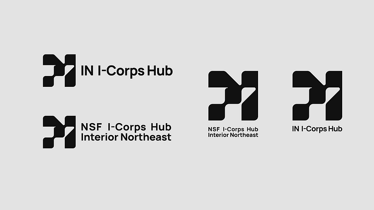
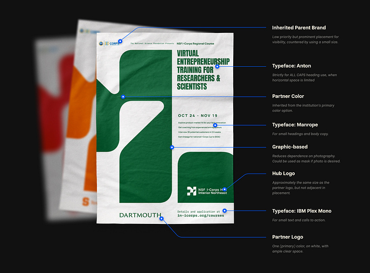
One of our priorities in building out this brand system was ensuring that the character of each partner institution was not lost or overridden and that the system was easy to use for everyone involved. 10+ institutions means 10+ different marketing teams… yet the hub’s materials need to feel cohesive across institutions. We built a set of design conventions that take a co-branding approach and kept institutional styles in mind as we developed typography, color, and design systems.
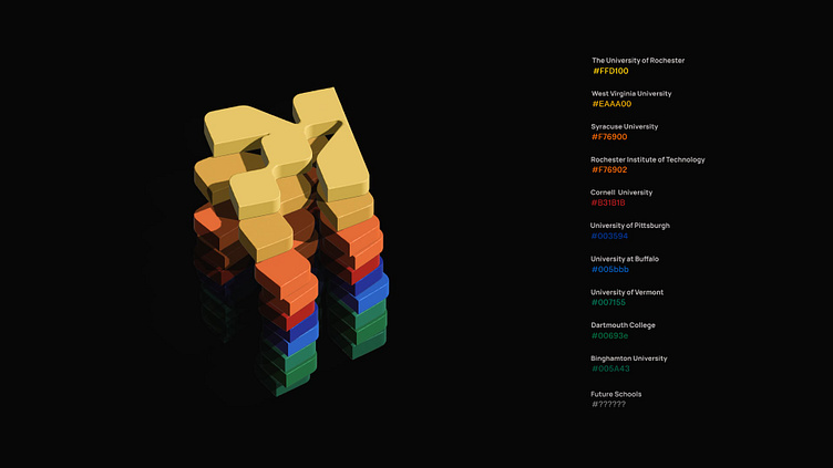

We came up with two different implementation options for palettes, based on context. This is the crux of the co-branding approach: materials associated with a university inherit the existing primary color of the partner brand. As illustrated here, the partners utilize almost the whole spectrum.
For materials not linked to a specific institution, we’ve introduced an alternate approach for color and brand assets. A coral highlight is unlikely to be duplicated by any future hub partners. Plus, it's a great color.
For materials not linked to a specific institution, we’ve introduced an alternate approach for color and brand assets. A coral highlight is unlikely to be duplicated by any future hub partners. Plus, it's a great color.

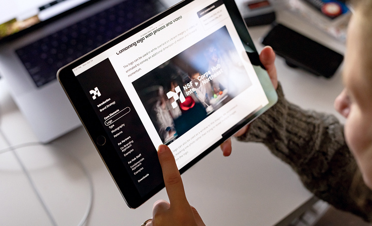
Lastly, all of this was compiled into an interactive brand guide. Again, because of the large number of potential users of this the guide, we made it a responsive website rather than a static document. A centralized location for best practices and downloadable assets is what we'd want if we were one of many teams relying on it.
This comes at the end, because it’s the culmination of everything we’ve built and learned along the way. It’s not meant to be overly restrictive or even prescriptive: the system is structured to function through the inevitable evolution of the IN I-Corps partnerships.
I'm pretty happy with the way everything turned out. It was a five week project, and we crammed a lot in. Then again, when you do one project at a time, it's almost better this way (a spring, you might say?!).
The IN I-Corps case study can be found in a slightly different format on the Relays website: https://relays.team/icorps/


