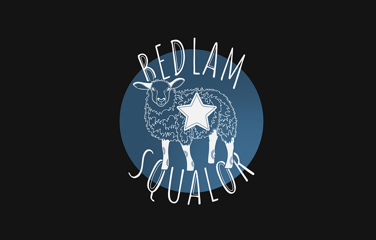
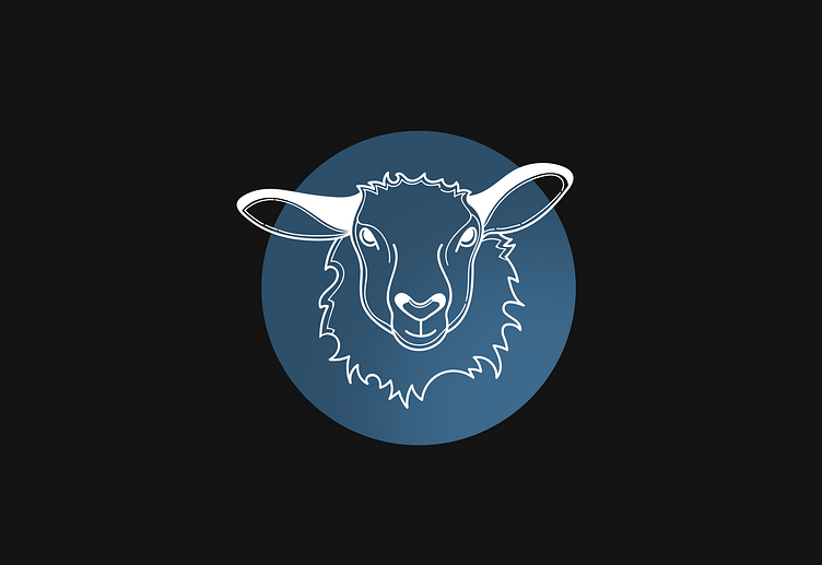
Logo design for Bedlam & Squalor


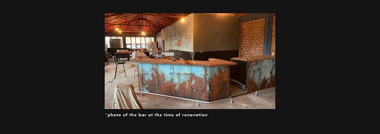
A bar owner from New Zealand contacted us with an unusual request. He said that he is currently renovating the premises for a new bar and wants it to have a very unusual character.
The Client is a big fan of post-modern literature and loves oxymorons. He intended the name of the bar to combine incongruous components. And the identity had to be appropriate.
"The name of the bar is "Bedlam & Squalor". This place must be dark and strange. It should attract visitors with its unusual aesthetics. It speaks of bizarre combinations. Here is a combination of high art and pop culture, communism and anarchism, Haruki Murakami and Ernest Hemingway, cubism and realism. The main task foe designer: to draw a logo and illustrations that could convey the spirit of postmodernism. And also to visualise the possible appearance of the bar (signage, shirts, advertising, stationery) after renovation."
- he wrote in his letter.
After this letter, we got excited about this project
While working on this project, we received the most unusual logo design brief:
Imagine "Monty Python" and "Fear and Loathing" stop to look at communist propaganda. Nick Cave is teaching Tom Waits about The Cure while listening to the Clash. Haruki Murakami and Ernest Hemingway are drinking old fashions in a grungy bar in Cuba. Twin Peaks is playing on a black and white grainy TV in a bleak Eastern European apartment block. Cubism and Bogotá street art are going through their gothic stage with sailor Gerry Tats… ”
The logo convey brand specific features:
quirky,
dark,
edgy,
surrealist,
different.
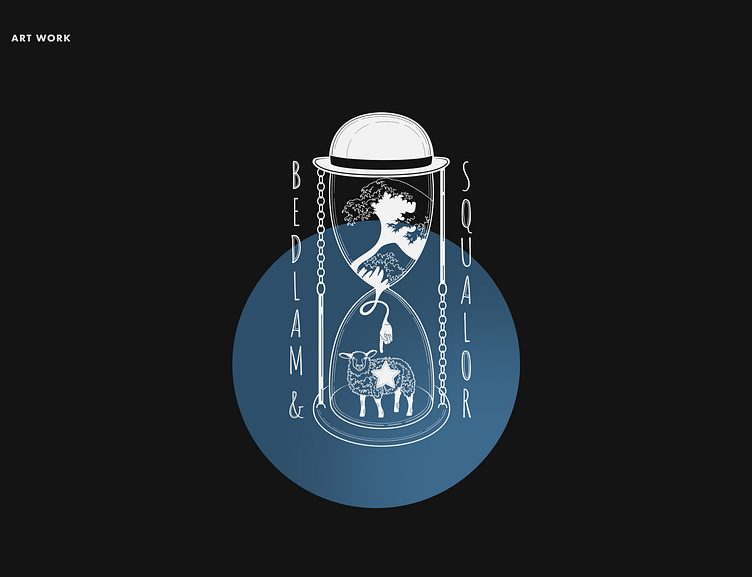
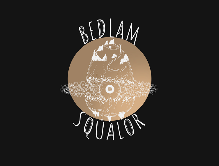

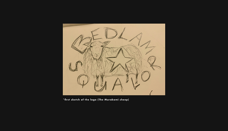
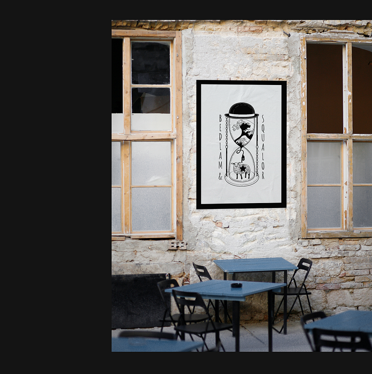
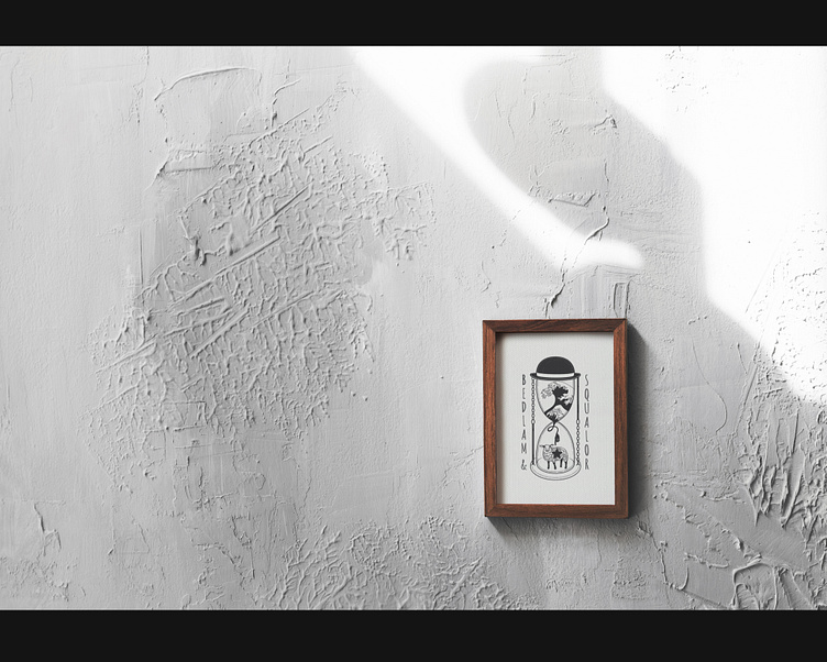
As a result, we have developed three alternative logos - emblems inside of which are hidden references to various well-known art pieces. Try to find them all :)
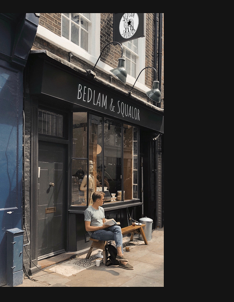
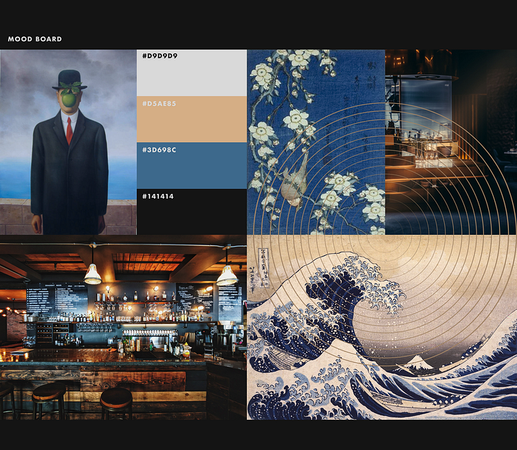
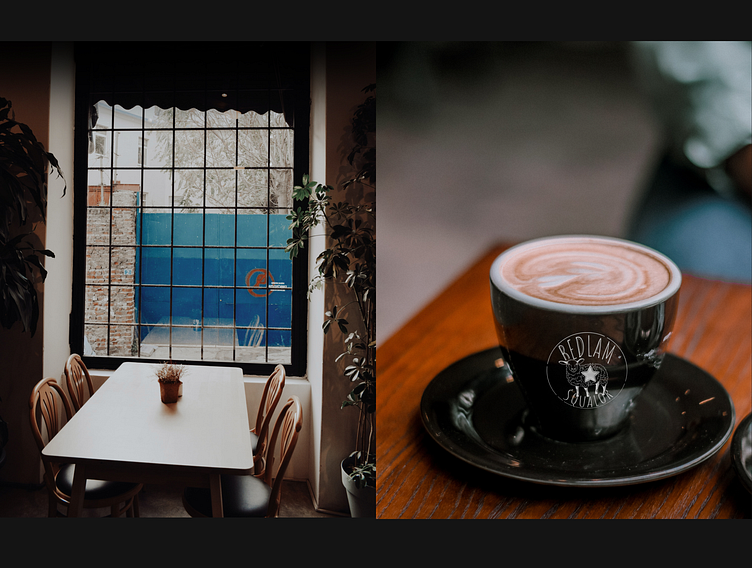
Also, to show how the logotypes look on media, we visualised the appearance of the bar after repair. We suggested using gold, gray, graffiti and deep blue colors in the design of the interior and signboards of the bar.
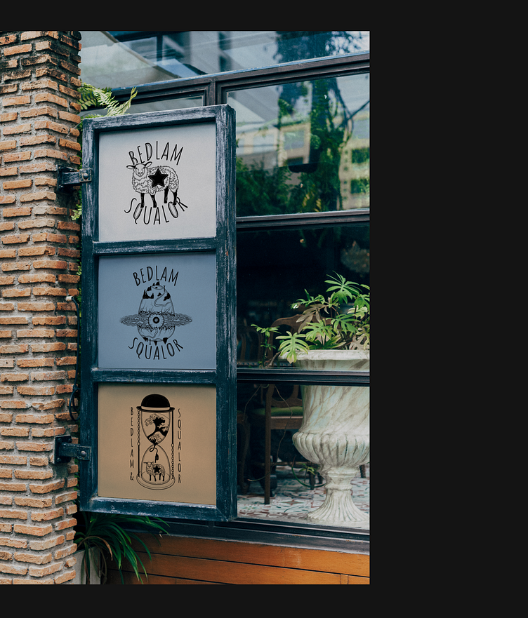
The textures of gray marble, gold and blue velvet are perfect for each other. Just like Hemingway suits Murakami. And just like Hokusai approaches Dali. This is a story about how opposites meet and create comfort and coziness.
And how they make you fall in love with the place you entered because of the unusual logo on the sign.
Thanks for your attention!
I hope you enjoyed this case :)


