Branding - Baby products online store

Hello Guys ! 👋
Today we are talking about one of my recent projects. This is a branding and visual identity design project for an online children's store.
Hope you enjoyed and press the "L" button As well, And let me know what you think about it in the comments 🔥😉
Contact us now !
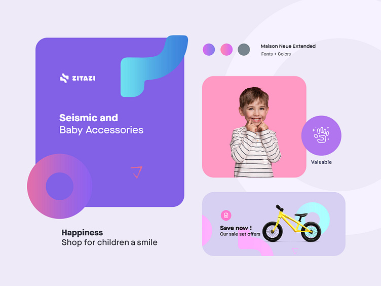
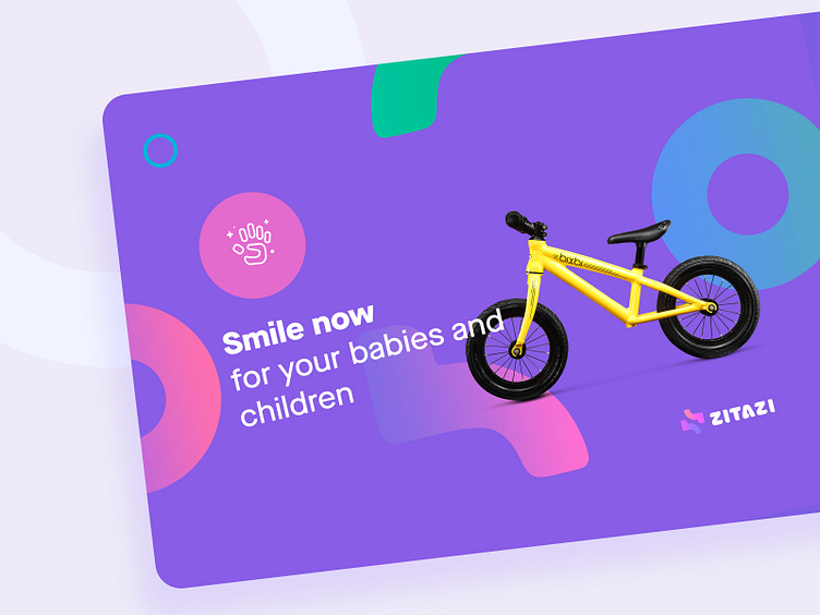
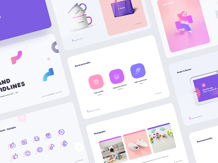
Children's colorful world
When we talk about children and babies, their fascinating and colorful world comes to mind. Accordingly, we used high-contrast colors and gradients to make the designs more attractive. Also, we designed a pattern from parts of the logo and combined these with different colors to create a childish and beautiful atmosphere. We used purple and pink gradients, which are very contrasty and catchy.

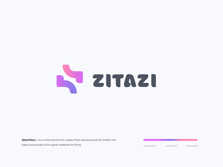
Brand logo design idea
The idea of designing the logo is actually using two letters z that are combined together because we wanted to use the two letters z that we had in the brand name as a point. Also, if you look at the form of the logo, you will see a child jumping. These were the things we wanted to convey in the message of the logo.

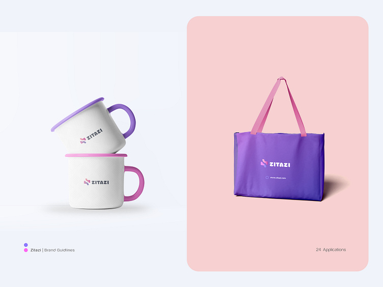
A brand book is a collection of creative elements of a brand, including ethos, colors, fonts and content. This is a working document that we define and matches with your brand, and in fact, the brand guide helps you to have a clear path and predetermined principles for your designs in the future.

Thank you for scrolling
I hope you will like the project ! Read our case study to learn more 🔥
✉️ Have a project idea? We are available for new projects at saeedyousefi@live.com | Send me a message


