PanCan - Branding

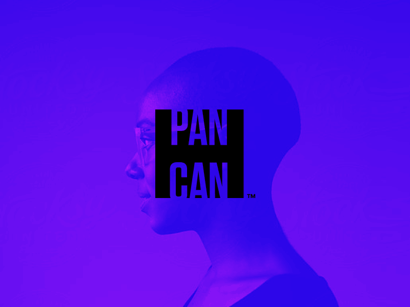
A little passion project I have been working on for the last few weeks: A rebrand of the Pancreatic Cancer Action Network or otherwise known as PanCan. I wanted to take elements of the current brand (i.e. purple box) and give it more of a concept.
The new logo concept revolves around the idea of this being a symbol of hope. Hence, the negative space "H" within the mark. I am still working out the kinks on some of the brand extensions but I would love to hear your guys' feedback. :)
(Sorry for the repost... I wanted to make a gif and then I forgot to put it on loop. Rookie mistake.)
Thanks!


