Interactive Navigation Bar Component Guide

Hey everyone! ✌️
I'd like to try a new format. This publication is kind of a guide of how to create an interactive component in Figma. I’m going to share how I’ve been creating an interactive navbar component for one my recent projects step-by-step. What difficulties I faced and how I’ve been solving them.
I also created Figma Community File. You can go there to check all details. Feel free to use the component in your design as well. I hope it is useful for some of you. Thanks!
I'd like to clarify one thing in the very beginning. This guide is not the only right way how to create a component like that. This is just a way how I personally tried to find a solution. I don’t ask you to go the same way.
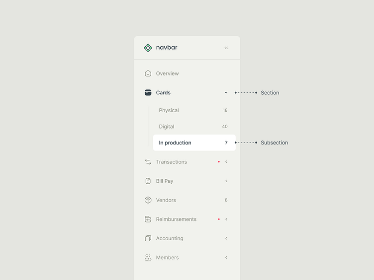
Intro
One day, when I’ve been working on one of the recent projects, I had to create an interactive prototype in Figma. One of the scenario actions was the transition from one navbar section to a subsection of another. Subsections are hidden by default. They appear as droplist items after clicking on the main section. So, in my prototype I had to show how to reveal subsections and go to one of them.
I could just create several navbar states and add transitions between them like “Dissolve” or “Instance”. It could be the simplest way, and I would spend around 5 minutes on it. However, I had enough time and a great desire to work on the prototype well and make it more detailed. I think a great desire was a key point there. Besides, It looked like a quite interesting and challenging task. I considered it as an opportunity which could help me in the future. I could use the component for main design layouts as well, not for the prototype only. And also It allowed me to reuse the component in other projects later.
Requirements
It doesn’t make sense to try to create a prototype which works 100% as a developed product. It would take too much time and there wouldn’t be enough benefit. So, I had to understand what exactly I’d like to get from the prototype. What user actions it had to respond to and how exactly it had to do that. What actions were not so important for this particular prototype and I could skip it.
Required
To provide “Hovered”, “Pressed”, “Selected” states for sections and subsections
To show subsections when the user clicked on a section which included them
Navbar was used on almost every frame in design file. It meant, the management of section names and icons had to be simple and clear. It was better if I could manage everything from one place. It would help me to speed up the process when I need to add a new section or rename one of them.
Icons for “Unselected” and “Selected” states had different styles. I used "Outlined" style for "Unselected" state and "Filled" for a “Selected” one. It was necessary to switch between styles in prototype.
Not required
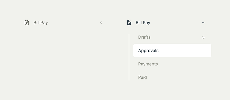
The idea was to have 2 states for navbar. “Standard” and “Compact”. “Compact” is when navbar becomes thinner, so section icons only are visible. I decided not to pay attention on this interaction in this prototype.
When navbar had too many sections inside, it was possible to scroll them right there. I skipped this condition as well.
You’ve got some context. So, now let me show you how I build this component.
What's first?
I’d like to start with something small to build the first brick. The component of a section.
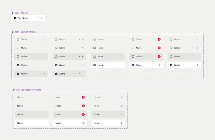
There are several variants of this component. The section might have subsections and might not. Accordingly to this, one option has a chevron icon and another one doesn’t.
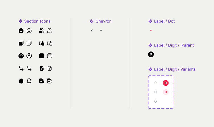
I also want to add a label. There are 2 ways how I’m gonna use the label. To notify about changes and to provide auxiliary data. The label consists of a digit and a background for notifications and a digit only for auxiliary data. However, It isn’t correct to use a notification label with a digit for a closed section which includes subsections. The label belongs to a subsection. So, the label near the section itself should simply notify that there is something inside but not to provide detailed information. It means the label for closed section is gonna be different.
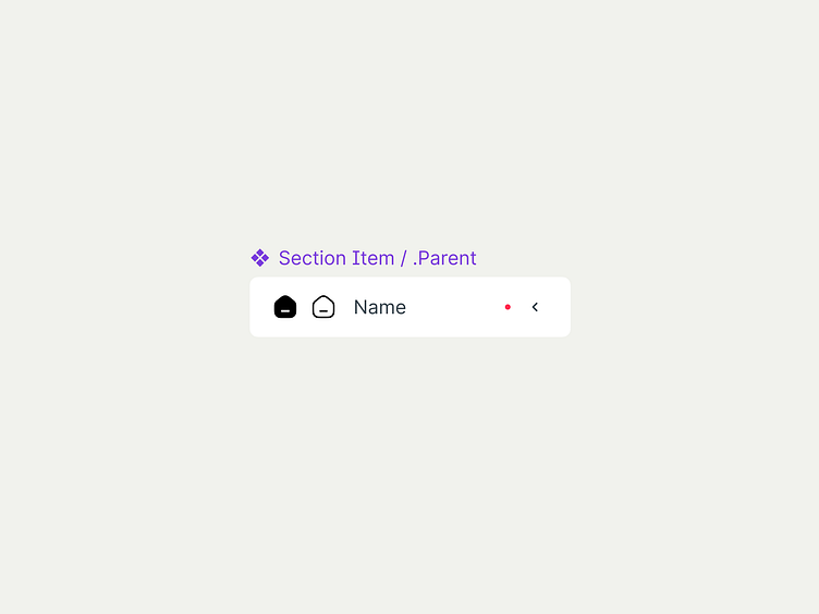
Section component consists of
Section icon
Section name placeholder
Notification label or informative label (optional)
Chevron (optional)
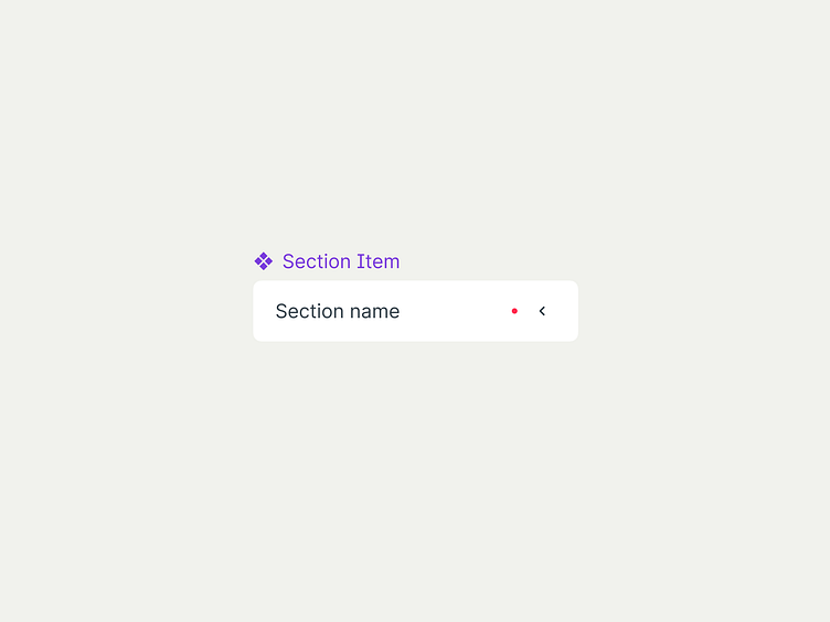
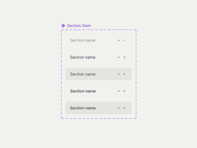
Section Item component
Let’s create this component. I’m not going to add a section icon on this stage. There is a bunch of tricky aspects about a section icon, so I’ll share how to add it a bit later.
I’m going to group "Placeholder", "Chevron Icon" and "Label" via auto-layout. We need to remember that a chevron icon and the label have states and variants. We need to provide those states before grouping all elements together.
I’m not going to show how I prepare states and create auto-layout group. I think it’s not a complicated process. I’d like to focus on some tricky and unclear moments in this guide. Anyway, if you’re interested in what states I used and how I organised them, you can go to Figma Community File and explore it right there.
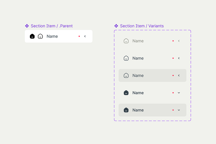
As a result, I got this component.
Now I need to create states. I’m going to create Variants with 5 states for a section with subsections. You’re free to have as many states as you need to. Then, I add interactions between states to create an interactive component.
Let's check how it works...
⛔️ Couldn’t play interaction: nested instance is swapped with it’s parent instance
You can see the error, when I interact with the existing component. It happens because one of the variants is a parent component. In other words, the first state in variants is a parent (parent instance), all other states are the same parent component but wrapped in new components (nested instances).
I’m familiar with 2 ways how to solve this issue. The first one is to detach a parent component inside nested instances. But if I do that, I'll lose parameters inheritance from the parent. It means, each state will be on it’s own. One of my requirements for this prototype is to get simple and powerful component management. So, this option doesn’t work for me.
The second option. I’m going to use the parent component as a source of truth. All other copies will inherit some parameters like the distance between elements, paddings, corner radius, etc. from that parent. All states are going to be nested instances which I’ll turn into variants.
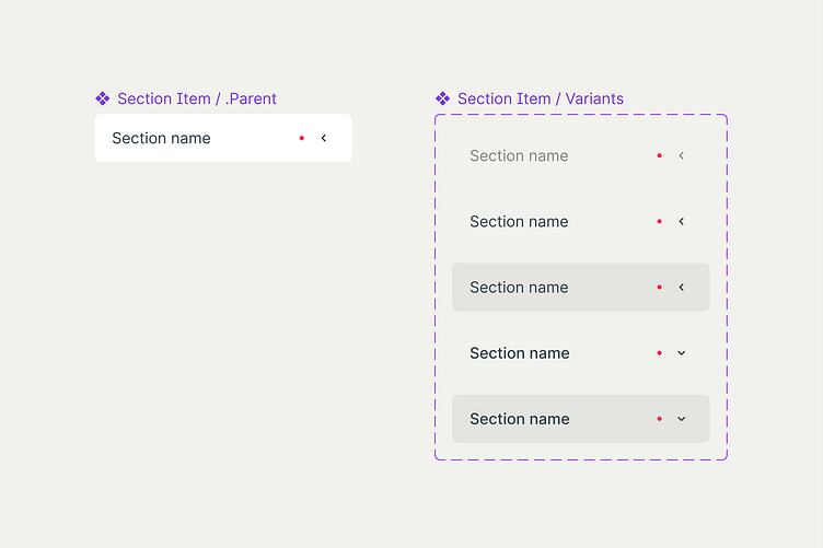
Let’s check if it works correct now.
👍 Great! Let’s deal with the icon then.
Icons
I think it’s the most complicated part. As I mentioned earlier, I use 2 icon styles. “Outlined” for “Unselected”, “Unselected - Hovered” and “Unselected - Pressed” states and “Filled” for “Selected” and “Selected - Pressed”. The icon has different colours depending on a section state. Somewhere the icon is dimmed, somewhere it has to be bright.
At first, I built the section component with the icon and decided to check how the interactive component worked. Everything worked well with the icon which I used in the component. Let’s name it, the icon “by default”. However, once I swapped the icon instance for another section I realised that Figma doesn’t swap icon style to “Filled” for a “Selected” state. Figma just turned back to the icon “by default”. It meant, the component was unusable because I couldn’t use it for section variations. It worked with one particular icon only.
I spent a lot of time experimenting with different approaches. I read a bunch of articles where other designers faced similar issues. But I haven’t found a solution which works in my case and solves my particular issue 100%.
I want Figma to automatically understand which icon to choose for “Selected” state and apply the right colour depending on a section state.
After a few experiments, I finally found a solution.
To correctly swap colours
1. Number of layers
The icons must have the same number of layers inside the icon components. Otherwise, Figma doesn’t understand where to apply a colour when you swap the icon. I understand that all icons are different. “Magnifier” and “Wallet” icons have different number of layers and it’s impossible to have the same number of layers everywhere. So, I advise to create a “Compound Shape” inside the icon frame. It might be “Union selection”, “Subtract selection”, “Intersect selection” or “Exclude selection”. It doesn’t matter which one you use. What really matters is to let Figma to “read” the icon as a single shape.
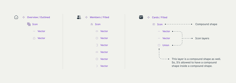
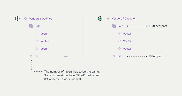
But what if you use Duocolor or Duotone Icons? No worries. In this case, your icon should consist of 2 parts. As I mentioned earlier, it doesn’t matter how many layers the icon has. The only matters is to keep the same number of layers from icon to icon. So, the first shape is gonna describe the icon part which represents the first color. The second shape is for the second colour.
2. Layers naming
It’s crucial to catch the only thing. You need to provide instructions for Figma, so it understands which colour to use for which icon part. That’s why it’s important to name layers properly. Same as with number of layers, It doesn't really matter how you name them. It is only important that they are named the same way from icon to icon.
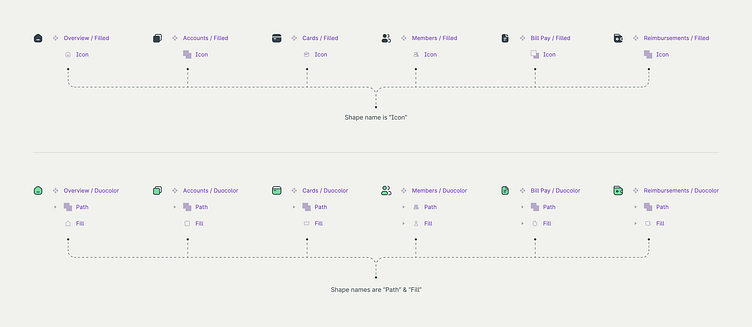
Regarding to 1 color icon transition (Outlined-Filled). This type of the icon requires only one shape inside. You have to name that shape the same way everywhere. E.g. “Icon”, “Vector”,“Shape” etc.
Regarding to 2 colours icon transition (Outlined-Duotone or Outlined-Duocolor). In this case, icon consists of 2 shapes. Provide names for those shapes and name them exactly the same way everywhere. E.g. “Color 1” & “Color 2”, “Path” & “Fill” etc. Feel free to choose names that works for you.
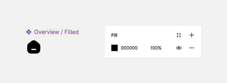
3. Parent component colour
Set neutral color for icons’ parent components. Do not apply a color style. It’s better to apply the color you don’t use in your design. For example, you can set #000 or any bright and contrast color which is not in the system. In this case, you’ll be able to immediately see if color isn’t swapped when the state is changed.
If the icon parent component initially has a color style, this might confuse Figma. I’m not 100% sure if it’s mandatory. Probably that everything will work even if the icon parent component has a color style. But it's better to be safe. Moreover, if icon parent components doesn’t have a color style, It won't make the experience of using the design system worse in this particular case.
To correctly swap the icon
It’s a bit more complicated. The solution here is not obvious. I want to swap the icon instance in a child section component and still have correct icon styles and colours for all states of a section component automatically.
1. One component for both styles
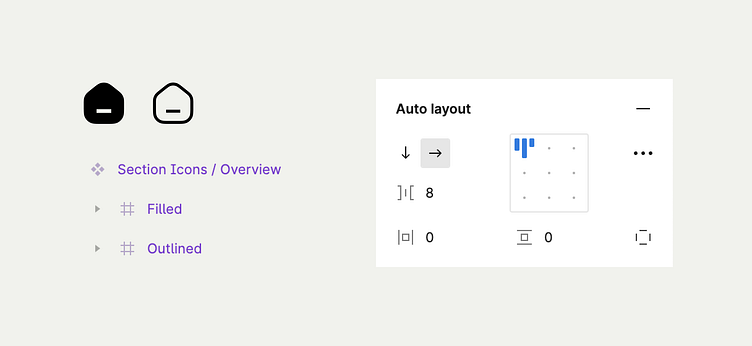
I have 2 icon styles. I need to explain Figma one thing. When I swap the icon I’ll still need “Outlined” and “Filled” styles but for another icon. To do that, I decided to combine both styles into 1 component. In other words, my icon component is gonna have 2 frames. One with “Outlined” style. Another one with “Filled”. Both frames grouped by “auto-layout”. I’m going to “Hide” and “Show” the necessary frame depending on a section state. It’s important for me to keep the icon frame ratio as 1:1. That’s why I use Auto-layout.
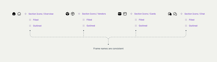
2. Frames naming
The names of icon state frames inside the icon component also have to be consistent. It allows Figma to apply parameters correctly from icon to icon. I’m going to name frames as “Outlined” and “Filled”. Feel free to name frames whatever you want to. Just keep names consistent everywhere and everything will work correctly
3. Put the icon component into the section component
I’m finally going to add the "Section Icon" component into the "Section Item" component. I won’t apply colour styles or turn on/off visibility of one of the icon states. I’ll keep the "Section Item" component as it is. I’ll modify everything in variants.
Here is how the "Section Item" parent component looks like now.
4. Detach visibility inheritance 🤔
In my opinion, the most interesting part! It’s extremely important to detach visibility inheritance from the parent component. If I hide frames inside the icon set in the "Section Item" parent component, the icon frames will be hidden in all variants as well. You can see it in the video below. I need to detach it. Otherwise, state transitions won’t work properly. How can I do that? I need to manually hide and unhide icon state frames for every variant. In other words, I need to hide and show “Outlined” and then “Filled” frames for every variant. As a result, if I do that and then try to hide icon state frames in the "Section Item" parent component, It won’t affect on the variants.
5. Adjust the icon states
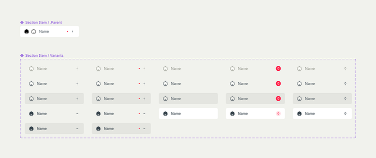
Finally, I can adjust the icon style for every section item state in variants. I’m going to apply a colour style and hide unnecessary icon state depending on a "Section Item" state. Here is how "Section Item" variants look like now.
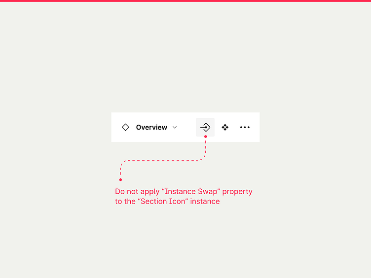
‼️ Attention
Do not apply “Instance Swap” property to the “Section Icon” instance inside the “Section Item” component. It breaks the prototype. I don’t know why it happens. Maybe it’s just a bug. The only thing I know is if you apply “Instance Swap” property for “Section Icon”, “Section Item” component won’t work correctly.
Section and subsection states
Alright! I’ve built "Section Item" component for a section which includes subsections. Now I want to create all possible states for "Section Item".
As I mentioned earlier, "Section Item" might have subsections and might not. It also might have a label. There are several label types. It might be a label for notifications or an informative one.
Here are all variants of a "Section Item" component I need. I created them exactly the same way as the first variants.
It’s time for a "Subsection Item" component. I’m going to reuse a "Section Item" parent component to create all variants of a "Subsection Item". "Section Item" and "Subsection Item" are pretty similar. "Subsection Item" is not going to have an icon and a chevron. And I'll rename "Section Item" parent component to "Item" just because I use it for both sections and subsections. I think this name is more correct in this situation.
Here is what I’ve got.
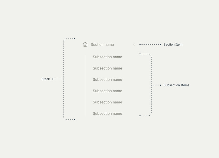
Stacks
Good! I have "Section Item" and "Subsection Item" components including all necessary states. Now I want to build “Stacks” for the sections which include subsection items. My idea is to manage section/subsection names and also the number of subsections for every stack from one place.
To reach this result, I need to create a parent “Stack” component. This component includes a “Section Item” component, some “Subsection Item” components and a vertical line. You can skip a vertical line. It’s just a visual element I'd like to use for this design. The style of a navbar depends on your purposes only.
I’m going to use a couple of auto-layouts to build everything I need. You can check how it’s built in a Figma Community File.
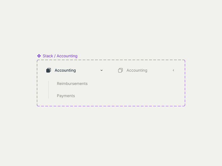
Then I need to prepare states for the first stack section. It’s going to have 2 states. “Closed” and “Open”. To create a “Closed” state, I'll hide an auto-layout group with subsections.
Here are the variants for the first stack.
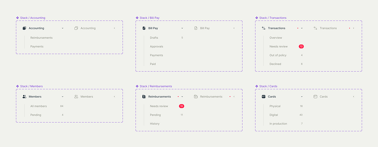
I’ll prepare variants for all other stack sections exactly the same way.
Once variants for all "Stacks" are ready, I need to connect those states as interactive components to open and close "Stacks" by click. However, there is a tricky moment here. If I just connect the top groups, it won’t happen anything when I click on "Stack". It happens because Figma gets the conflict between “Stack” interactions and “Section Item” interactions. Figma thinks I interact with "Section Item" itself, so when I click on it, it just changes the “Section item” state but doesn't open “Stack”. To fix it, I need to apply the interaction to the nested instance of “Section Item”. By doing this, I put the new interaction higher in the hierarchy.
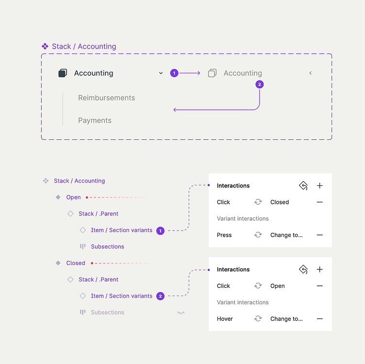
In this case, “Stack” opens and closes by click. Moreover, all other interactions from “Section Item” like “Hover” and “Pressed” work as well.
Organism
Everything what left is to combine “Stacks” and “Section Items” without subsections in one navigation bar. I will use auto-layouts to dynamically move sections when I interact with stacks.
Here is the final result.
Outro
This is everything I wanted to share with you in this guide. I hope it is useful and you’ve got something new here. If you have any questions regarding to the process of creation, feel free to ask me by using my email, Telegram (@danielmoss), LinkedIn or Dribbble.
Thank you!
See you later ✌️
————————————————————
danielmoss.studio@gmail.com


